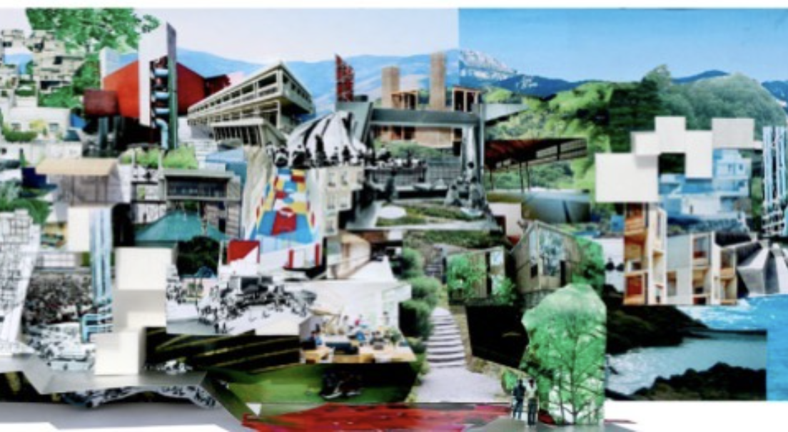
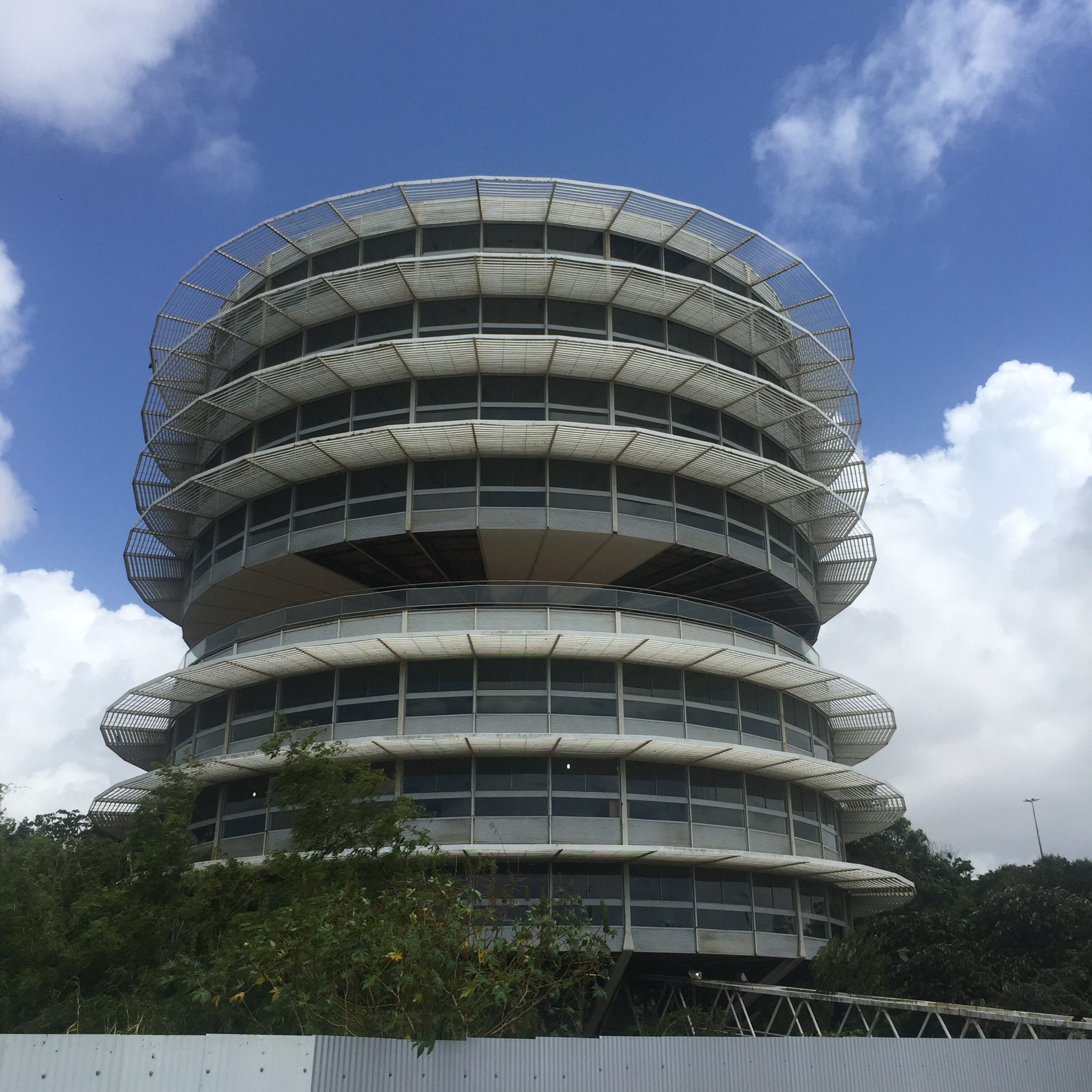
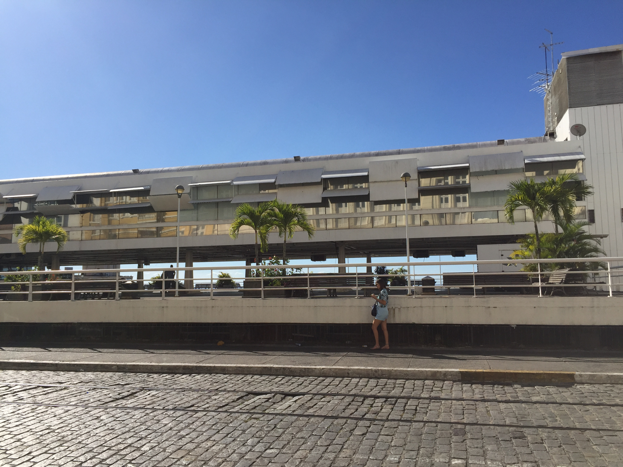
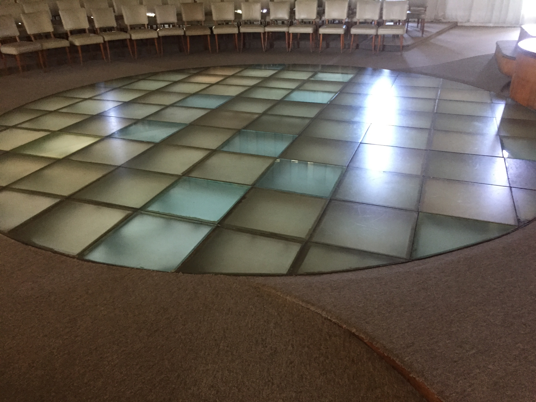
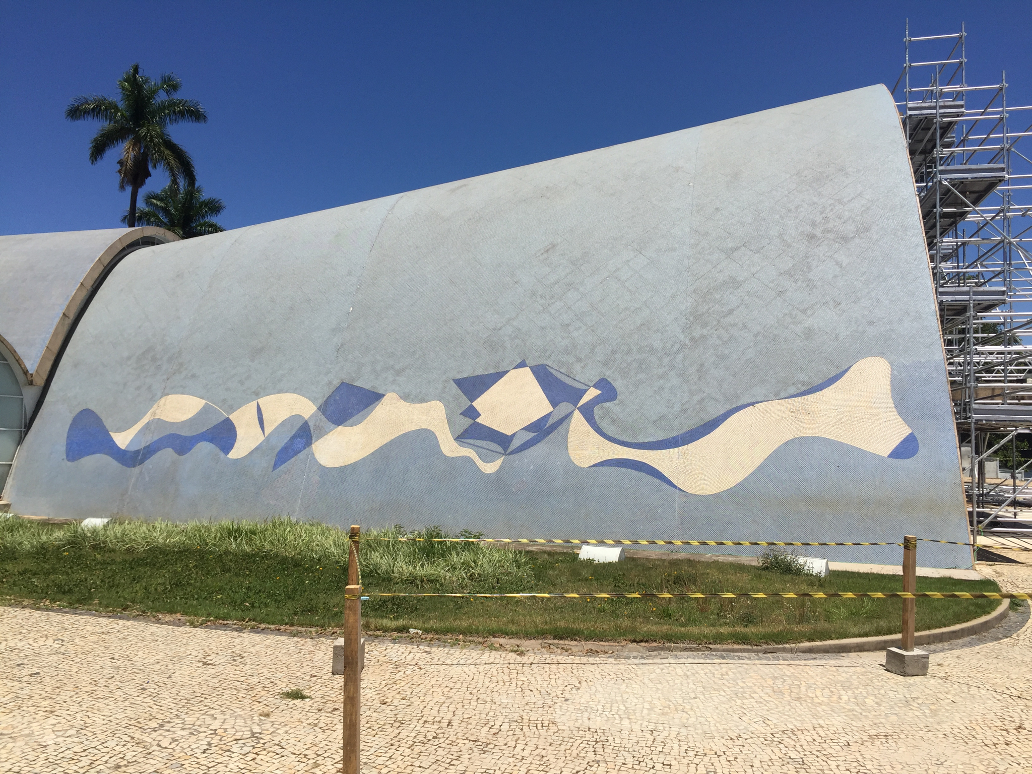
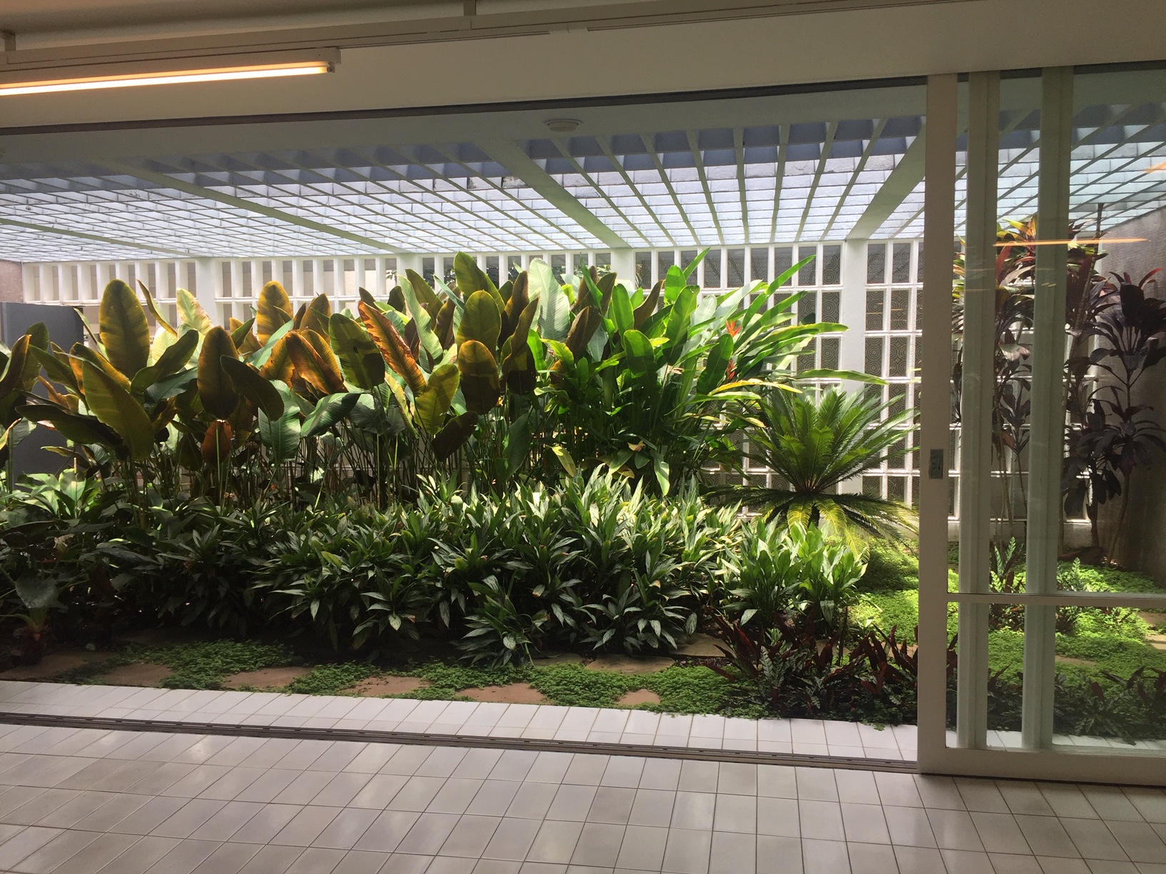
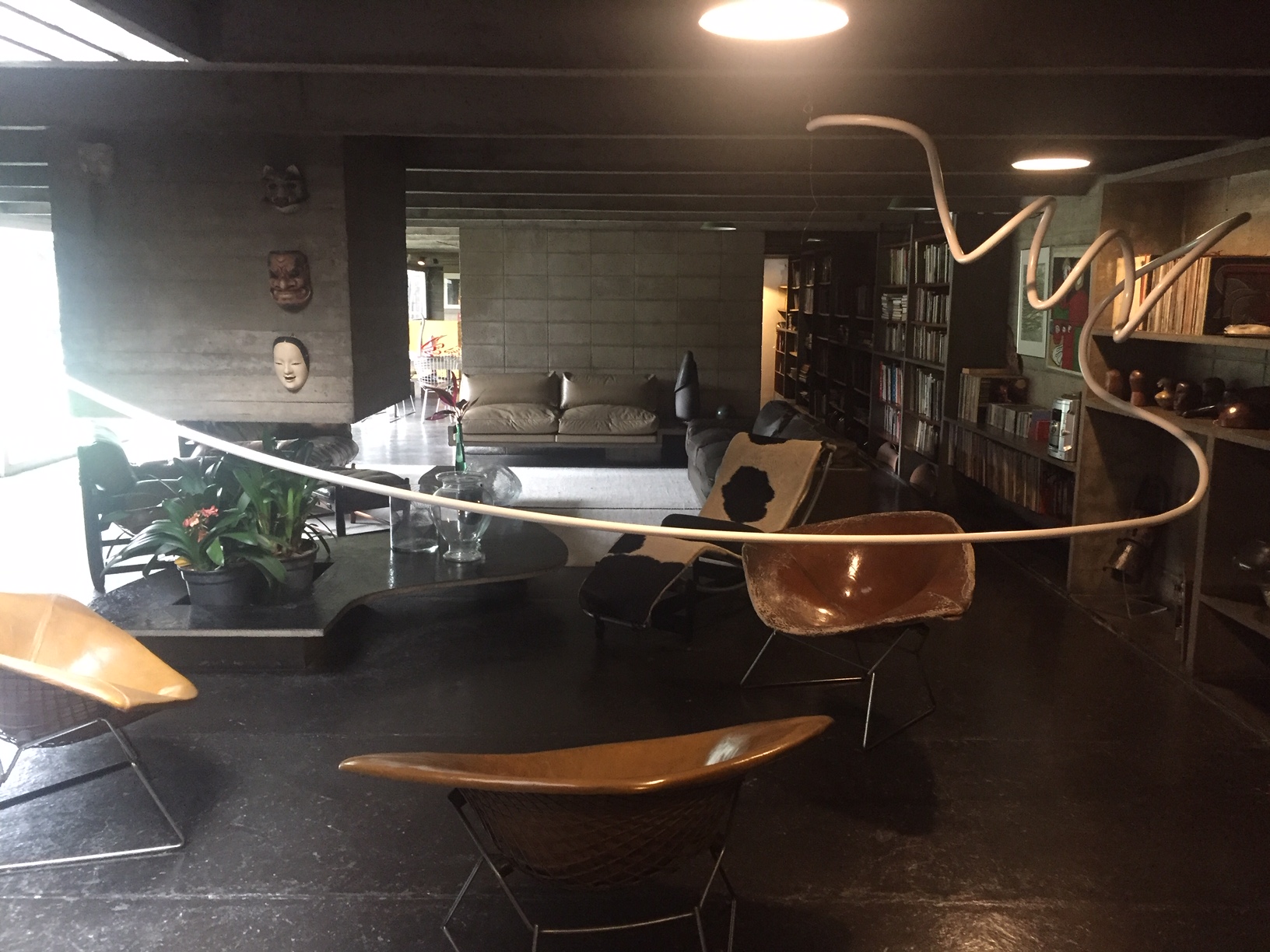
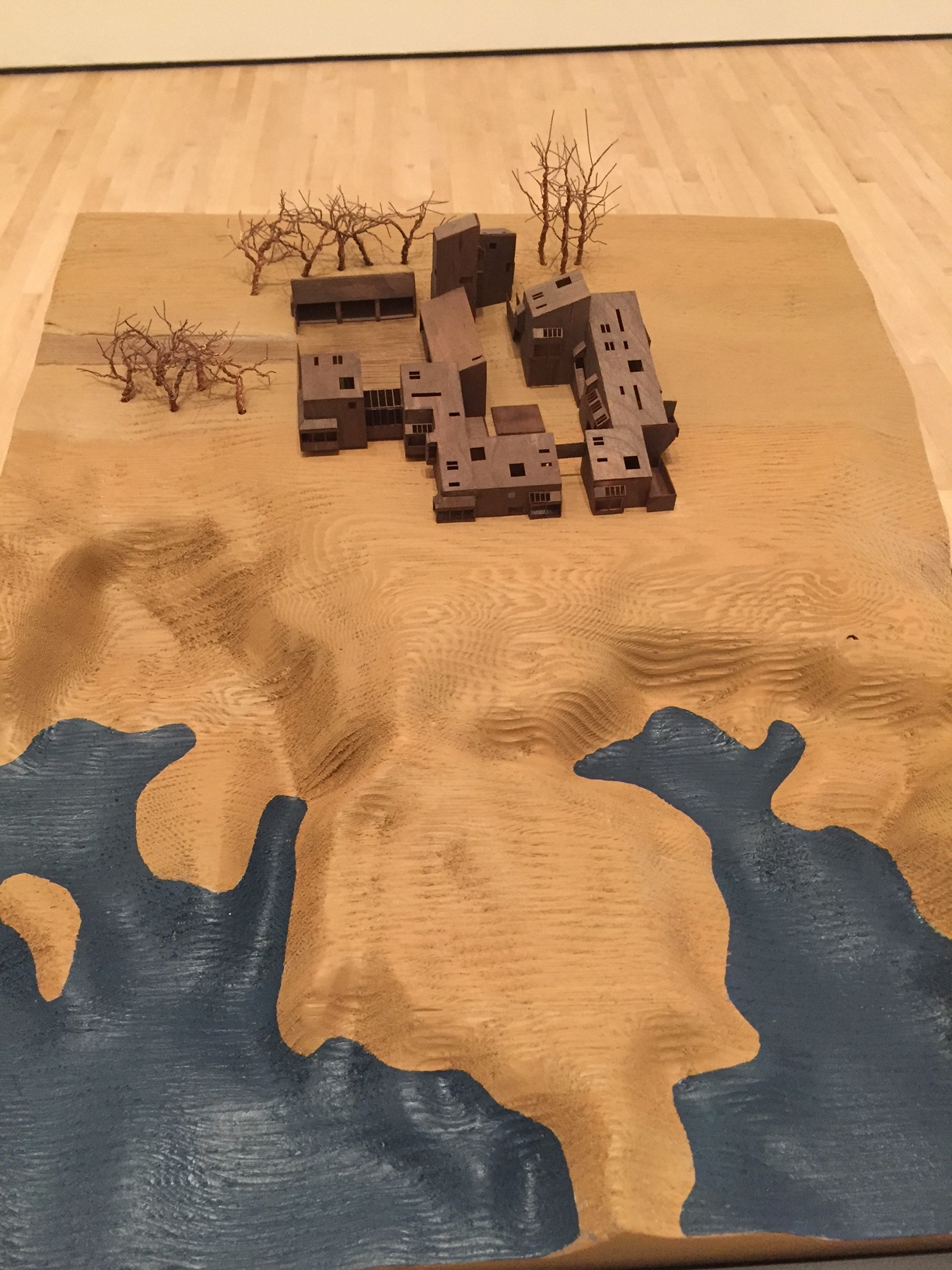
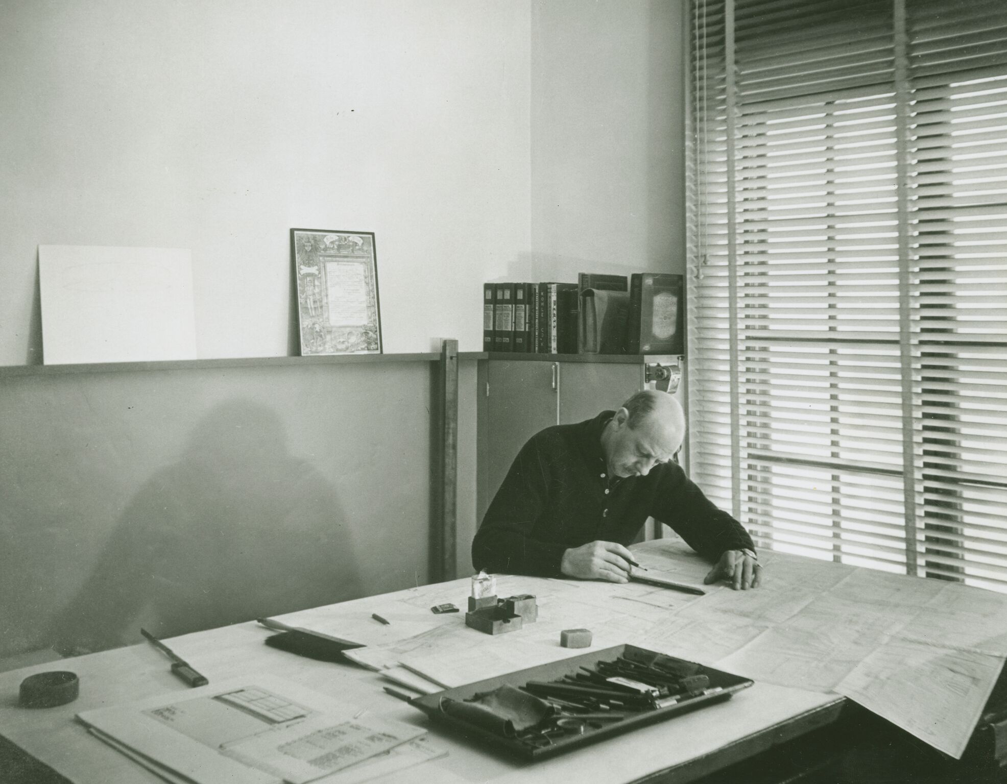
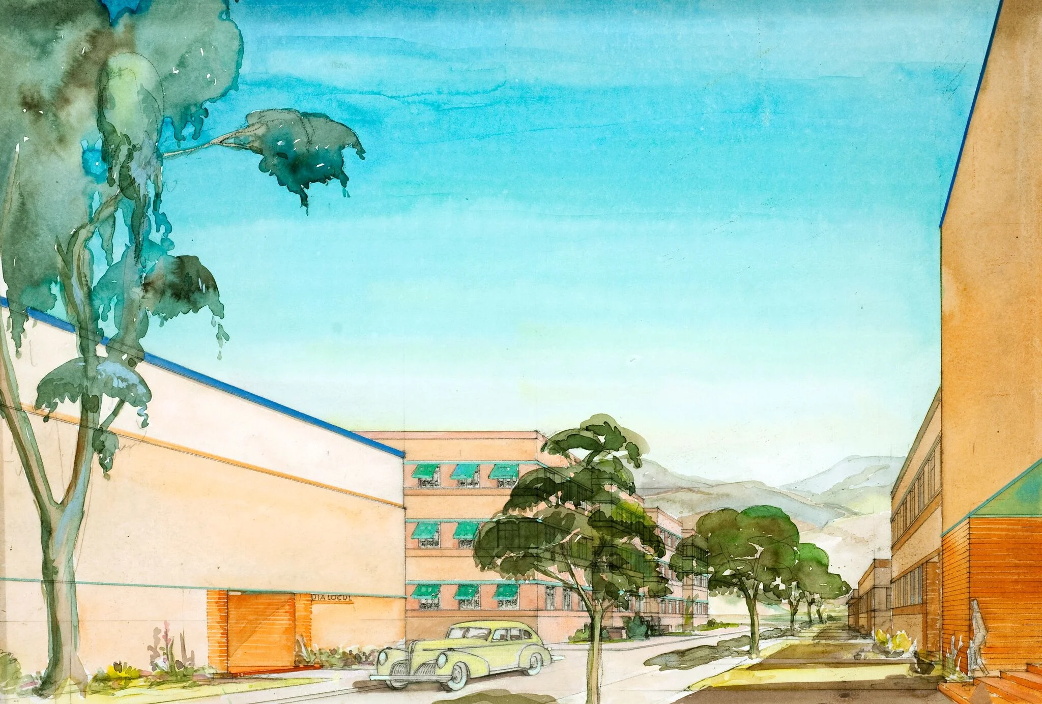
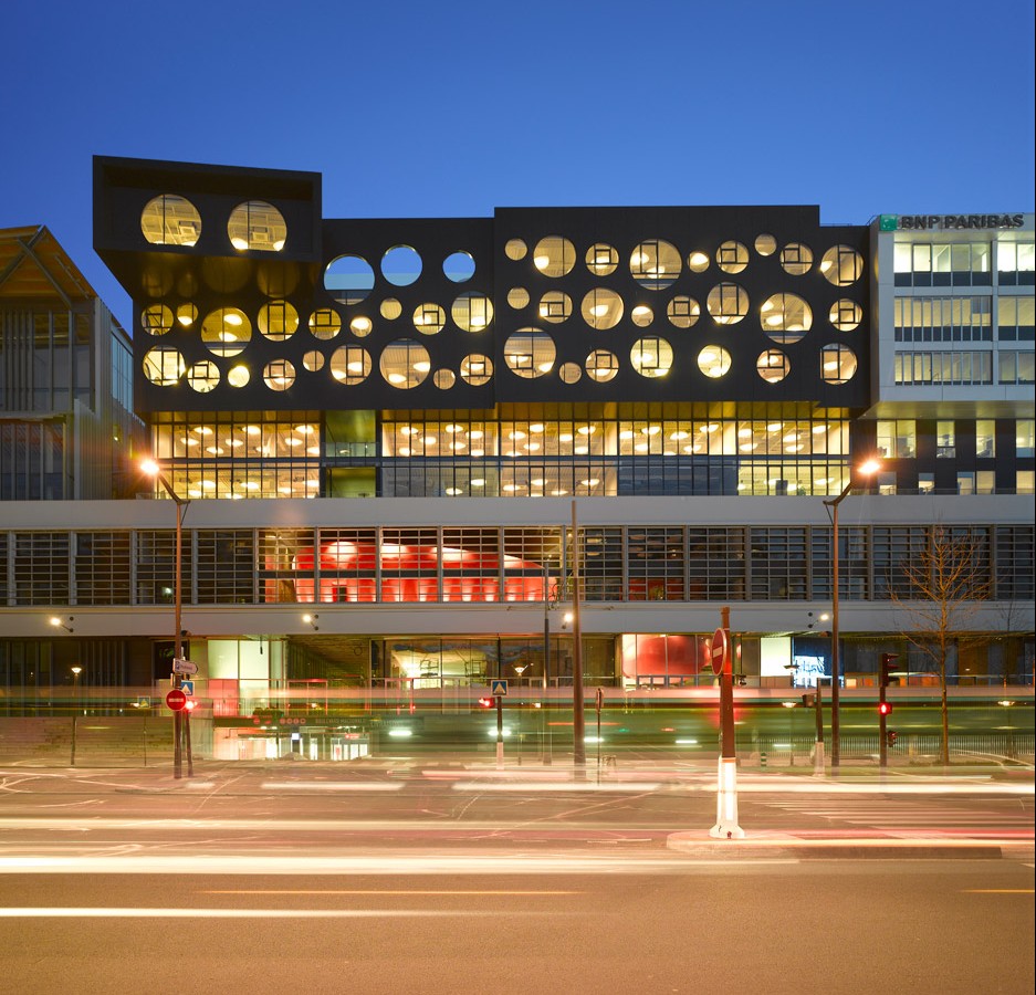
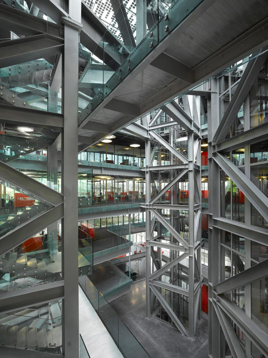
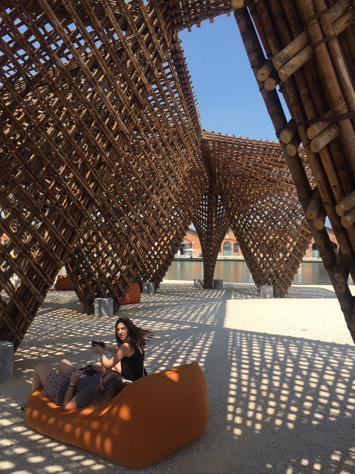
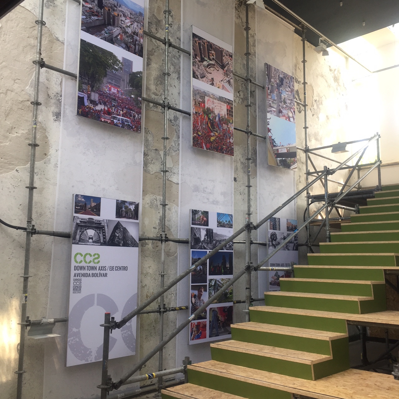
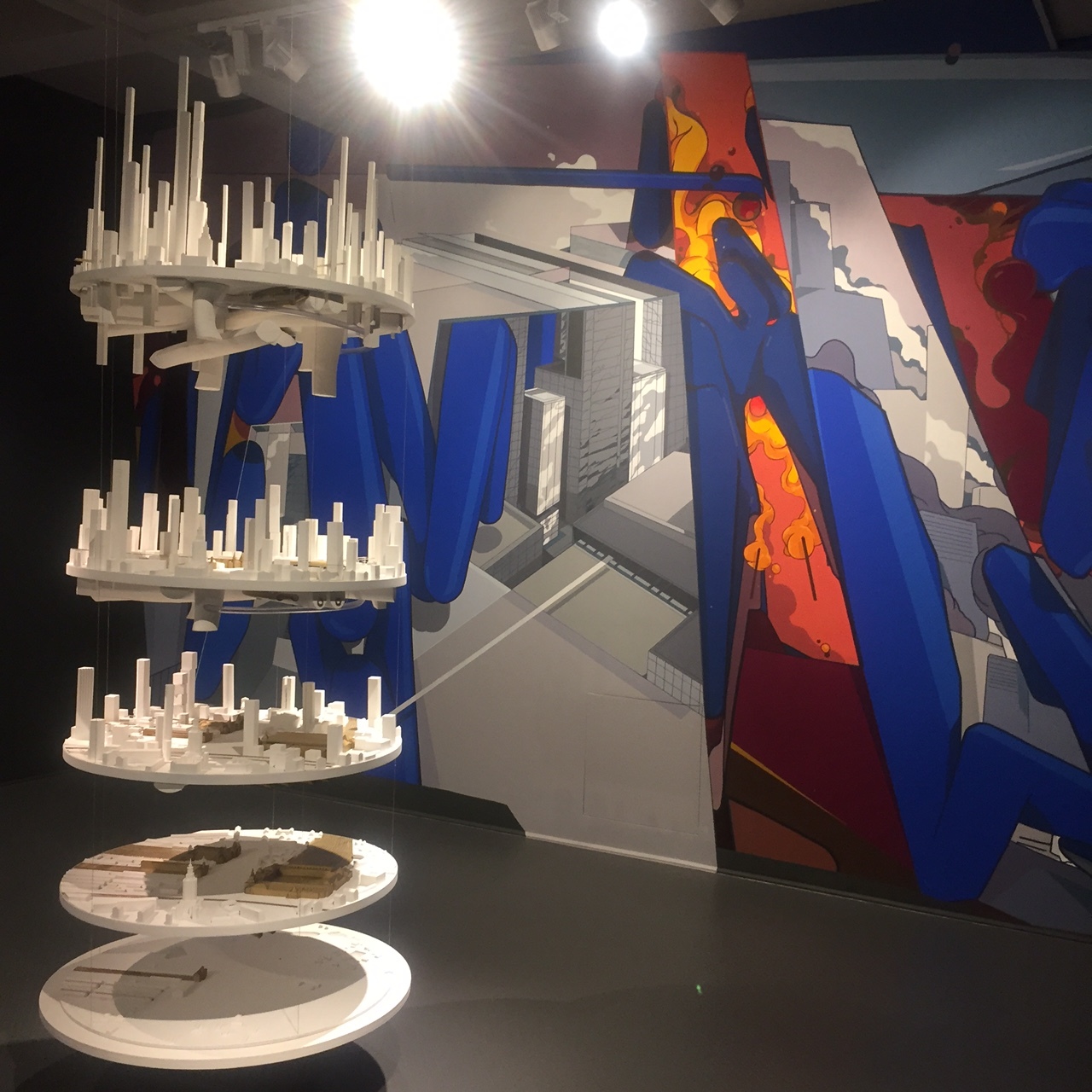
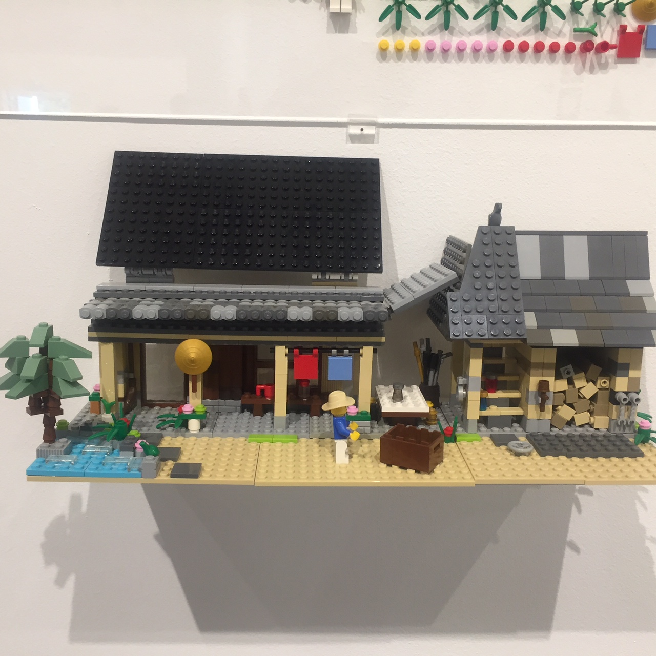
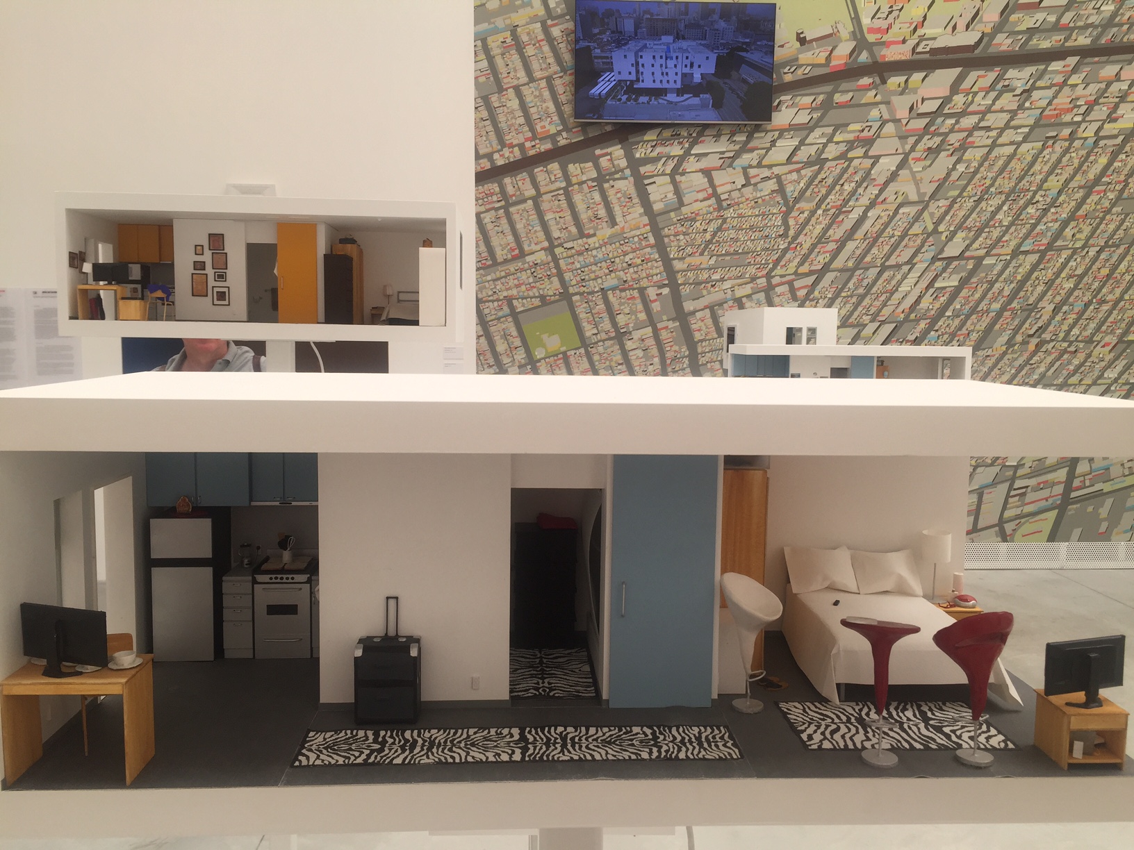
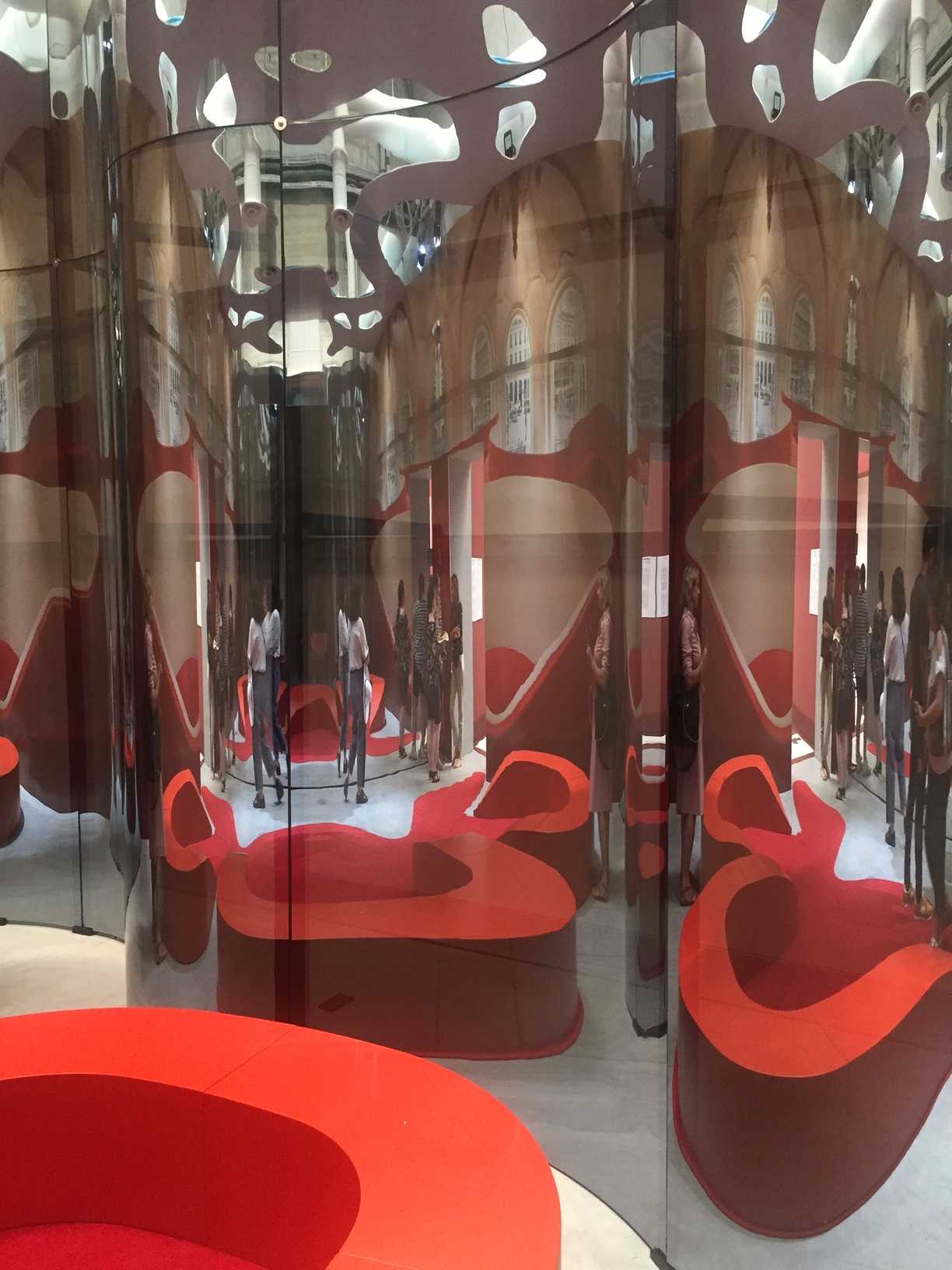
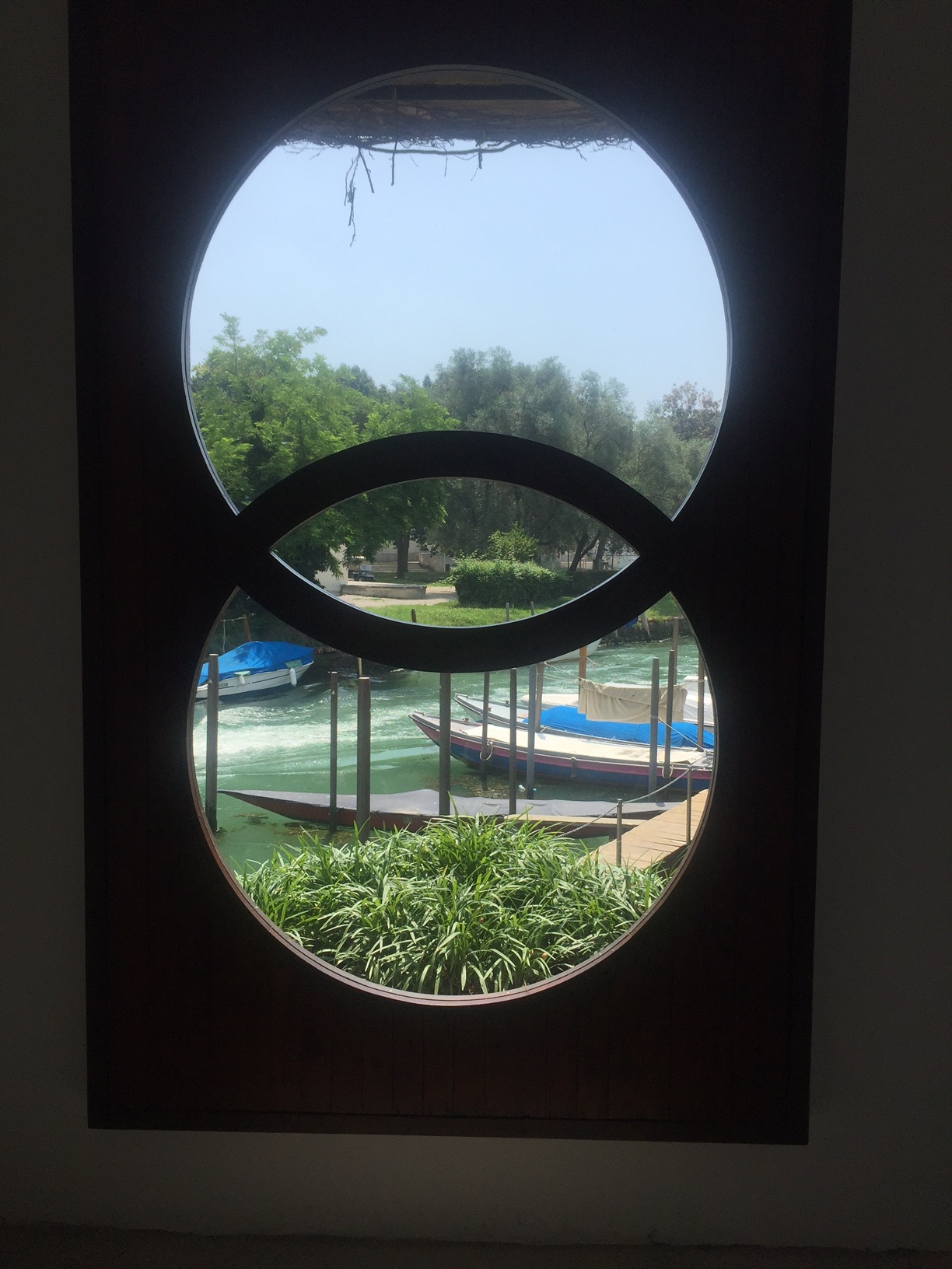
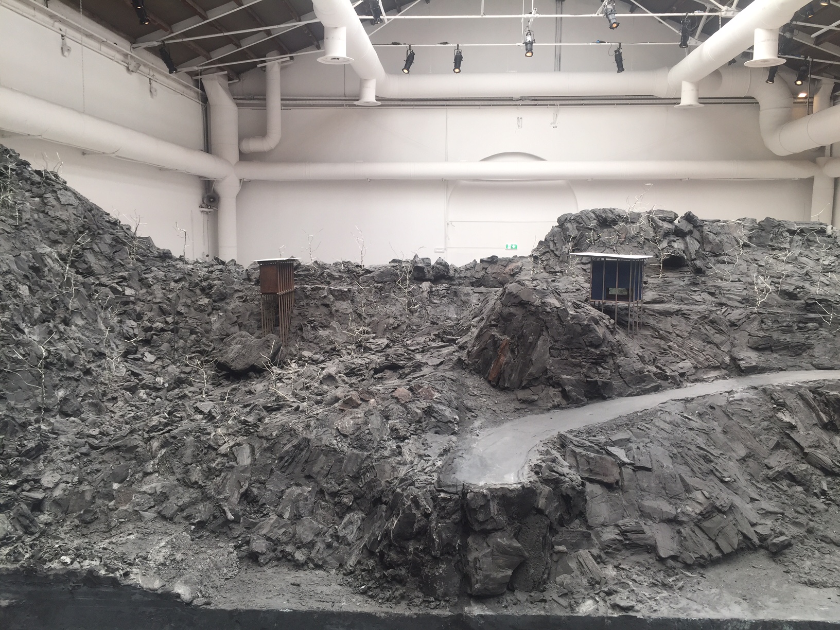
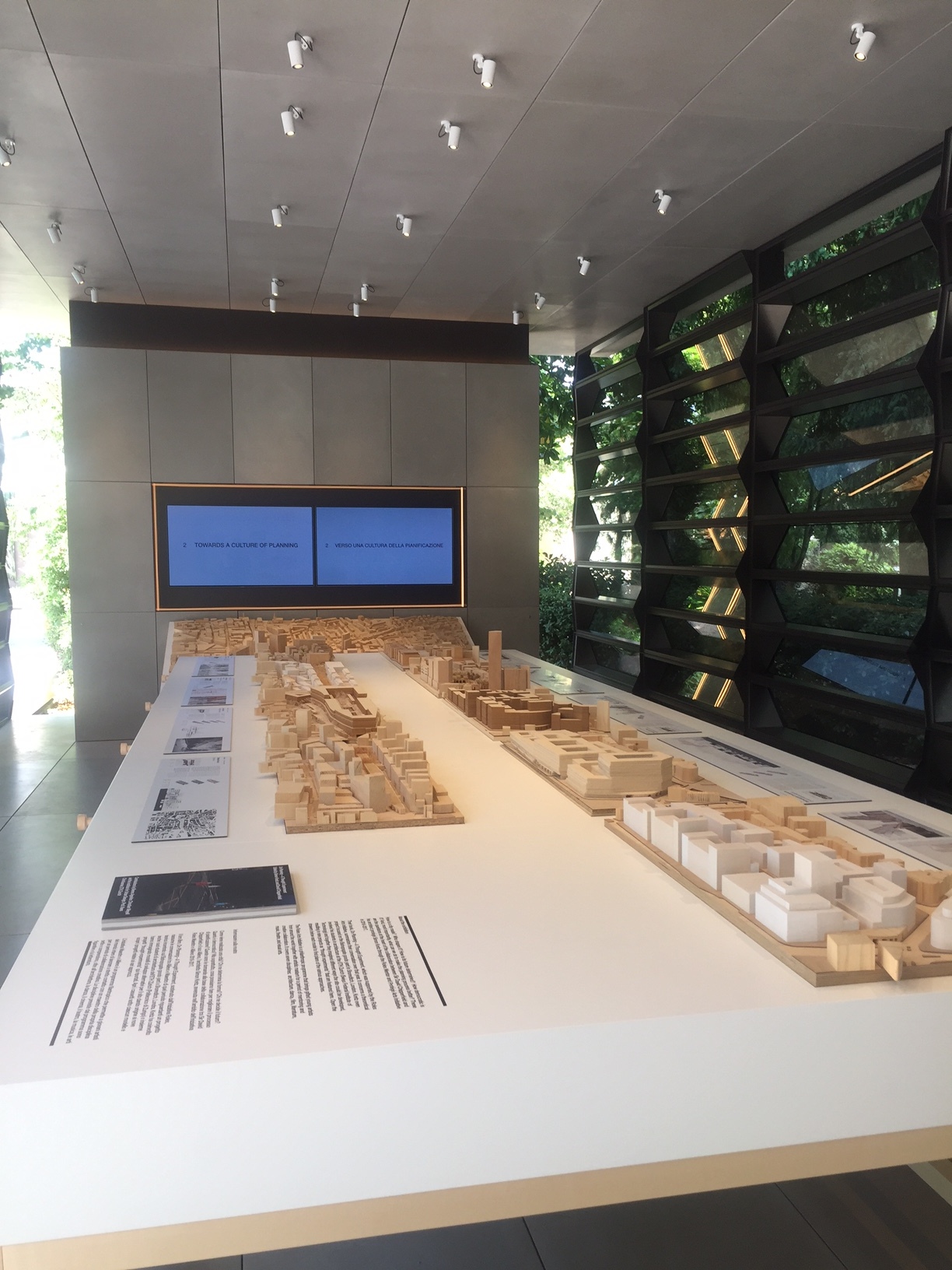
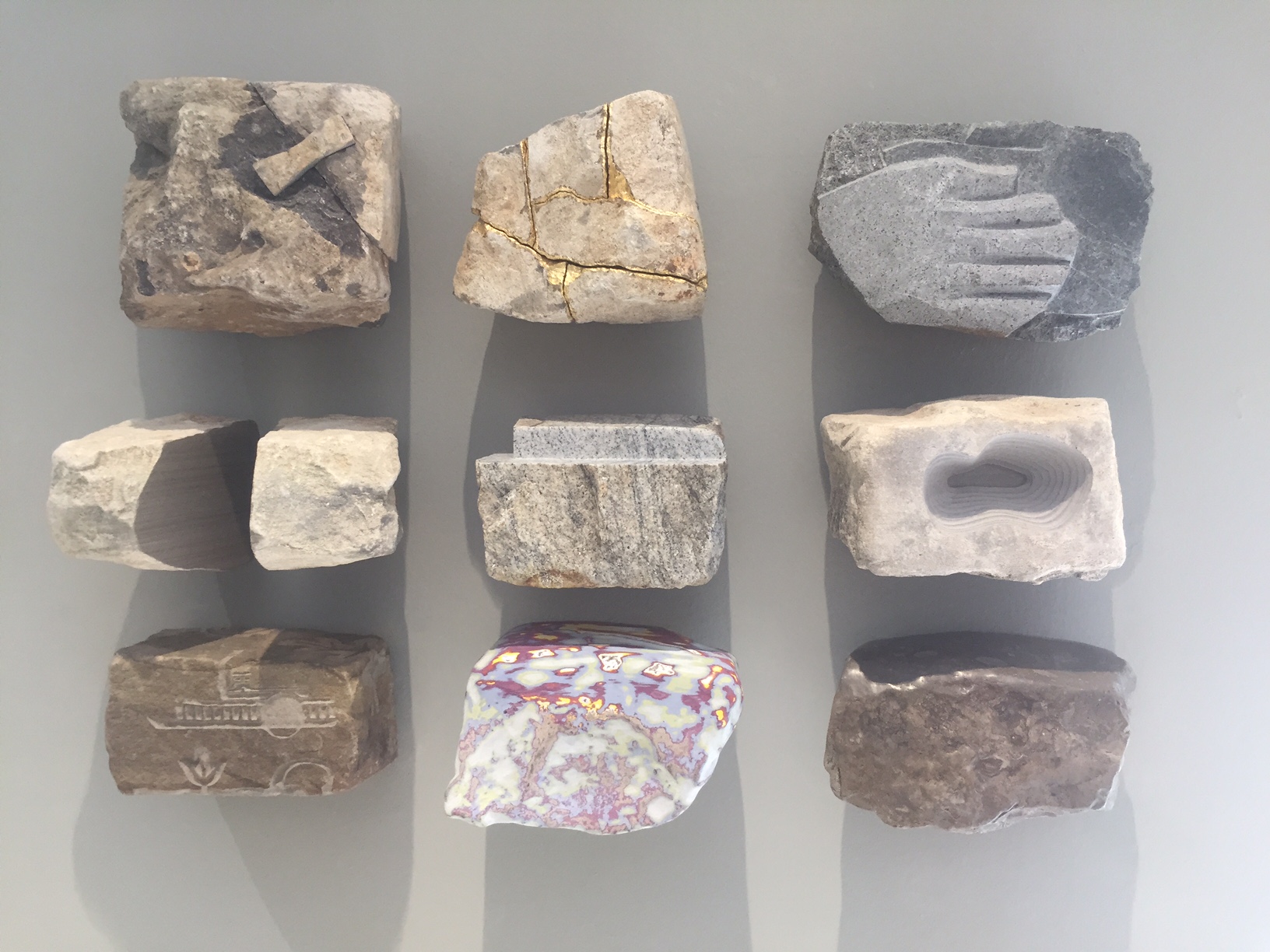
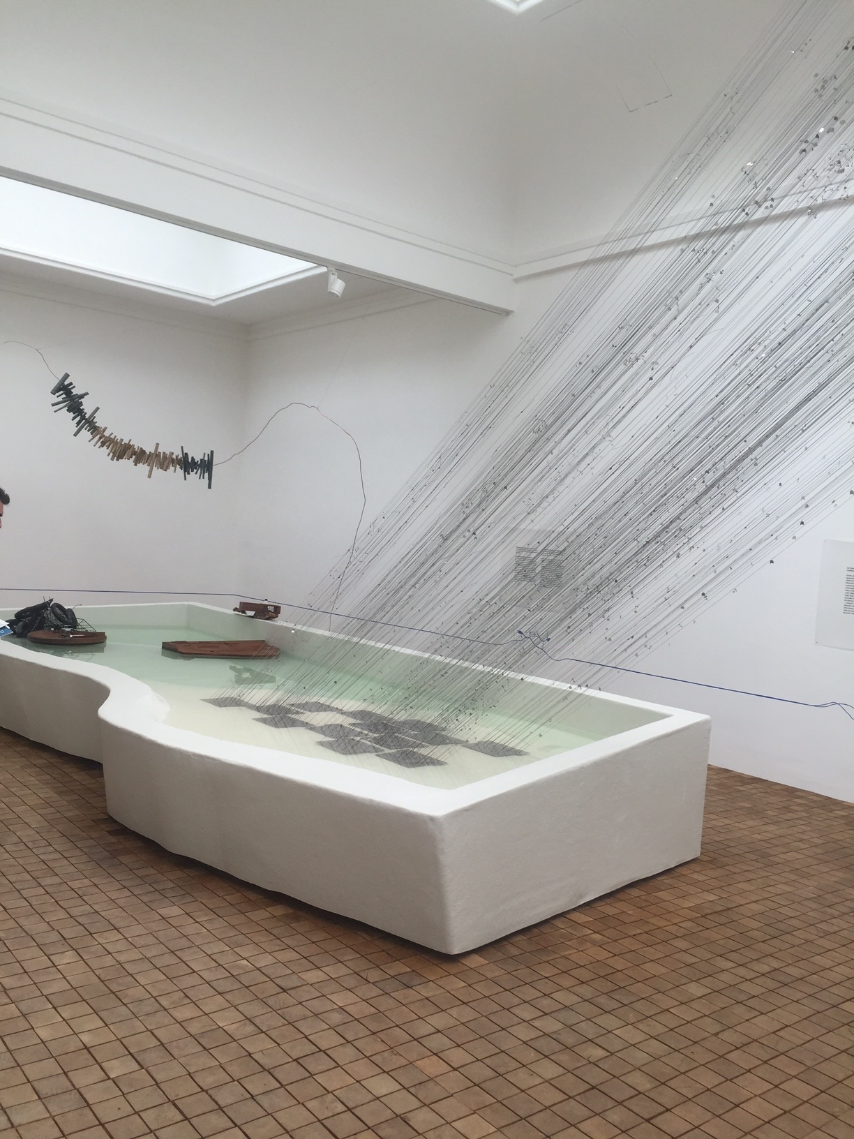
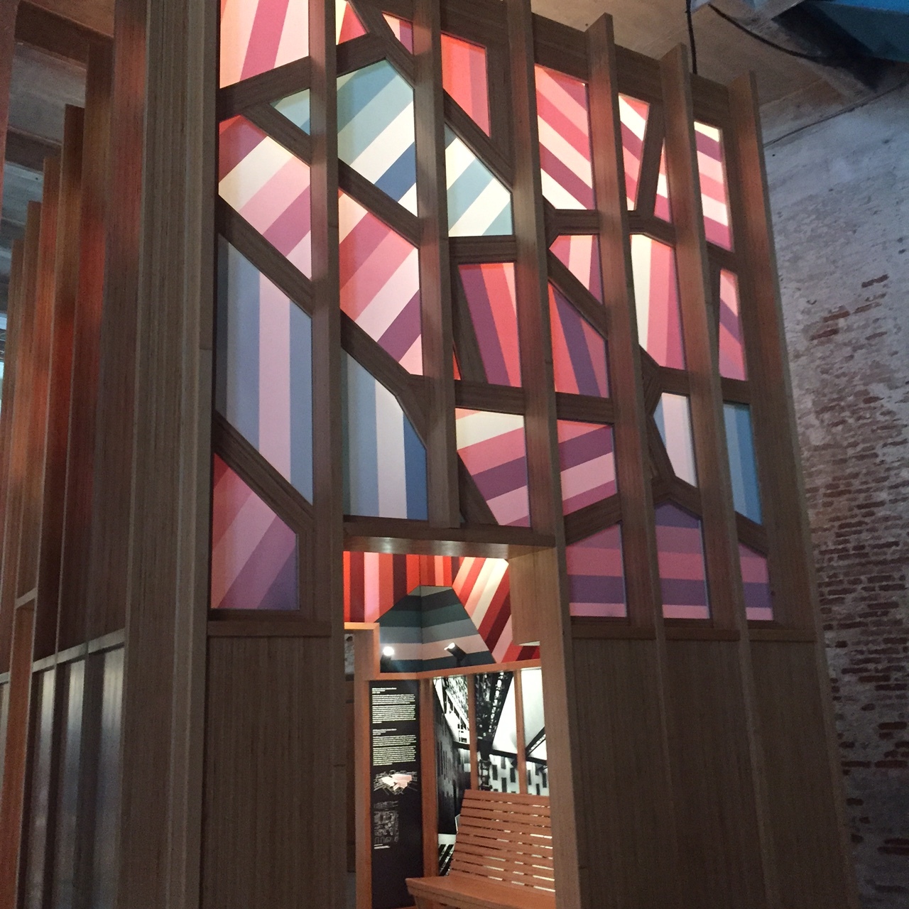
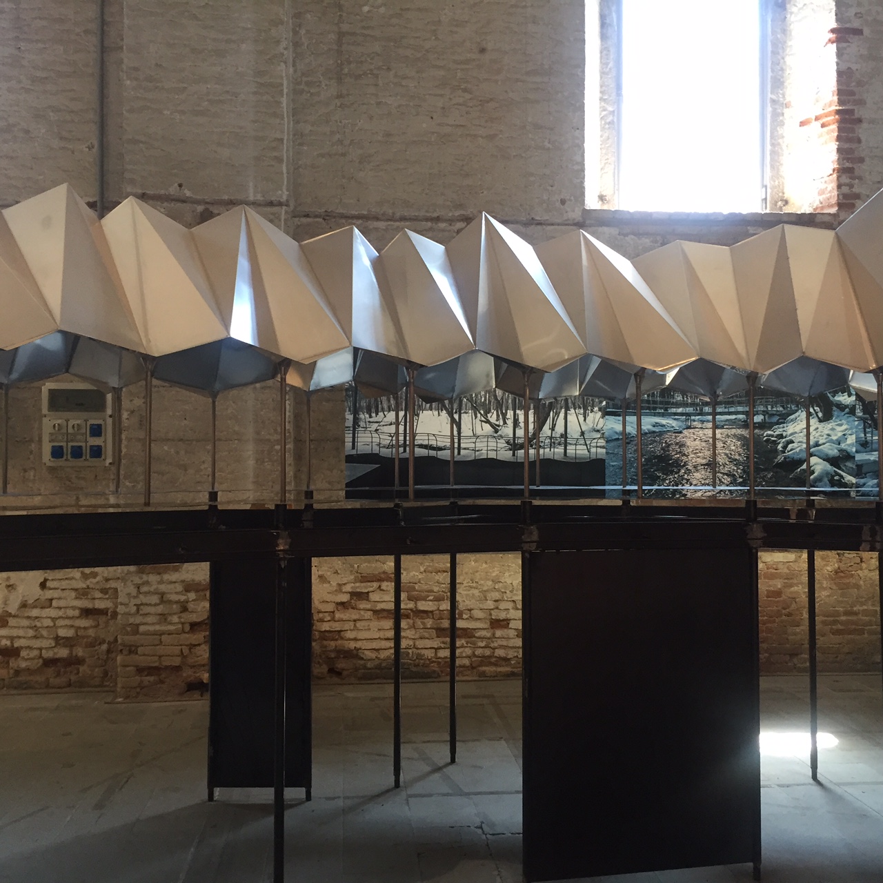
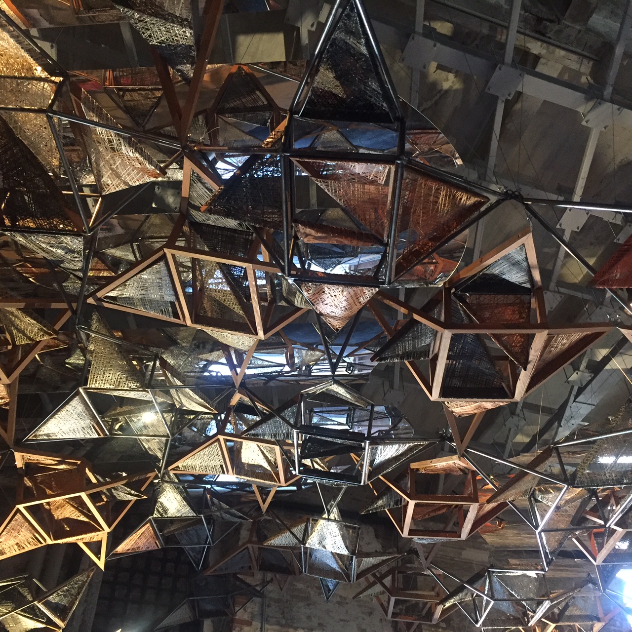
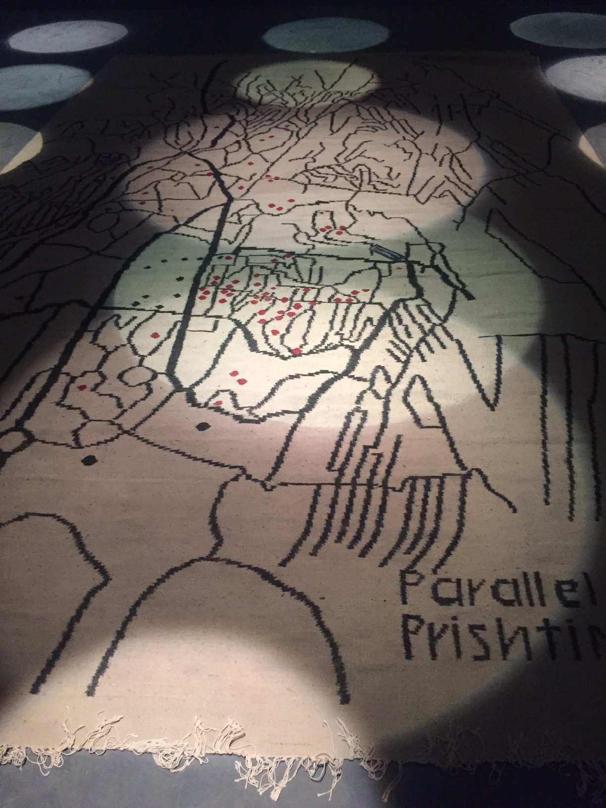
The Mexican architect Tatiana Bilbao doesn’t have a signature building style that’s instantly recognizable. She’s not a top-down diva who designs grand sculptural statements by computer. Instead, Bilbao is singularly engaged with how the world is made and how people interact with her projects. Thriving on input, she prioritizes listening, documenting, and collaborating, a process that begins with her handmade, collaged drawings, which are, she says, “the first sentence in a conversation about architecture.” Bilbao’s egalitarian approach—a change in the traditional paradigm—is winning notice. “Architecture from Outside In,” an exhibition on Bilbao opening today at the San Francisco Museum of Modern Art, features her expansive concept for a Hunters Point master plan.
In schemes with her Tatiana Bilbao Estudio—a botanical garden, government housing, a pilgrimage route, a church, a monastery, a skyscraper “village,” an aquarium, even something as simple but urgent as a safe passage through a dangerous urban park—Bilbao has imported her ideology of inclusion, privileging local elements in novel ways and making the projects themselves agents of change and community.
Bilbao prefers to have a seat at a table, where she actually wants to be challenged. In the SFMoMA gallery, visitors will be encouraged to pause, discuss, and question what they’re seeing. “It’s the moment we’re living in. If we don’t open our voices to other channels, we will get nowhere,” she says. In her work, Bilbao has come up against crime, tornadoes, apathy, and corruption. But she is patient, routinely visiting the inhabitants of her housing projects to get feedback, and wishing every project could emulate her botanical garden, where she has been able to return—to tinker. “I don’t have the answers,” she has said. “I just have the questions.”
Thom and Jones Meet USC
USC has archived architectural photographer Wayne Thom's vast collection of a decades-long career as the go to photographer for many California late modernist architecture and other international projects. Thom fell into architectural photography via his brother, an architect, and documented the late wave of glass and white brutality that became the aesthetic during the 70s.
The Annenberg School of Communications by A. Quincy Jones (1974-9) now houses other student services and there's a new building for the Communications school. But it's a fabulous building as seen here via Thom in its vintage iteration. I still haven't gotten down to Sunnylands, Jones's other masterpiece for Walter Annenberg, his home in Palm Springs.
Jones was a brilliant, particularly Southern Californian architect but who made that specific design aesthetic ethic every bit as international as his confreres in modernist Europe.
Image by Wayne Thom courtesy USC Digital Archives.
Orpheus and Apollo at Philharmonic Hall
The Preservation League of New York State, in conjunction with Landmark West hosted a zoom designed to bring more attention to the abrupt and ill considered removal in 2015 of the glorious Richard Lippold sculpture Orpheus and Apollo at Philharmonic Hall (variously known as #AveryFisher and now David Geffen) at Lincoln Center. Well, they have mine, and now maybe yours.
Apparently the new architectural plans cannot accommodate this beauty. The panelists, among them the indomitable Phyllis Lambert who singlehandedly got her father Samuel Bronfman, to create the greatness that was (and still is sort of) The Four Seasons restaurant which also houses a Lippold described this artist's meticulous work process and flair. His piece was landmarked with the entire restaurant as it was understood the art and architecture were inseparable.
Max Abromovitz, the original architect, worked with Lippold at Lincoln Center from the outset. It made a rather humdrum tier of the hall pop.The piece was apparently dismantled without markings or without great care--putting it back together will be a challenge. A presentation by historian Marin Sullivan who is writing a book on these sculptures and others of the period (Harry Bertoia etc) was riveting. There's no question that a great misdeed has occurred.
Deborah Borda— In LA you were so proud of the Disney Hall architecture. I know you have recently cancelled your whole season until June. I mourn the absence of the orchestra also. But please revisit your plans with your architects and see if they can't find a way to restore this singular object to its rightful place even if it's not exactly the same place.
NOMAD x Phillips at the Palais Bulles
Photography by Studio J'Adore Ce Que Vous Faites. Courtesy of NOMAD.
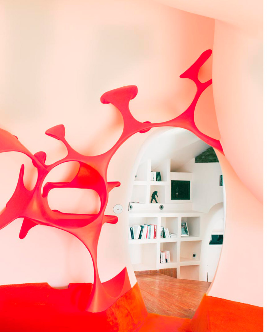
When this marvelous architectural confection came across my inbox this week I just had to share. The Palais Bulles (literally the Palace of Bubbles) which overlooks the Mediterranean, part of this year's @nomadcircle and @phillipsauction private sale collaboration has been owned by Pierre Cardin since 1992, and was originally built by Hungarian architect Antti Lovag for his friend and patron French industrialist Pierre Bernard and finished as recently as 1989. I thought it was a sixties structure, in keeping with the Cardin dress designs that also were hallmarked by this kind of fab pop innovation (I once went into the right bank Paris boutique in jeans to buy a belt which is all I could afford. This was not well received by the mod salesgirls).
Lovag, who had apprenticed with Jean Prouve, apparently coined the word habitology to describe his style which was to meld natural forms with the built environment. Water is everywhere, you can feel under the sea and on top of a hill at the same time.
The house was renovated by one of my favorite architects Odile Decq whom you can read about here. Apparently you can rent it: giving a party here would be a dream.
Ryokichi Mukai's Tokyo Bunka Kaikan
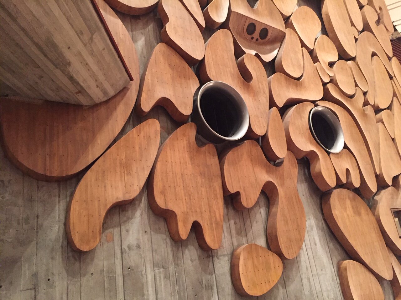
It might take a moment for you to figure out what these are. Don't they resemble the work of Jean Arp? That's what I thought when I entered the Tokyo Bunka Kaikan, one of the venues for the Tokyo Metropolitan Orchestra. Though sited directly across from the Museum of Western Art by Le Corbusier, most miss this off the radar gem from 1961. Inside are two halls, a symphony space with these gorgeous cloud shaped acoustical beechwood babies created by Ryokichi Mukai and a smaller space for chamber music and recitals. It's hard to get in to see these spaces without attending a concert, so that's what I did, returning at night for a lovely performance of Beethoven while skulking around trying to access everything else. I tried to organize a proper architecture tour but was rebuffed. Try your luck! Go to their website, there's a video architecture tour.
The Getty's last round of Keeping it Modern architecture grants
The last round of the Getty's Keeping it Modern Architecture Grants were announced last week. Of all the Getty's marvelous initiatives, and there are many, this has hands down been my favorite among favorites. The buildings that the Getty has identified over the years have been heritage sites that have usually been obscured by want of money, too much politics, and often natural environments that have intruded. A building needs love just like a person does, and these modernist structures are as important as a gothic cathedral or a greek statue. The mid century is no longer overlooked, but unlike the furniture from the period which has seen a renaissance, the buildings are a much bigger task. Take a look at this slide show for some architecture jewels (including work by Wallace Harrison, Pierre Jeanneret) that now have a bit more of a chance of surviving. I am so very sorry this program is being discontinued. In Gibellina Italy for example, they need this kind of help (See my story for ArtNet). This program was designed as a stimulus, not as the answer. Perhaps local authorities will take up the cause.
Charlotte Perriand and Oscar Niemeyer: A rare meet up in Brasilia
Image courtesy of the family of Charlotte Perriand.
This unique image memorializes the meeting of two great stars of midcentury architecture: Charlotte Perriand and Oscar Niemeyer. The two met up when Perriand visited Brasilia. In her memoir she says she admired the urban plan of Brasilia (Lucio Costa was responsible for this, not Niemeyer) and the architecture (this was Niemeyer) but not the interiors--an area in which she had extensive experience having worked for Le Corbusier and also by the sixties, on many wonderful projects of her own. Perriand admired artisans and had a lifelong commitment to egalitarian politics. She worried about housing, about poverty, about crop yields and even the sexual behavior of weevils, which reminded her of a Picasso painting. Perriand was more bottom up, Niemeyer rather top down and their approaches to clients and projects quite different. For Perriand, there was intense attention to the user: the splay of a seat back, the height of a bureau, the fabric of a cushion. She cared about housewives and wanted to make their lives easier. She would have been right at home in 2020 and perhaps had some solutions for us as we face new architectural challenges created by the Covid pandemic.
Lina's World; my story for Air Mail News
“I felt I was in some unimaginable country where everything was possible,” said Italian-born Bo Bardi when she arrived in Brazil.
In a career filled with cliffhangers and high drama, there was likely no moment more urgent for the polymath architect Lina Bo Bardi than the one captured by a photographer in 1967 (above). In her on-site design office under the grand span of the Museum of Art of São Paulo (MASP), her riskiest architectural scheme to date, the restive, Italian-born Bo Bardi, was, for a rare moment, stationary. The project in her adopted homeland had been riven with years of frustrating political setbacks and engineering fixes to her radical design, and now she was racing to meet the 1968 inauguration by Queen Elizabeth. Beside Bo Bardi, Van Gogh’s The Student (The Postman’s Son, Gamin au Képi) was encased in a prototype of her innovative freestanding glass-easel display system, which allowed viewers to circle paintings as if meeting a friend. Behind her stood construction workers, a symbol of the premium she placed on architects acting as instruments of and for the “people”—to whose creativity and needs she was devoted—and not gods who put their designs and egos first.
Recently the subject of “Habitat,” a three-venue career retrospective, and a show of drawings at the Carnegie Museum, all cut short by the coronavirus, Bo Bardi’s work is included in newly reopened exhibitions at the Design Museum Gent, in Belgium, and the Vitra Museum, in Germany. Bo Bardi, who died in 1992, has arrived at the pinnacle of international recognition as much for her diverse body of work as for the original way she went about it.
High-strung, alternately adored by and alienated from her collaborators, Bo Bardi craved attention but struggled for years before receiving any significant commissions. In the interim, she poured her considerable energies into editorial and educational projects, exhibition design, and domestic spaces, emphasizing open access for all. Her ambition for every project was fierce yet inclusive: plant life, circuses, boxing rings, and streets made their way into her creations. Her touch evaded easy classification—she could be monumental or refined—and though she often sought to simplify things, in the end the solutions were almost always complex. By comparison, Oscar Niemeyer, who designed Brasília (the city would become Brazil’s new capital in 1960), was a brand: you knew what you were going to get.
For a time, Bo Bardi was all but forgotten except by insiders. A celebration of her centenary in 2014 began a slow return to recognition. As this latest group of exhibitions prove, she has now been anointed the ultimate architectural heroine.
Material Girl
Born Achillina Bo in Rome in 1914, Bo Bardi would one day claim that she’d wanted to write her memoirs at the age of 25 but did not have enough material. Still, the headstrong young woman already possessed a keen artistic sensibility that was to mark her productive, tumultuous life. A self-described misfit who defied her mother, Bo Bardi adored her father, a builder whose first love was painting. Though her training in classical architecture gave her a solid grounding in history, she escaped her conservative upbringing and education by fleeing to Milan, where her expressive, colorful drawings easily found their way into freelance illustration and writing assignments for the magazines Domus and Lo Stile, both founded by the revered Italian designer Gio Ponti.
Bo Bardi thrived on the attention of male mentors, who were often infatuated with the seductive, opinionated young woman whose imagination and dynamism foreshadowed an unconventional talent. But bereft of any meaningful architecture career, she grew increasingly disturbed as many notables, including Ponti, allied with the Fascist Party that was gaining traction among Italians in the years leading up to the Second World War. An assignment to document living conditions in Italy following the end of the war left Bo Bardi with ideas about the need for humanitarian action and a feeling of solidarity with the disenfranchised. Her romance with Pietro Maria Bardi, a shrewd, older journalist, curator, and dealer looking for respite from postwar economic retrenchment—and, apparently, his wife—was to be dispositive. He had his marriage annulled; they quickly married to appease her family and departed for Brazil, where he had important contacts and she hoped to energize a meaningful career.
Bo Bardi’s touch evaded easy classification: she could be monumental or refined.
When the newlyweds arrived in Rio in 1946, the freedom and hopefulness in the air was a stark contrast to the gloom of postwar Milan. Bo Bardi, now 31, found it exhilarating. “I felt I was in some unimaginable country,” she said, “where everything was possible. ” Nevertheless, she was largely ignored by the entrenched Carioca School of modernist architecture—the war may have been over but her battle for recognition had just begun. When Bardi found a crucial supporter in Assis Chateaubriand, a newspaper magnate with aspirations to build a new museum, the couple decamped to São Paulo, a culturally underdeveloped city where they could more easily make their mark.
The trio quickly opened temporary museum spaces where Bo Bardi experimented with display and Bardi with unorthodox teaching methods and exhibitions focusing on new audiences such as children and native Brazilians. The Bardis sensed that their worth and the worth of the Brazilian people would develop in tandem, and they envisioned a day when the museum could be much more than a receptacle for art.
Read All About It
As the Bardis plotted a more capacious home for the new museum, they knew that popular media could help them gain traction with their daring, multi-disciplinary efforts. In their launch of the magazine Habitat, Bo Bardi found her voice as an advocate for indigenous culture and a vision that turned away from the paternalistic, European canon. The magazine achieved a global following. With fashion and Surrealism populating its pages alongside Marxist tracts and articles on basket weaving, it was a stealth project to wake up the bourgeoisie, alerting it to the wealth of creativity within Brazil’s own borders. Everything in the Bardis’ tool kit had an integrated socio-political function. They fast became a Paulista power couple.
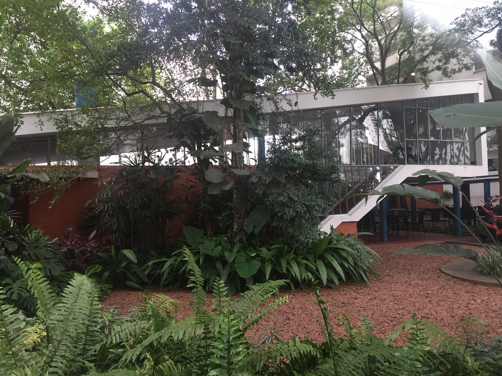
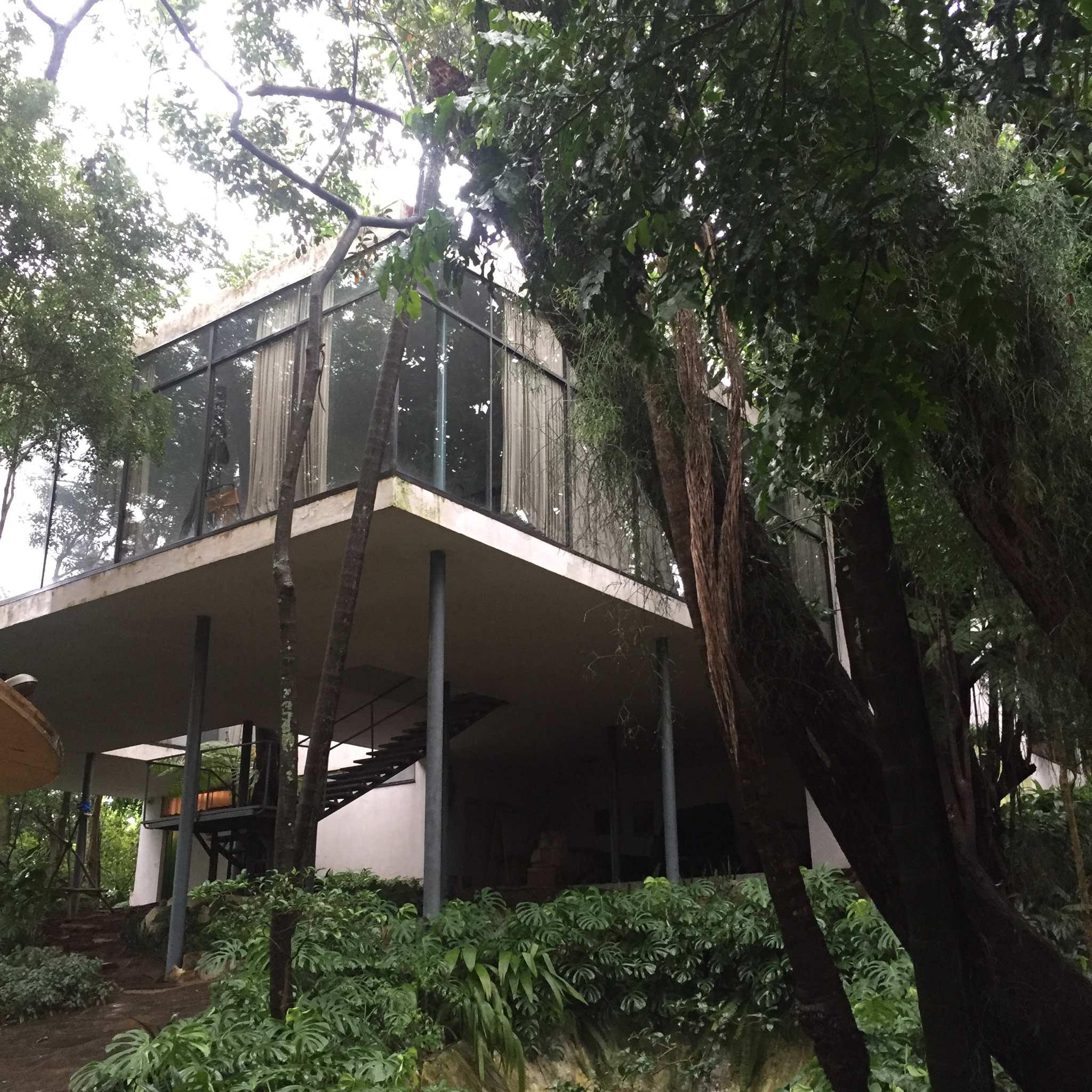
If a woman’s home is her castle, the Casa de Vidro—the house Bo Bardi designed for them outside São Paulo, now the site of the Instituto Lina Bo e P. M. Bardi—was instead her laboratory, an environment “that offered protection…but at the same time remained open to everything.” With inspiration from Le Corbusier and Frank Lloyd Wright, Bo Bardi combined the transparency of glass with thin supporting pilotis to create a tree house with its rear hugging the hill, an inventive mashup of modern and colonial. Now almost entirely surrounded by her plantings—which she may have considered the real occupants of the property—the building feels at once open and private, a perfect setting for an ongoing salon that mixed the creative class with powerful figures in society and government. Being on display was a hallmark of Bo Bardi’s person and her projects. “I was born for this,” she would soon say.
Despite her improved status, Bo Bardi longed for a refuge from the slow progress of the museum and other projects and, not incidentally, from the orbit of her powerful, unfaithful husband. Though Bo Bardi seemed fearless in transcending gender boundaries, her inner life was often a torment of self-doubt.
Alternately adored by and alienated from her collaborators, Bo Bardi struggled to receive commissions.
Salvador de Bahía, the former colonial capital, would become the conduit for Bo Bardi’s transformation from stylish belle of the ball to the substantive, makeup-free, “Anna Magnani of architecture,” as the critic Martin Filler has called her. The ethnically diverse city buttressed Bo Bardi’s growing belief that architects were not handmaidens of the aristocracy but of the people. In Salvador, like the drumming and dance ensembles known as sambistas, Bo Bardi became a whirlwind of movement. She taught at the university; wrote a Sunday column; co-founded and directed the Museum of Modern Art of Bahía in a sugar mill she adapted; curated a landmark exhibition on the indigenous culture of Brazil’s northeast region, Nordeste; ran educational programs; and embarked on long-term collaborations with the filmmaker Glauber Rocha, the ethnologist and photographer Pierre Verger, and the theater director Martim Goncalves.
In a second wave, Bo Bardi master-planned a renewal of the colorful city center that included the Casa do Benin for African heritage and the Ladeira Da Misericordia—a narrow, crumbling street that hugged the edge of the city—which she revitalized by integrating her colleague João Lima’s thin, undulating, concrete buttresses into a housing and restaurant complex. Chairs she designed evolved from sleek leather buckets to roadside perches made of twigs: beauty had become a barometer of decadence. “No one can save themselves by design,” she wrote. “Can a beautiful glass save us from thirst? Can a very beautiful dish … save us from hunger, misery, illness and unemployment?”
Though Bo Bardi’s productive years in and out of Bahía ended in humiliation and intimidation—her volatility made enemies of key supporters and the military junta—they freed her to tap into the region’s rich Portuguese and African traditions along with leftist politics and the avant-garde. She came into her own. Bo Bardi’s baggy pants, blue workers shirts, and free-flowing hair announced Salvador’s parallel personal impact. Where she had once needed to be desired as a woman, now she could lay claim to being noticed as a propulsive thinker and doer.
Spot the Difference
By the time Queen Elizabeth arrived in São Paulo to inaugurate the opening of the MASP, gone was the Bo Bardi of elaborate ensembles. In her place: the public intellectual and architect who excelled at ruffling feathers. “I want to clarify that…it was my intention to destroy the aura that always surrounds a museum,” she wrote. The museum instead became a social and cultural resource for the metropolis, a new town square.
Bardi’s freestanding glass easels display art inside MASP.
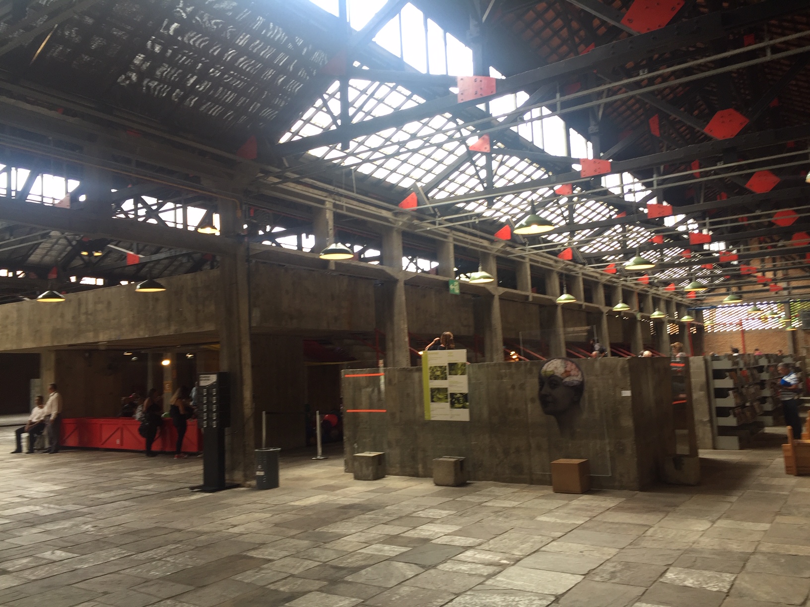
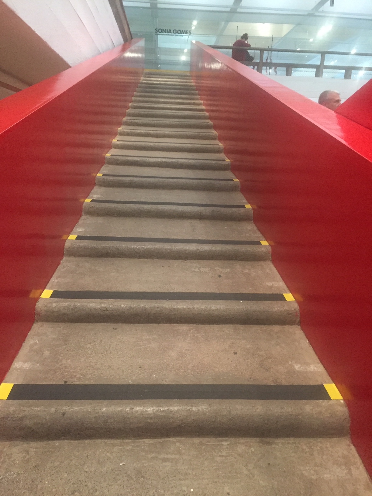
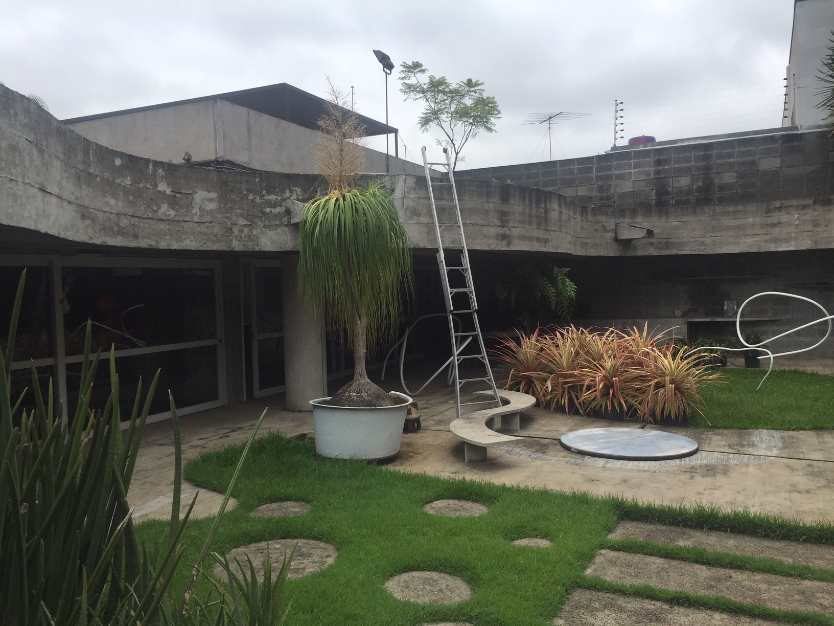
Bo Bardi’s last decades cemented her reputation as an exceptional innovator. Her most consequential commission was the transformation of an old barrel factory in a working class section of São Paulo into the SESC Leisure Center on the Rua Pompéia. The inviting spaces born of low-rise, cavernous sheds became a library, a cafeteria, art studios, a theater, and a public “living room” with a winding reflecting pool. The Center culminated in delicate, ramped concrete structures for sports, all free and open to the public. Bo Bardi designed the furnishings, signage, even new uniforms: this was a project she proudly owned in its entirety. Once again, her insistence on an on-site office made the posse of young male architects and construction workers more nimble; she may have been demanding, but she inspired ardent dedication.
She had once needed to be desired as a woman; now Bo Bardi could lay claim to being a propulsive thinker and doer.
Bo Bardi died at age 77 after declining health, her legacy not assured. She was that rare combination of populist and autocrat and many of her interventions were allowed to deteriorate, or worse, were suppressed. Though the Getty Conservation Institute made a survey grant for the Casa de Vidro, and the World Monuments Fund put the Ladeira on their Watch List, a visitor last year found only debris and weeds in the largely inaccessible abandoned hilltop bar which had incorporated nature and her signature cloud windows. In Salvador’s Gregório de Matos Theater, dozens of her folding wooden chairs were stored in a grimy heap next to garbage and paint cans. Her elegant Casa do Benin has had to survive as a gift shop. Bo Bardi was able to supervise repairs to São Paulo’s MASP before her death but not to prevent 20 years of posthumous decline, as well as the removal of her unique painting display system.
Happily, the glass easels are now returned to open formation and the museum is again on surer footing. But increasingly diminished resources for culture in Brazil are worrying. What would Bo Bardi think—however holistic their intentions—of the Danish starchitect Bjarke Ingels, who recently toured Bo Bardi’s beloved Nordeste with members of a real estate conglomerate and then met with authoritarian President Jair Bolsonaro to receive his blessing for large-scale tourism development?
Both Bo Bardi’s published writings and her buildings are vigorous counter-narratives for a bottom-up, inclusive world. Her love for the circus—she once made space for it under the massive span of MASP, and used it for her plan of the Espírito Santo do Cerrado Church in Uberlândia, Brazil—is emblematic: all are welcome under Bo Bardi’s Big Top.
Photos: Lew Parrella © Colección Instituto Bardi/ Casa de Vidro São Paulo; Courtesy of Museo Jumex.
Jadwiga Grabowska-Hawrylak, a Polish architect revitalized a city left in ruins
The very complete Patchwork show of the architecture of Polish woman Jadwiga Grabowska-Hawrylak ended last week. In the early seventies my husband joined a posse of American planners and architects who went to Poland on Marshall Plan money to help revitalize the country. They found a bleak environment and harsh post war conditions. Grabowska-Hawrylak was associated with Wroclaw (formerly Breslau) as a student and as a prime mover of the reconstruction of the city along with a similar, domestic cell of architects and planners. At the Center for Architecture, a panorama of her built and unbuilt works told a tale of public housing, education, cinema, conservation, capitalism and socialism and a country left in ruins. Social Realism gave way to urgent needs of housing the population irrespective of theory. Prefabs were required. Residents jokingly called their housing estates The Principality of Monaco or Manhattan. A model of her Grunwaldzki Square project had been built out of Styrofoam and it was magnificent.
Photo: ,Courtesy The Center for Architecture, by Chris Niedentha
Bulletin from Brazil
Brazil has been much in the news. As if it weren’t enough that post-Olympic budget shortfalls, political corruption, Zika and crime had combined in a toxic brew, the recent election of Bolsonaro pointed up deep-seated philosophical fears and divisions much as the Trump election did in the US.
Brazilians in the creative sector have been trying to regroup, but in addition to the above they have faced devastating fires (the National Museum of Rio), burst dams, (Brumadinho adjacent to Inhotim art park), and the abolishment of the Ministry of Culture, which has been folded into a newly christened Ministry of Sport.
I finally returned recently to Brazil after a long absence. As a pre-teenage exchange student in the home of a wealthy Carioca family with whom my parents had briefly met and conspired late one night undoubtedly after too many caipirinhas, I had a decidedly one-sided view of the country. As a sheltered suburban girl, suddenly I was with a posse which had free reign—underage drinking and driving, dancing ‘till dawn on Ipanema. On the wild rides to mountain homes in Petropolis we passed favelas which made me mute— Brazil was my first third world country.
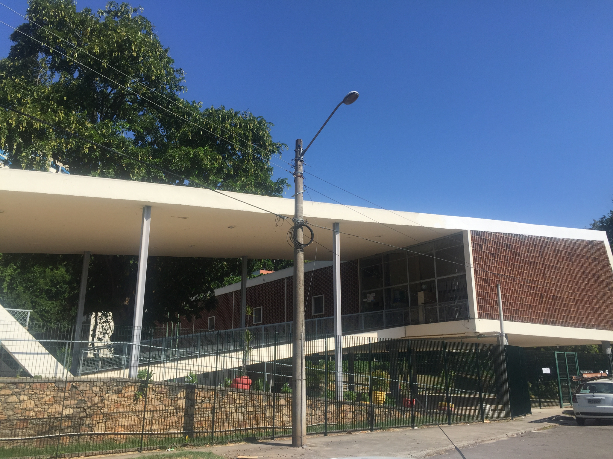
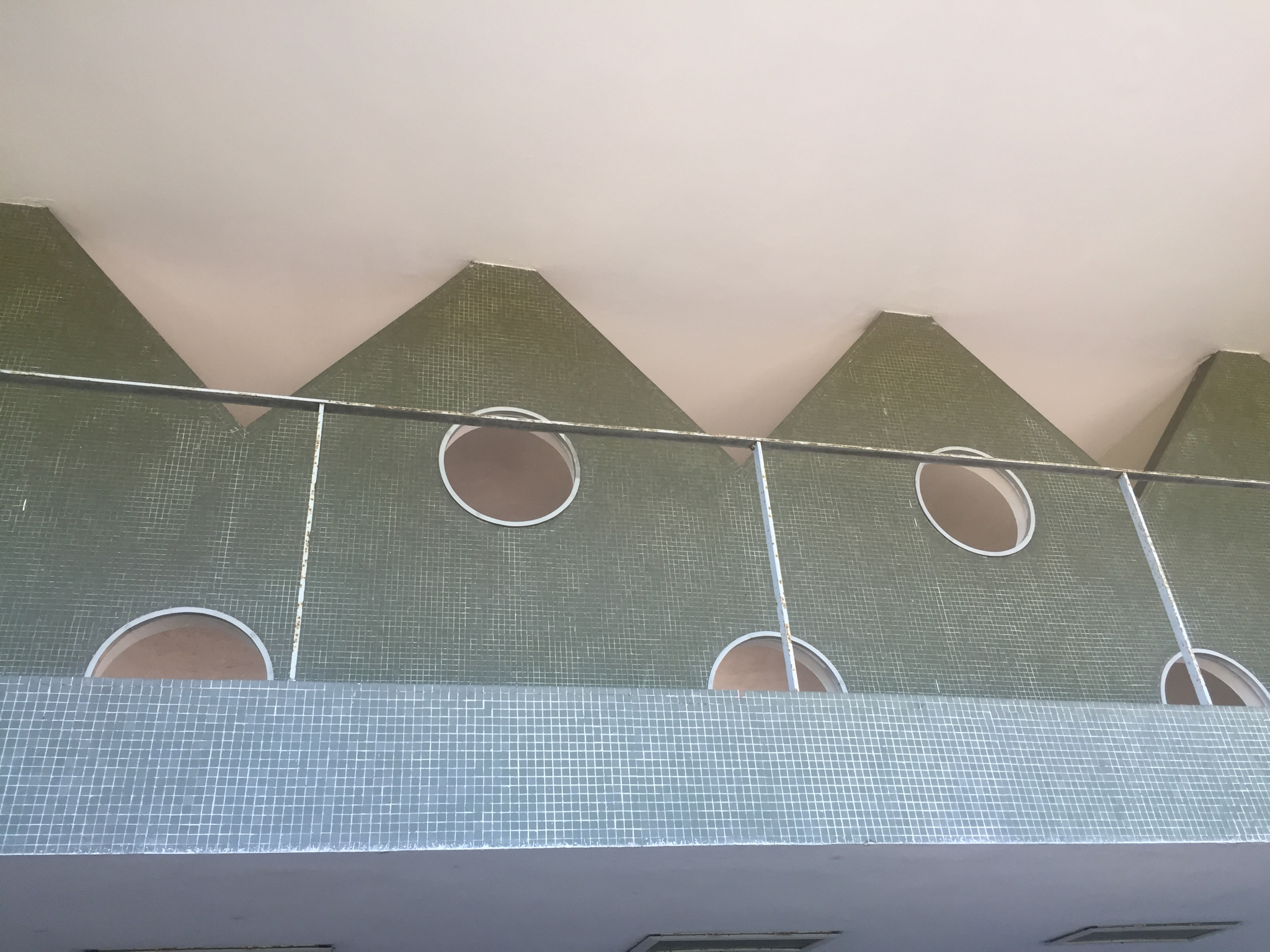
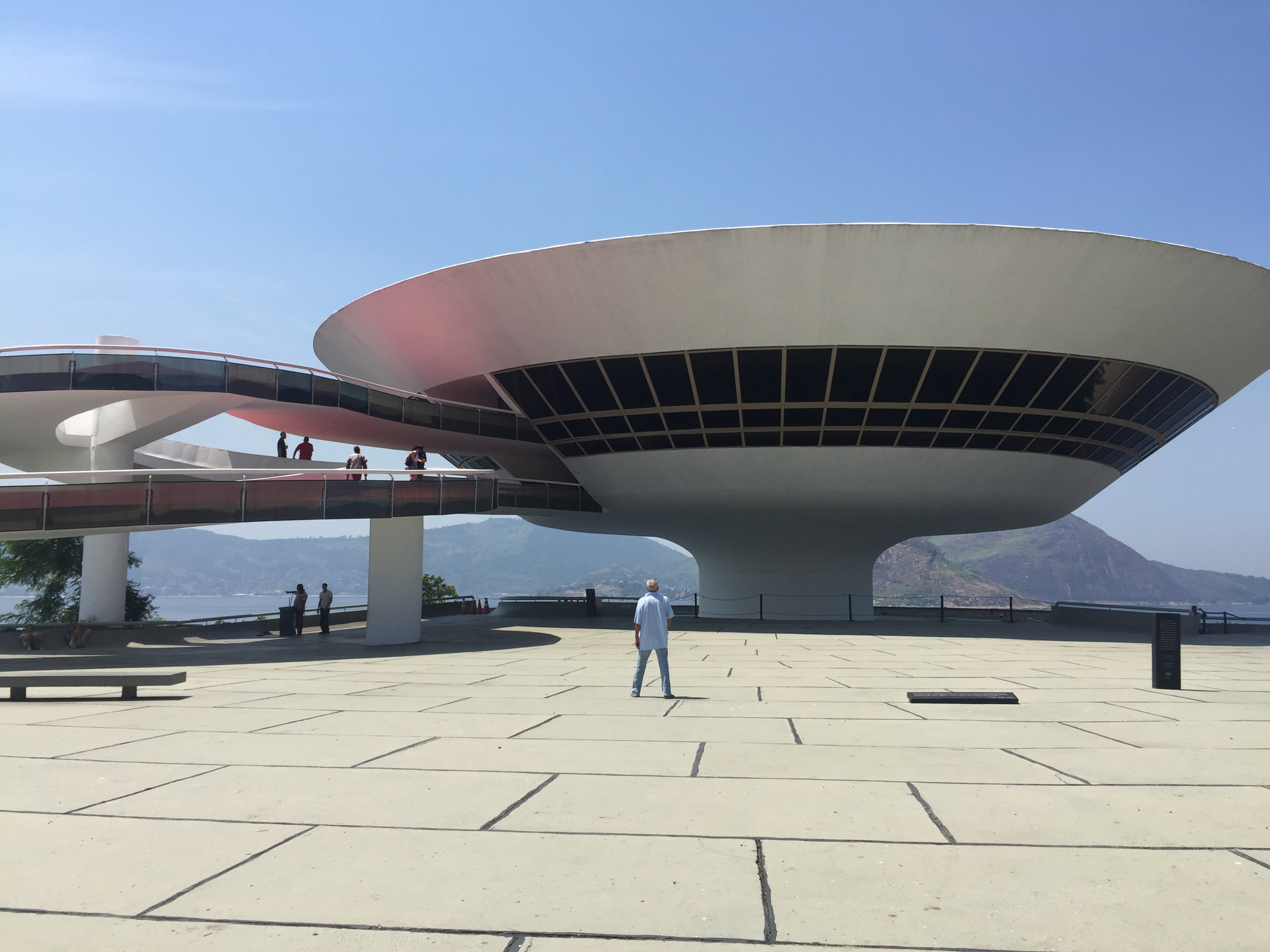
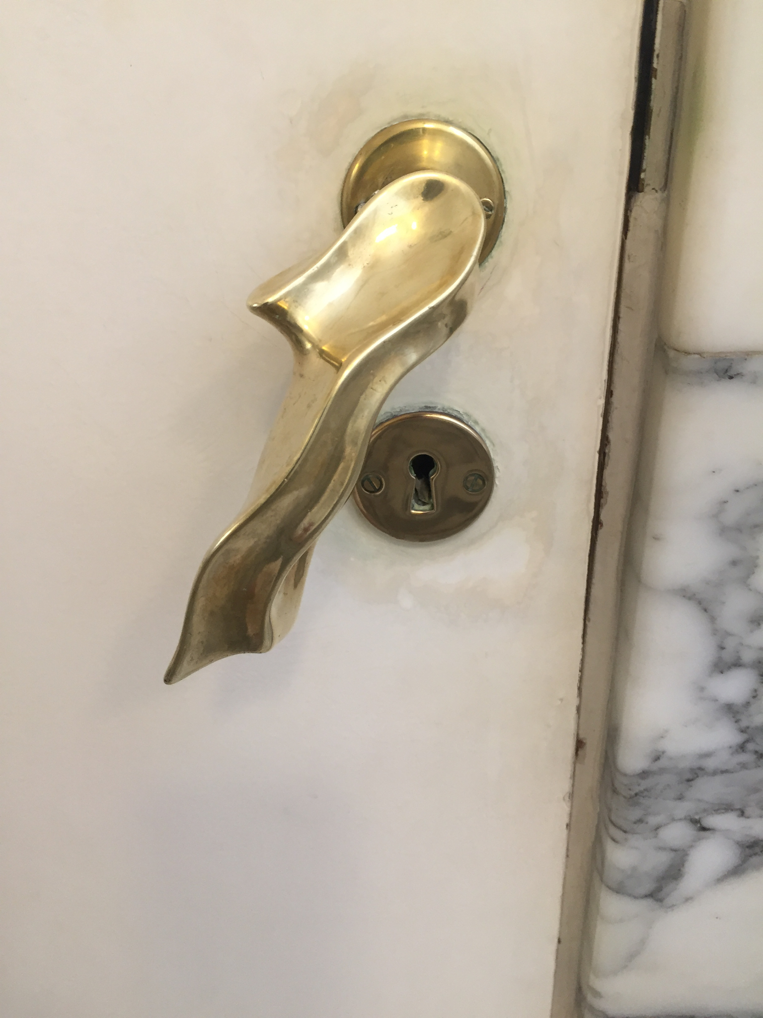
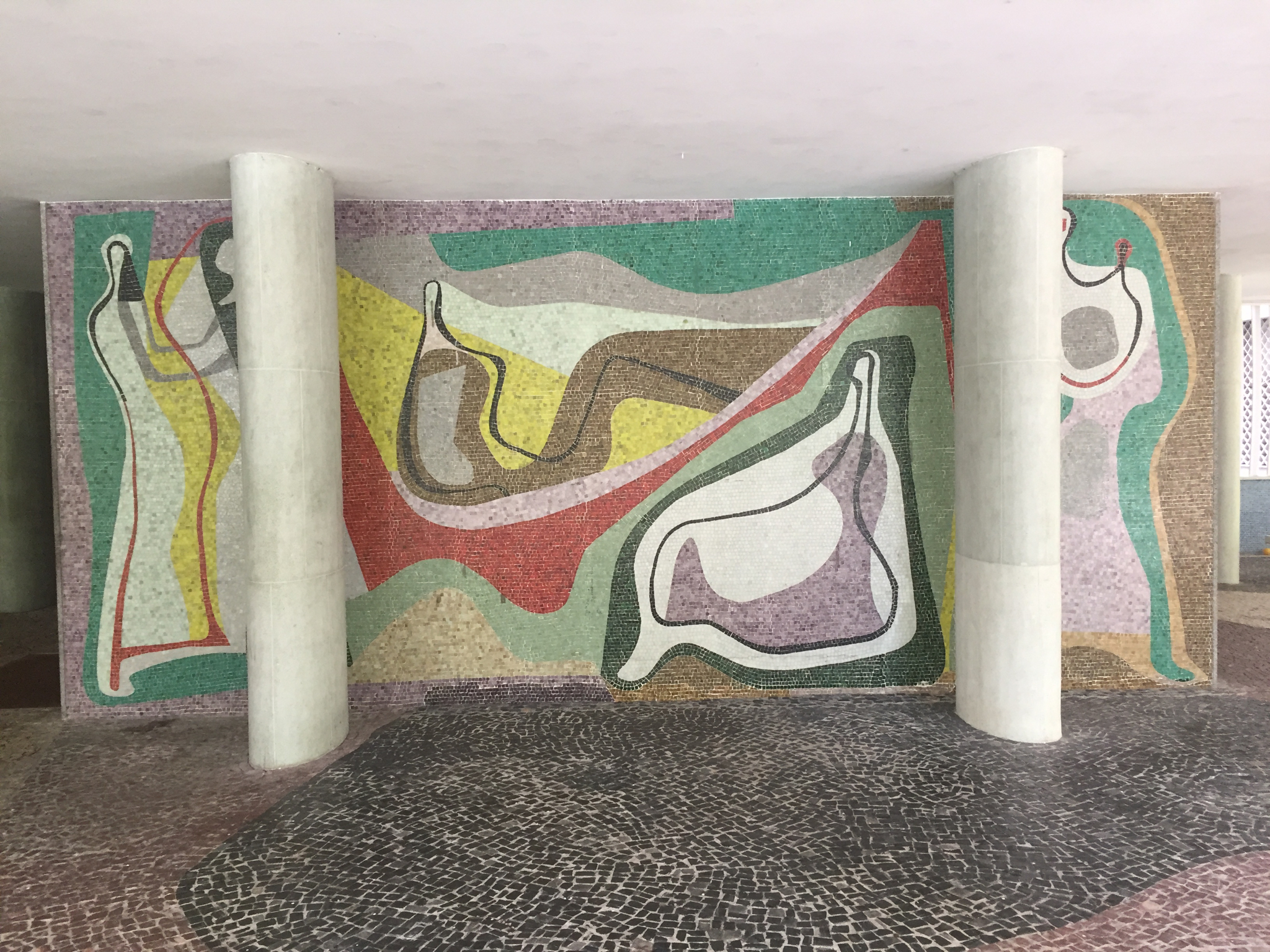
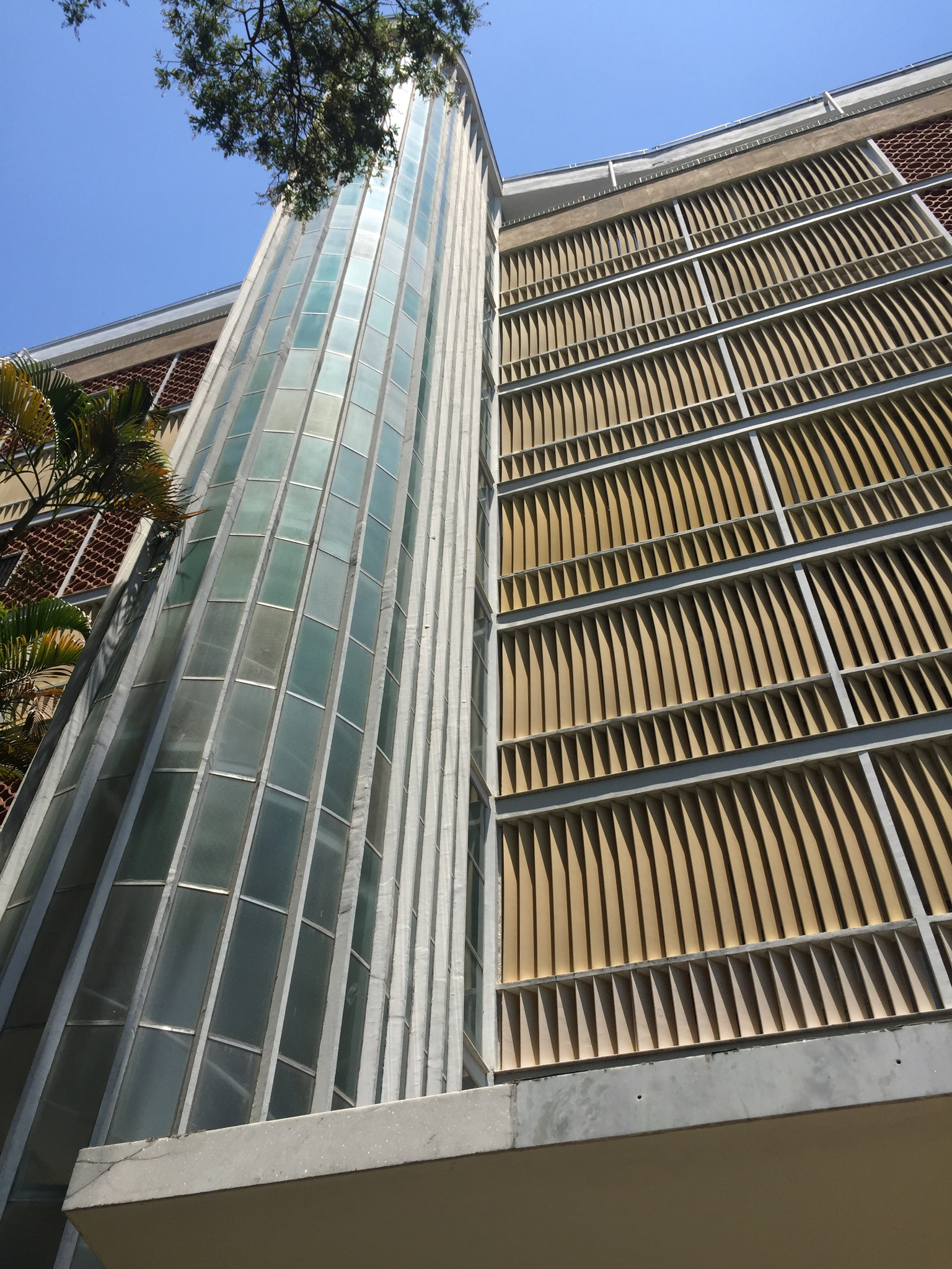
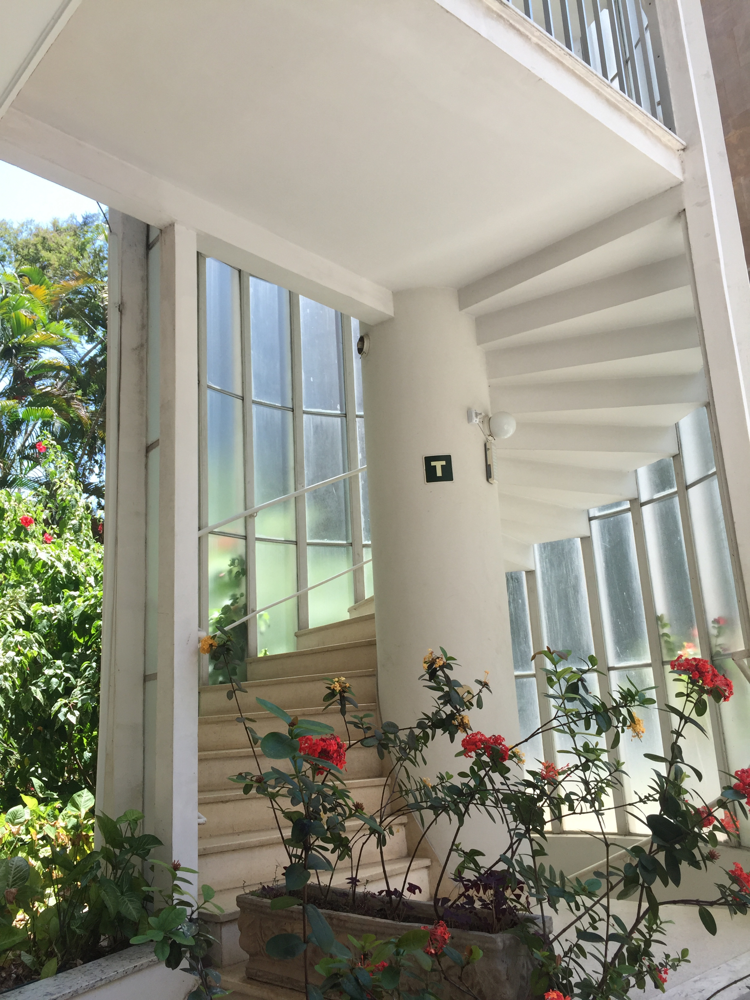
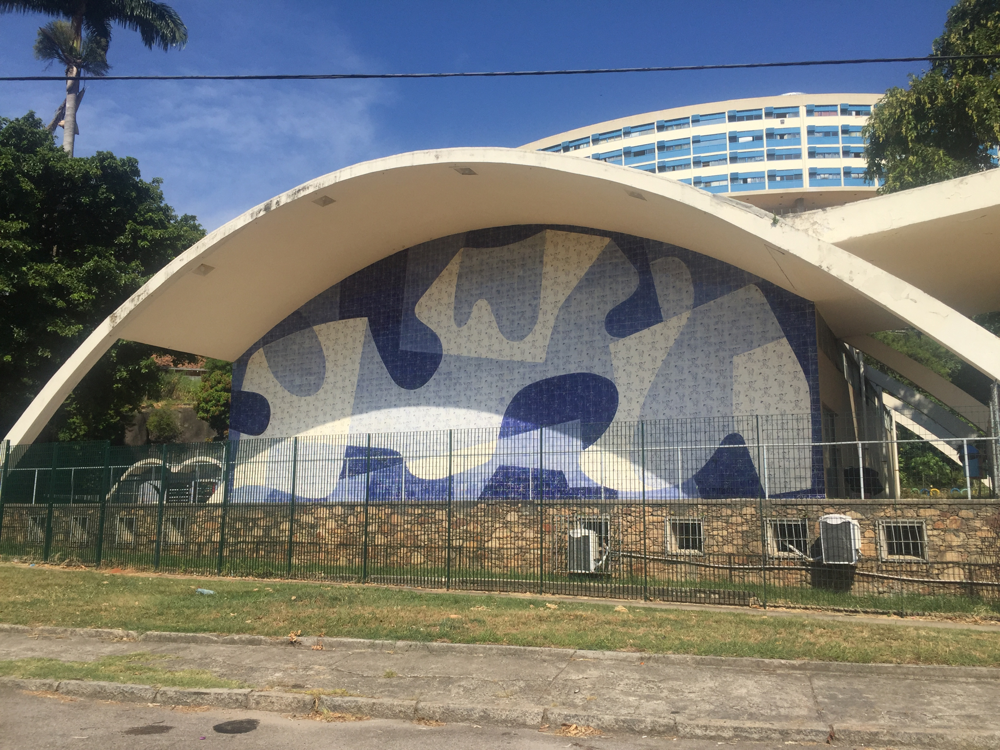
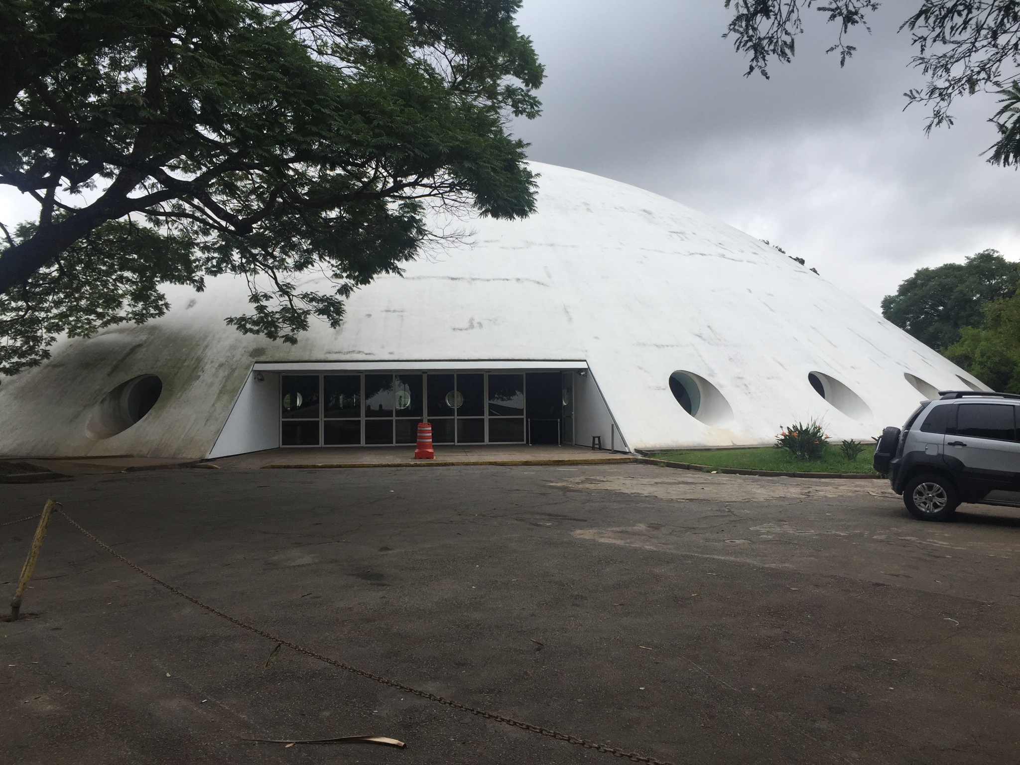
I returned ostensibly to study modernist architecture but my journey became a window into both politics and culture as a country’s built environment—and how it is respected— is closely aligned with the political imperatives of the day. In my view, this 20th century patrimony is as important as the pyramids are to Egypt. So many iconic structures are deteriorating and are without adequate fire protection. In Rio next year there will be a world architecture congress with government support which will address some of these issues—already a few of the most distinguished buildings are undergoing thorough, if protracted, preservation projects.
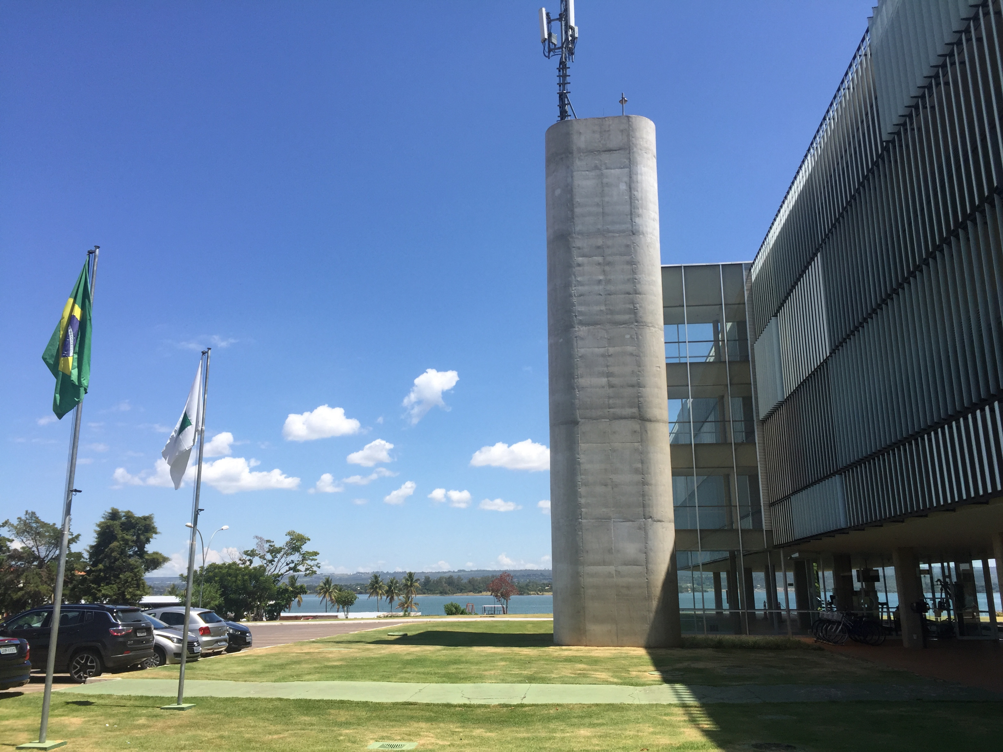
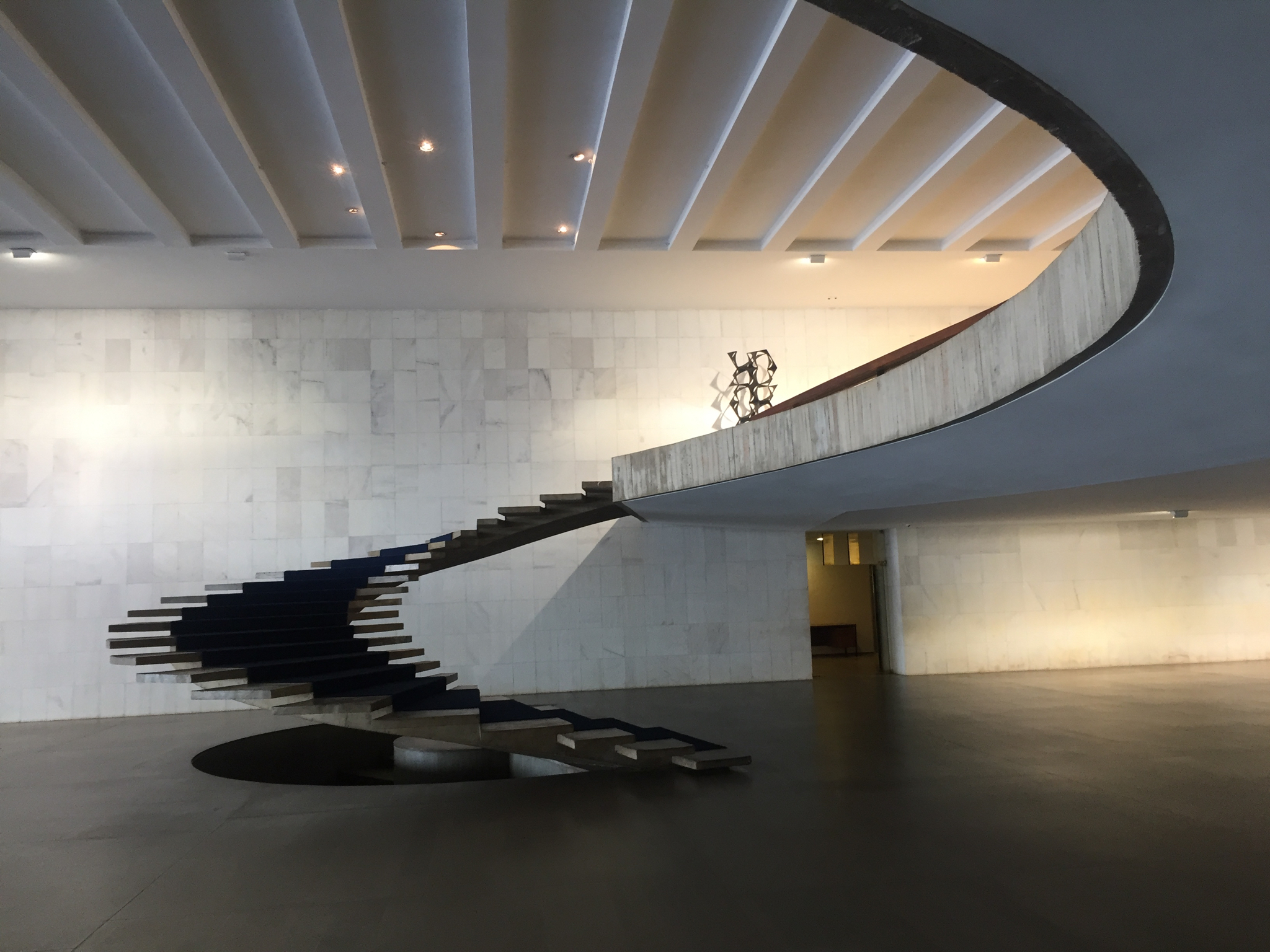
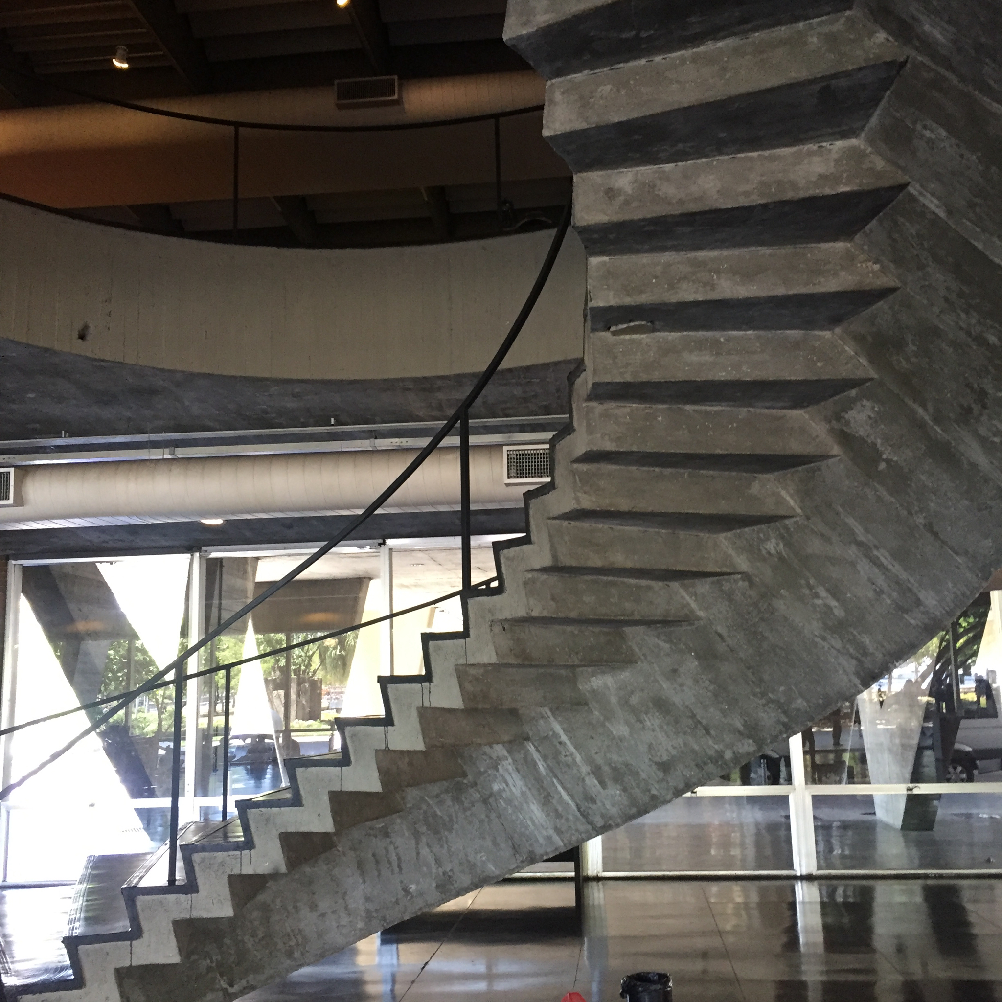
I arrived this time in Brasilia and went directly from the plane to drop my bags at the Niemeyer designed Palace Hotel, a quiet lakeside gem near the Embassy district. I had the impression of being on a stage set even though Brasilia is now a full-fledged metropolis. Inevitably, it is the show stopping Niemeyer federal buildings that still have pride of place. My first stop was to be the Alvorada Palace, the Brazilian White House, the Bolsonaro residence of only a few weeks’ duration. Military guards and street blockades warned that this would not be easy and, sure enough, even though I had given my passport number in advance (and Bolsonaro was in Davos), I learned that the palace, though previously accessible on certain dates, was now permanently closed to visitors. My architectural colleague (almost all my expert guides were organized by Superbacana) explained that, in his opinion, the house was Niemeyer’s most beautiful work in the city. I’m told this might change, but it was only the first of many heartbreaks of inaccessibility along my route
Nevertheless, my day with Oscar, as I came to think of it, was every bit as fulfilling as I had imagined. Brasilia is a resounding example of the political will of principally three men—Juscelino Kubitschek (President), Lucio Costa (planning) and (architect) Oscar Niemeyer— to build a utopian mecca for a new more central seat of Brazilian government in 1956 (it had been Rio)—in just four years. Though I generally am suspicious of superstardom in architecture, here I was grateful to have this body of monumental work on display. Yes, there were manifold issues around its construction in the middle of a largely rural province. As in the construction of Gibellina Nuova, Sicily, the visionaries marched to their own drum without consulting local inhabitants.
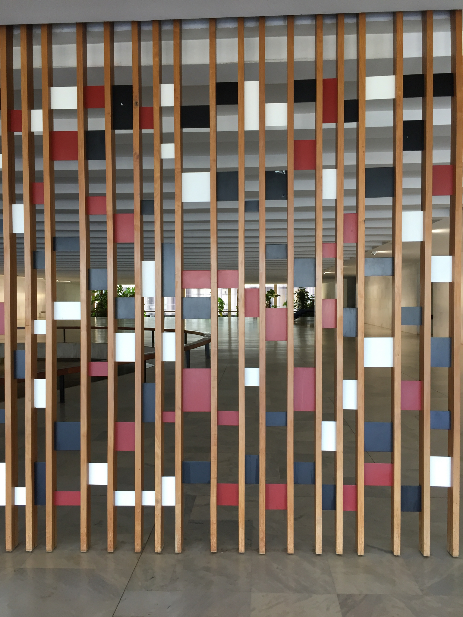
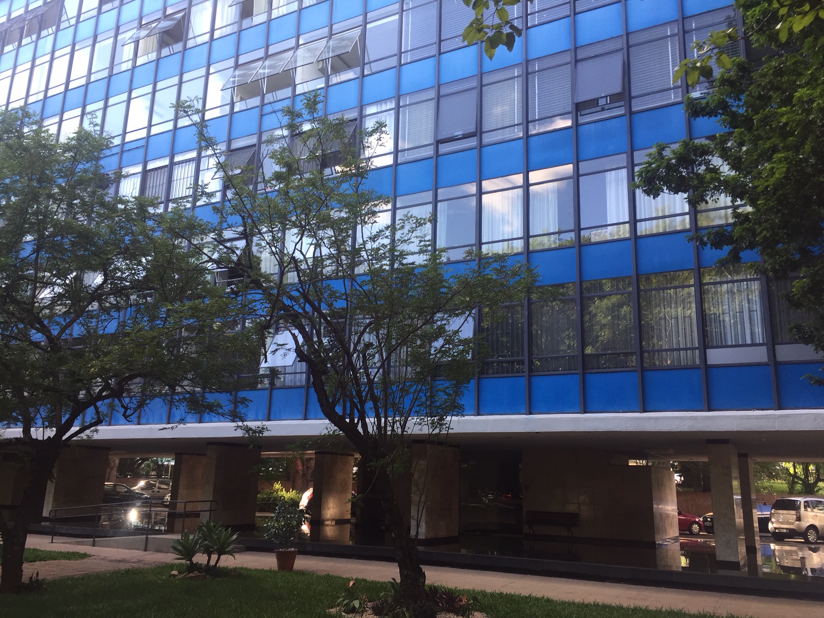
Highlights: on the Monumental Axis, the Itamaraty Palace with its splendidly thin arches, its central staircase, its Roberto Burle Marx garden; the National Congress with its pea green carpeting, brutalist hallway and starry-ceilinged legislative chamber, the Ministry of Justice with waterfalls emerging from its façade. On the residential axis, the elegant living spaces and muted colors of the Superquadras (these a true revelation), the brutalist, un-gated Mexican Embassy. (Our American Embassy has just announced a new project by Jeanne Gang. Thank goodness, as the walled, wired, hodgepodge mess there is an embarrassment. At least one good decision from the Trump State Department).
In anticipation of going to Salvador, Brasilia’s polar opposite, I took an Afro-Brazilian dance class at Steps. That revved me up for the multi-culti experience of that seaside city which keeps its clock—and its energy—on a time all its own.
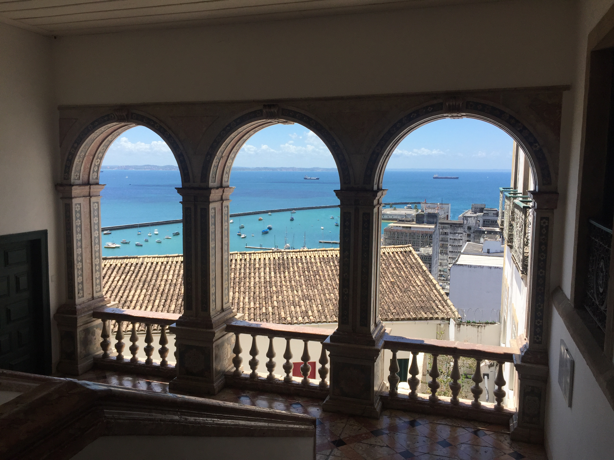
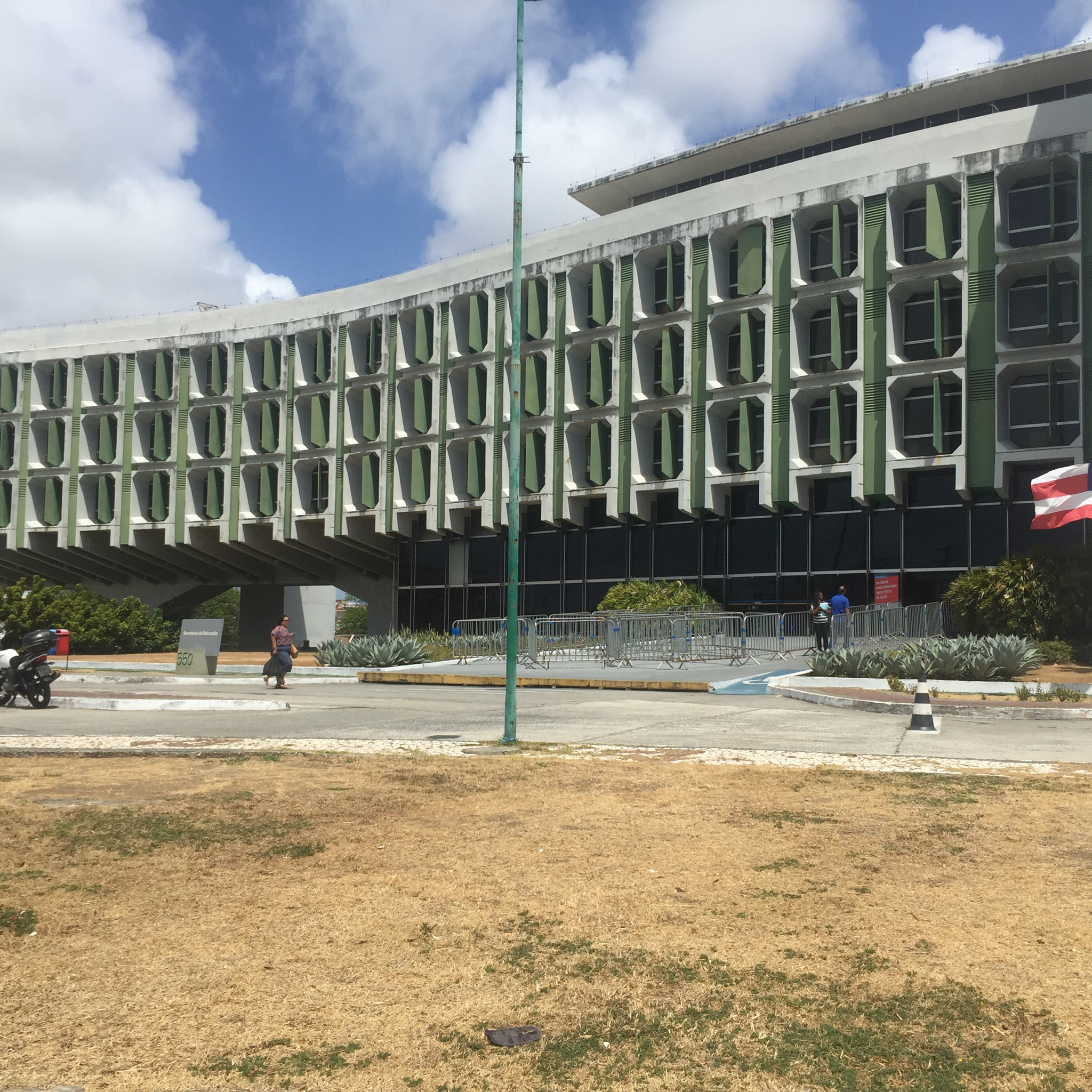
Highlights: There is a Lele (Joao Lima) cathedral and city hall and other projects by Lina Bo Bardi, one in restoration (the museum) but others (a theater, a bar) in alarming stages of disrepair. I was very taken with the local branch of the Sarah Hospitals chain (LeLe was in the in-house architect), and a wonderful history museum, the Misericordia Hospital, evidence of the Portuguese wealth that existed when Salvador was an early capital. These are thankfully in pristine condition.
A contemporary architectural intervention into an adjacent palace made the Carnival Museum a dynamic space with video exhibits which—for the first time in my experience— give dance and music a founding place in the history of a country. However nothing was as thrilling as an actual afternoon Carnival rehearsal with Olodum, the largest of the Bloco Afros.
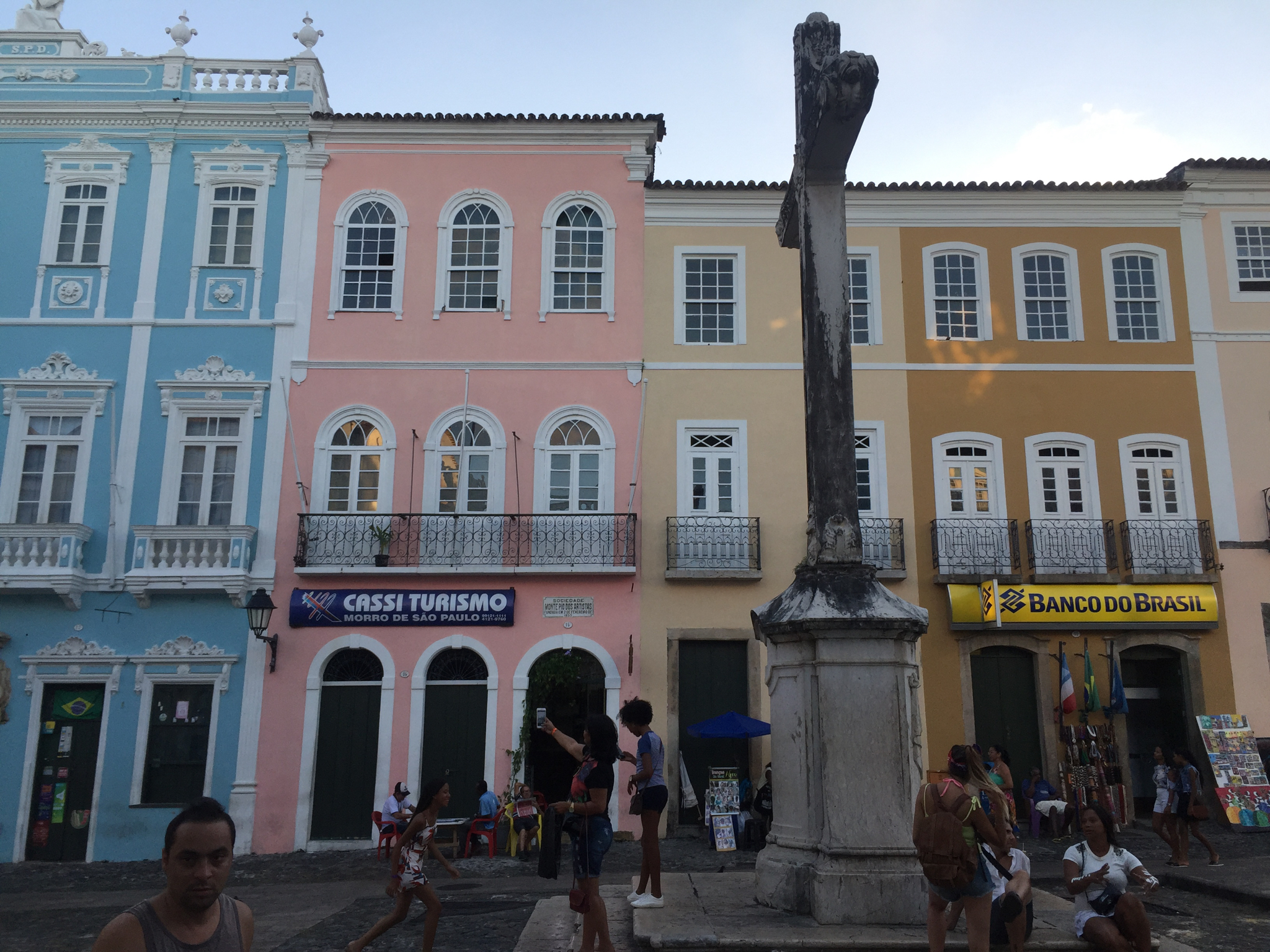
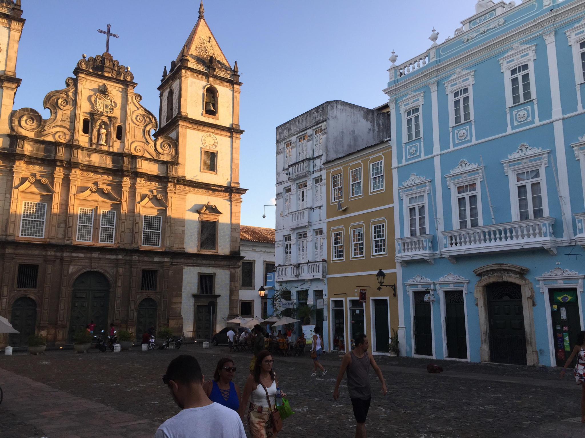
Though some claim they have become too commercial, their intense drumming and singing which revved up a crowd of locals and foreigners was entirely infectious and hardly disturbed by the defile of military police which marched through at regular intervals. ( In the town square, I saw other police routinely searching and harassing local youth. Is this a new Bolsonaro initiative or business as usual in Salvador?) Two new chic hotels are open near the waterfront (Fasano and Fera), but I stayed in the heart of the Pelourinho district at the faded but friendly Convento do Carmo which felt more in keeping with the city energy. Salvador was named one of the NYT 52 places to visit this year, but I would wait until fall as many things are under construction.
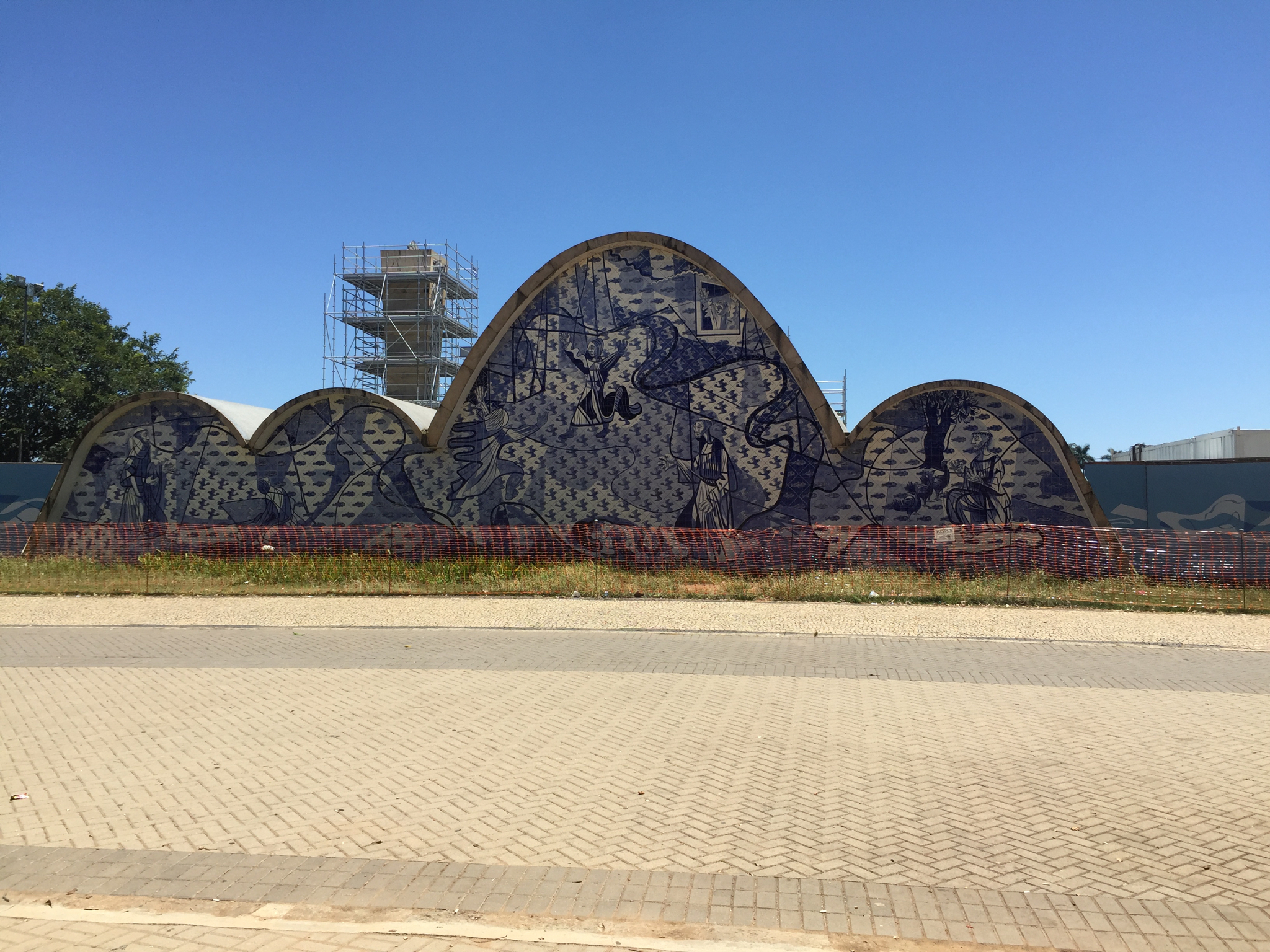
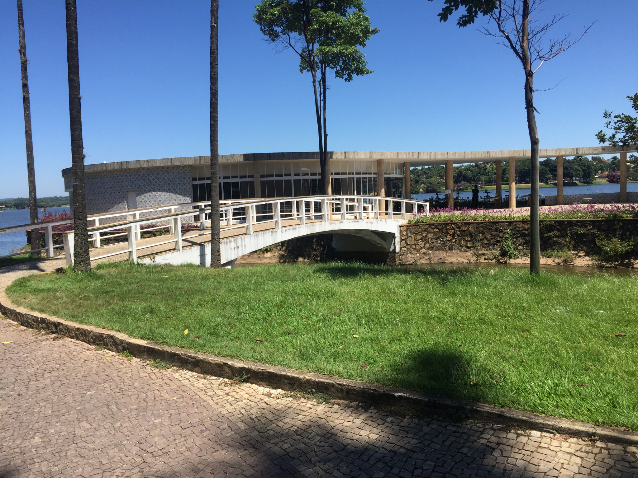
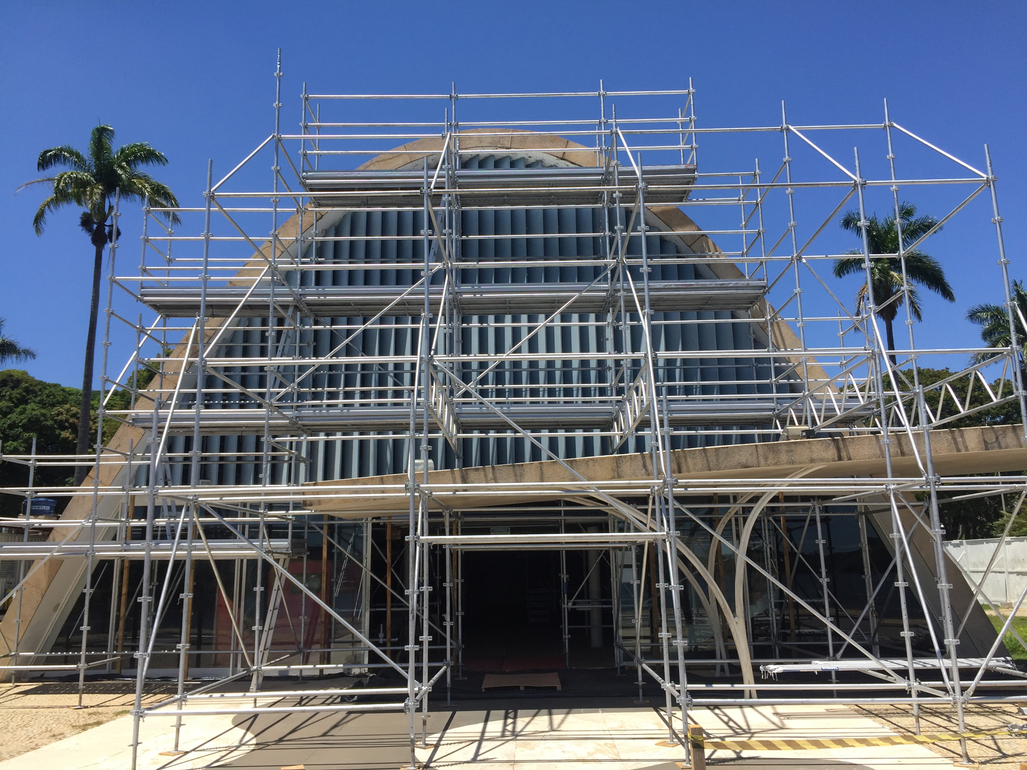
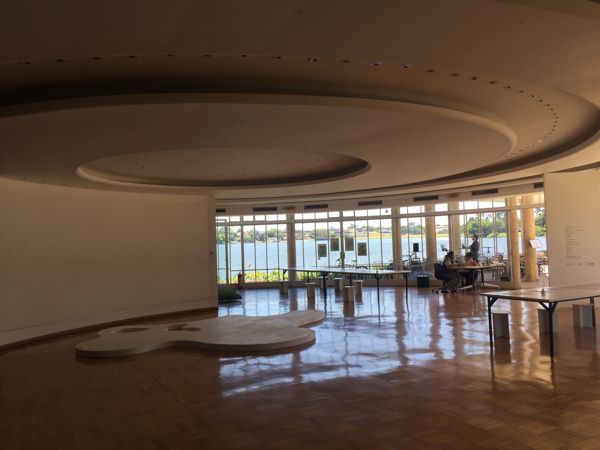
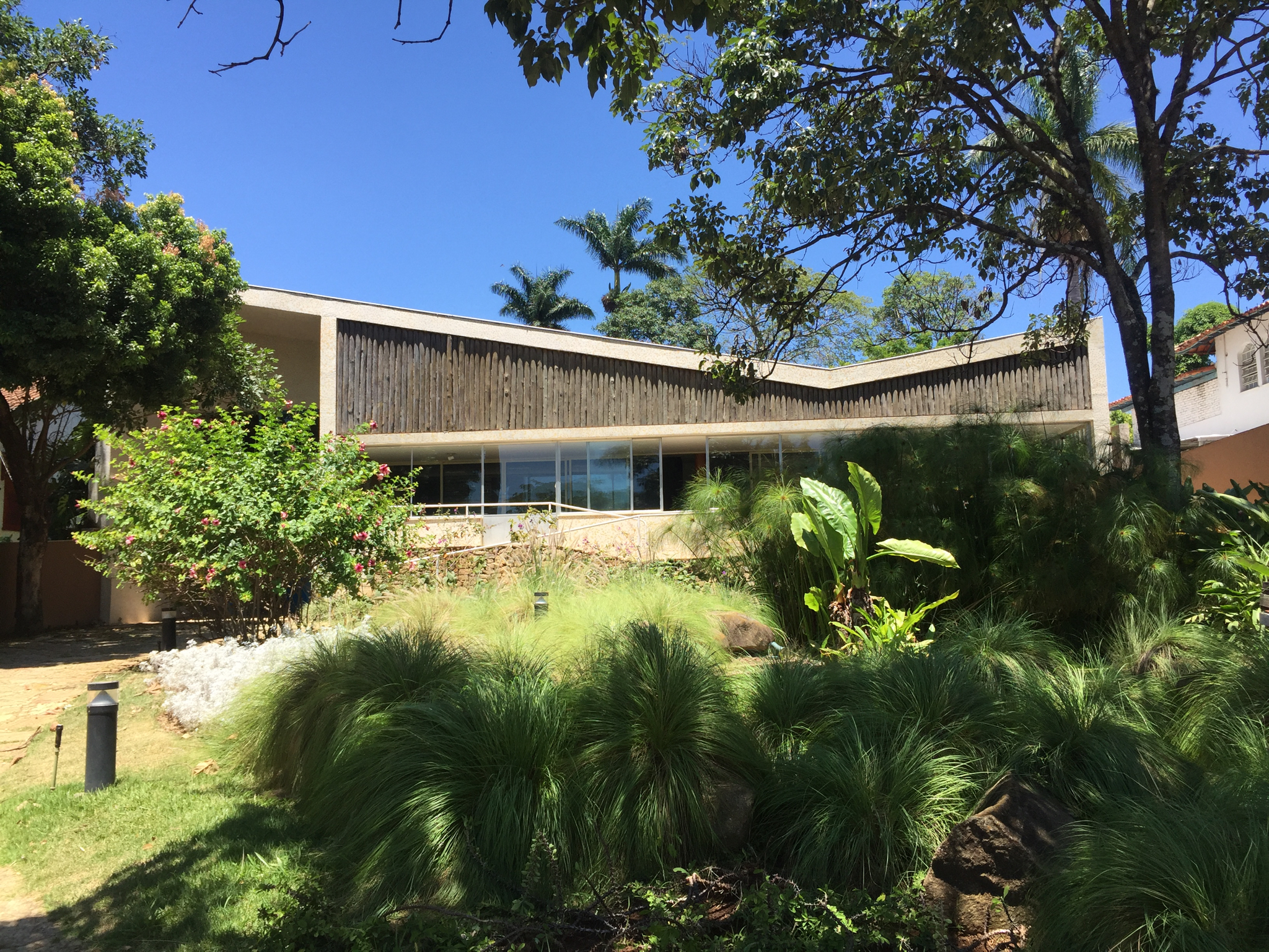
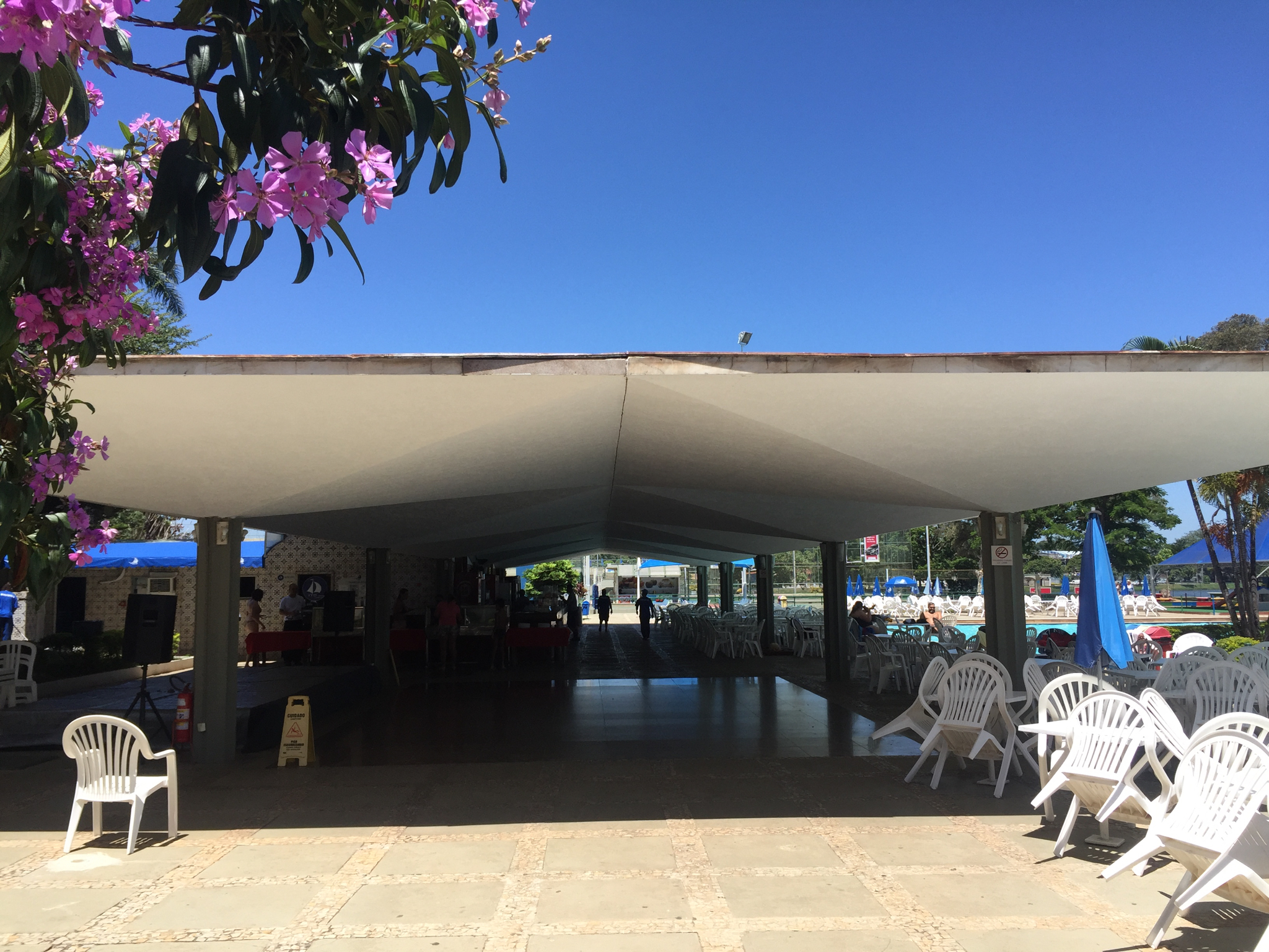
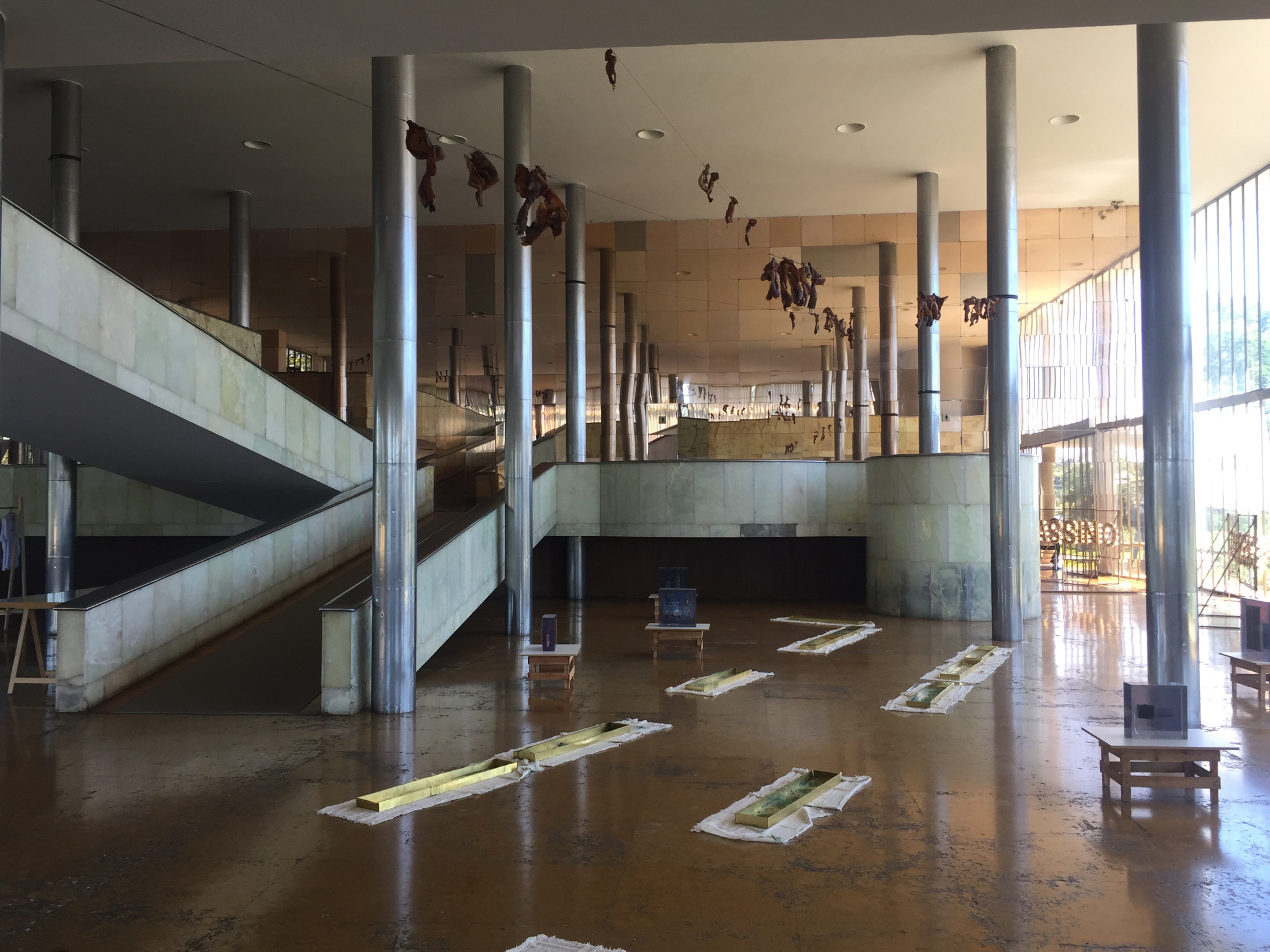
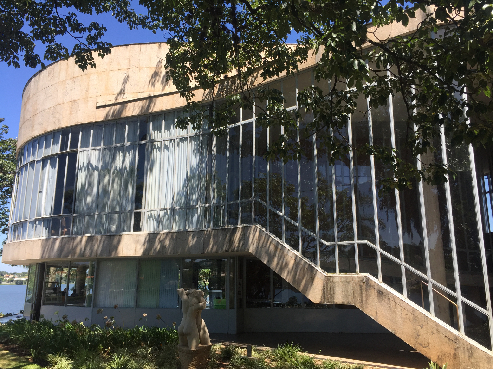
I was a lesser but still mournful victim of the giant dam disaster in Brumadinho as, despite pulling every string possible, I was not able to gain access to Inhotim, the marvellous contemporary art site just adjacent which, although not damaged, was closed in solidarity. I made lemonade by adding a stop outside Belo Horizonte at Pampulha, Niemeyer’s spectacular lakeside complex—again devised in a collaboration with Kubitschek.
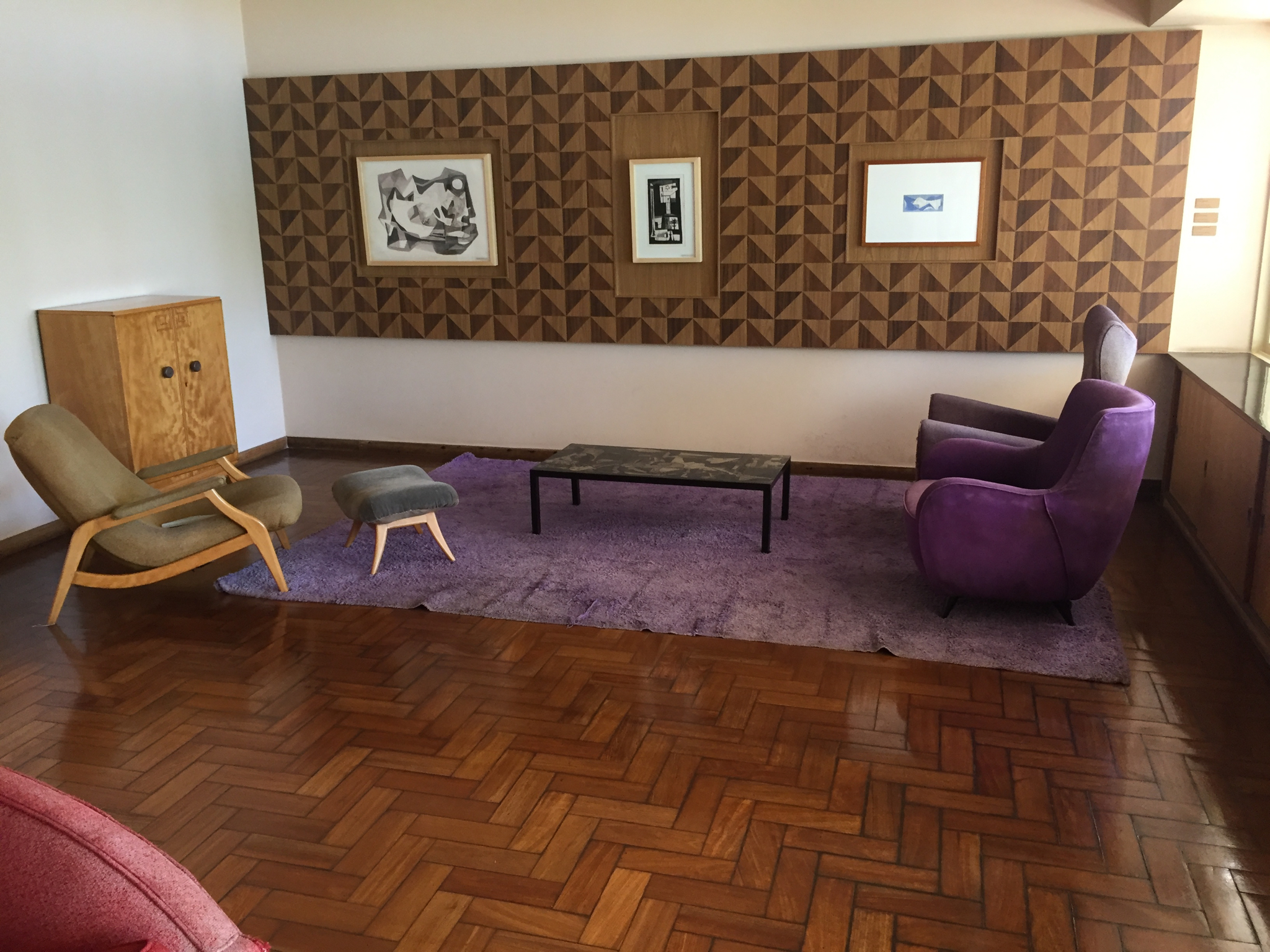
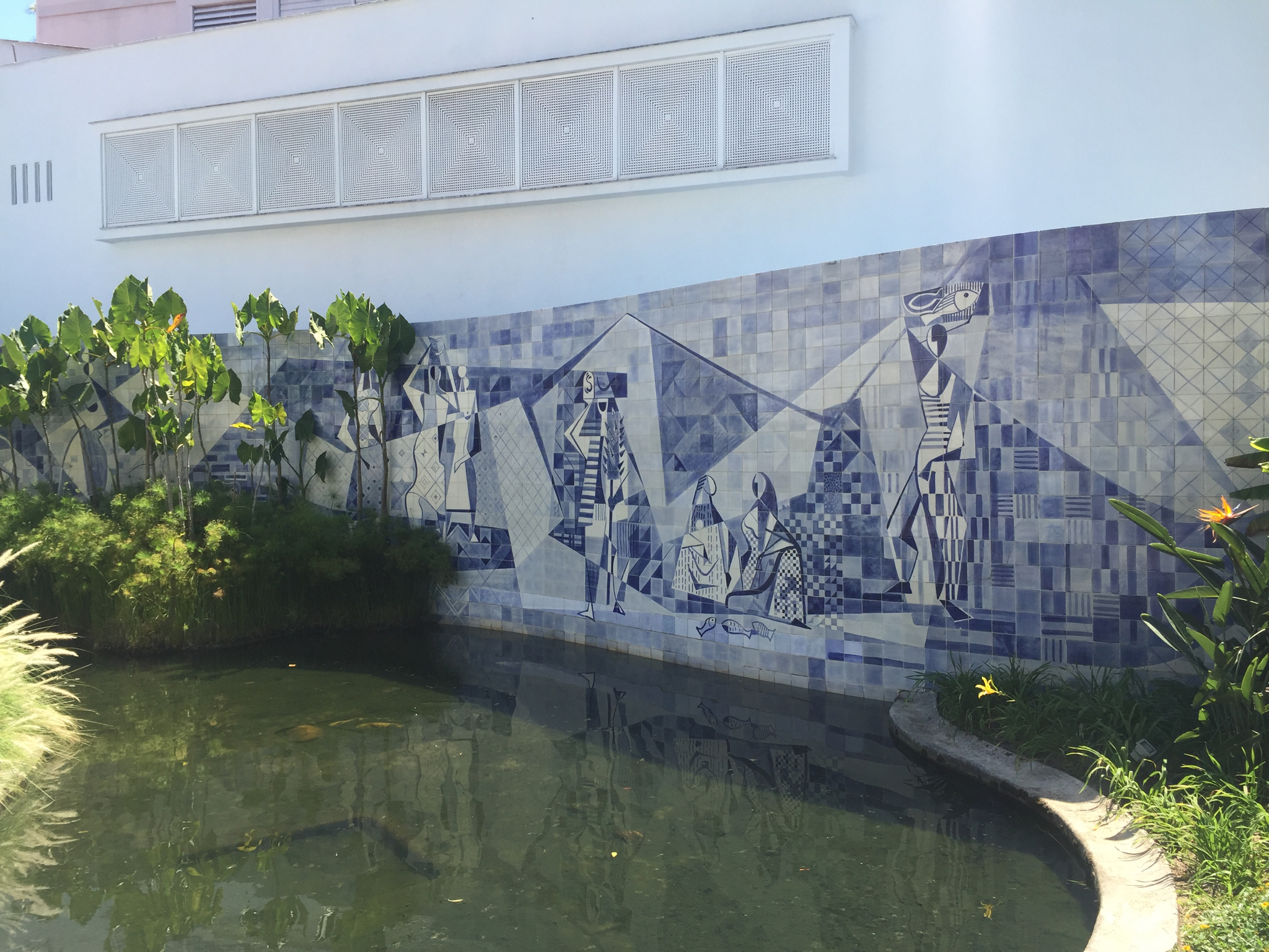
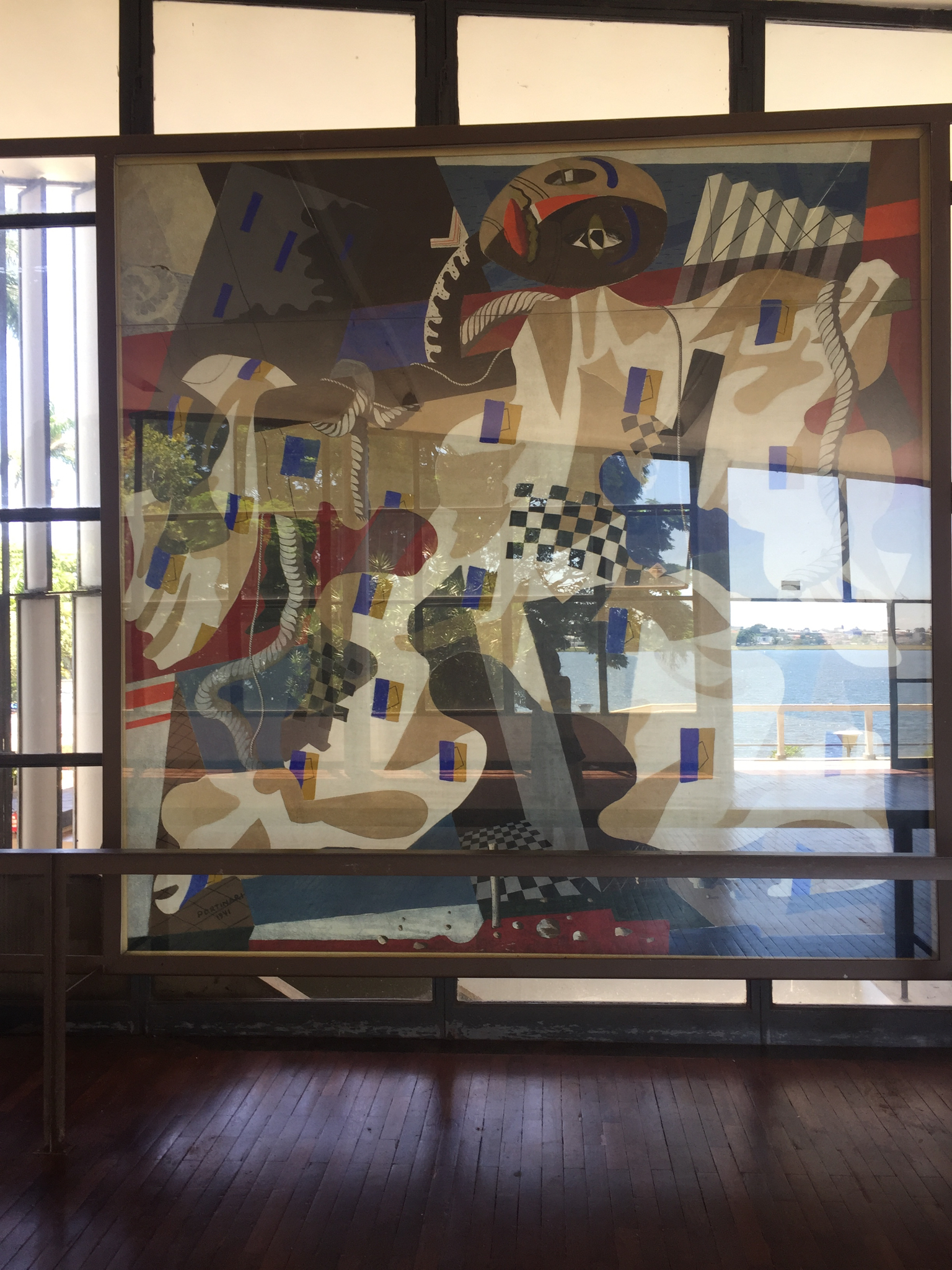
Highlights: The museum, the church (it’s in restoration but I managed to get a peek at its famous mural), the open air restaurant, the Casa do Baile (Sanaa must have seen this one), the beach club, and the home he built for the Kubitscheks, which feels as if they might emerge at any moment, are once again vibrant examples of this giant of 20th century architecture who was able to think about intimate spaces as well as grand.
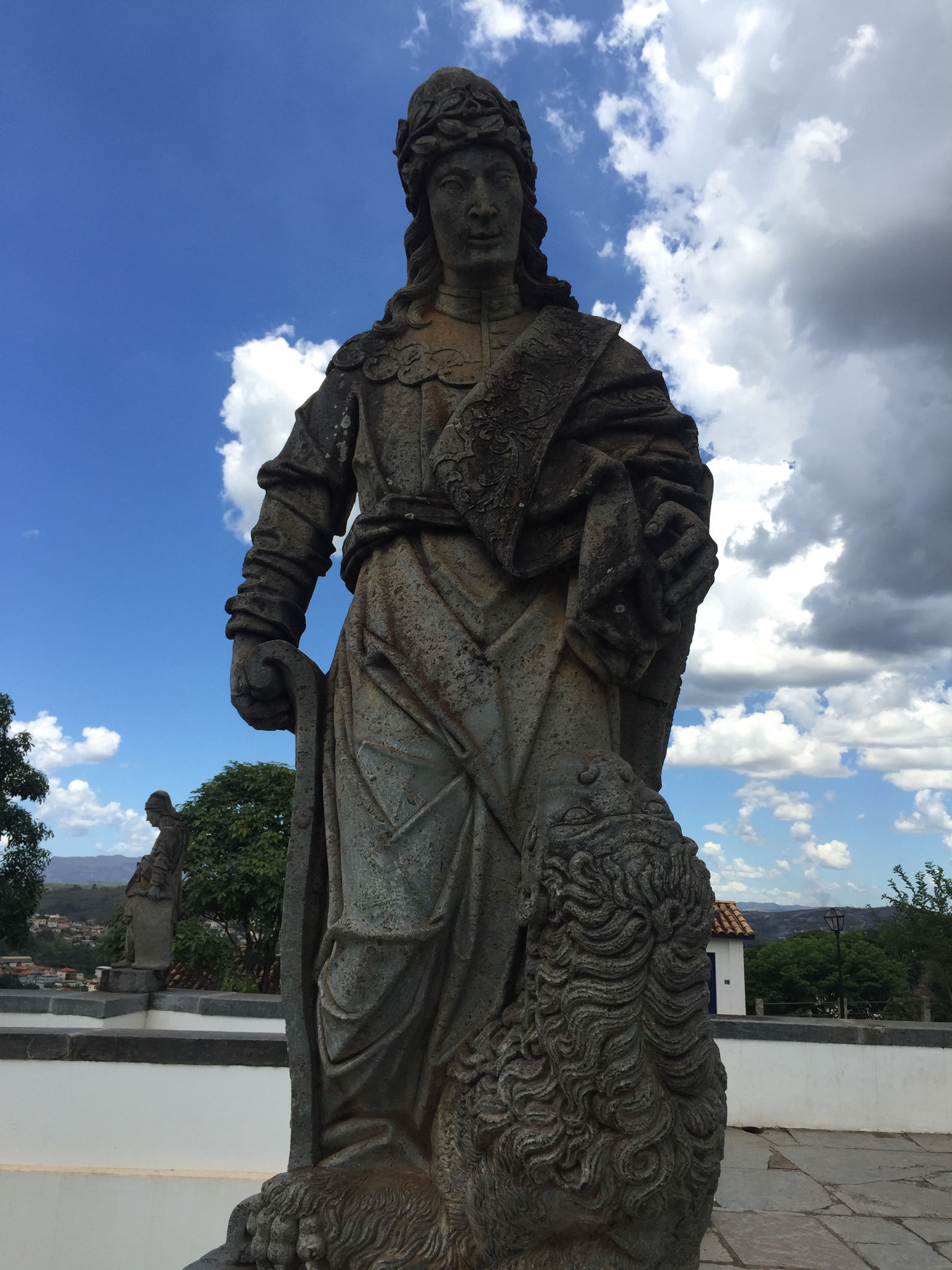
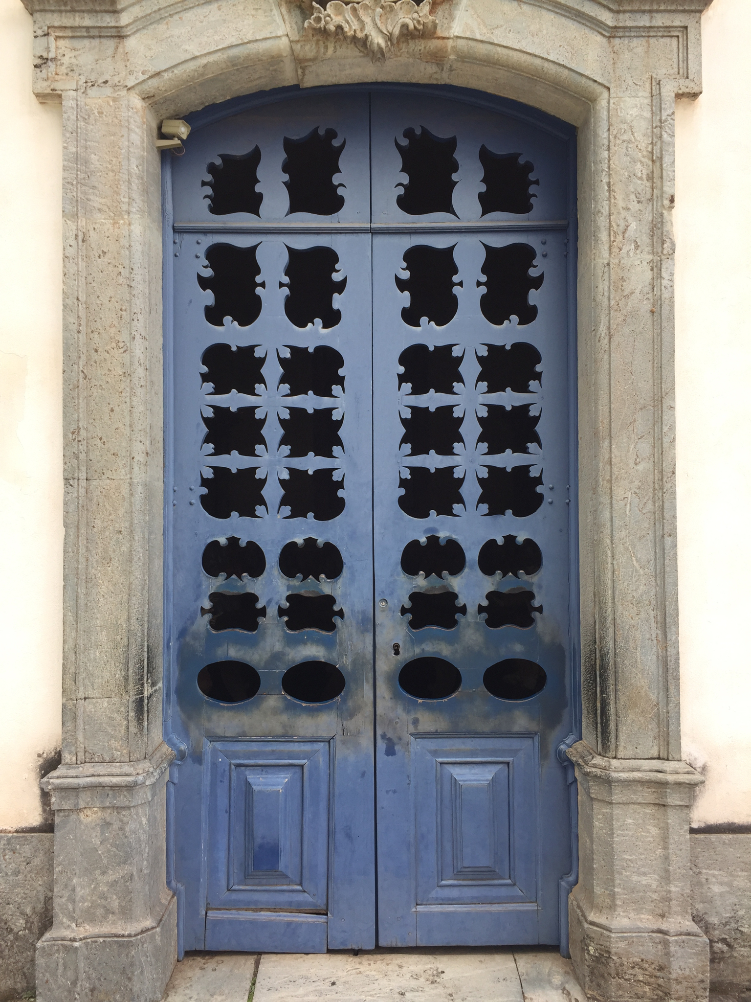
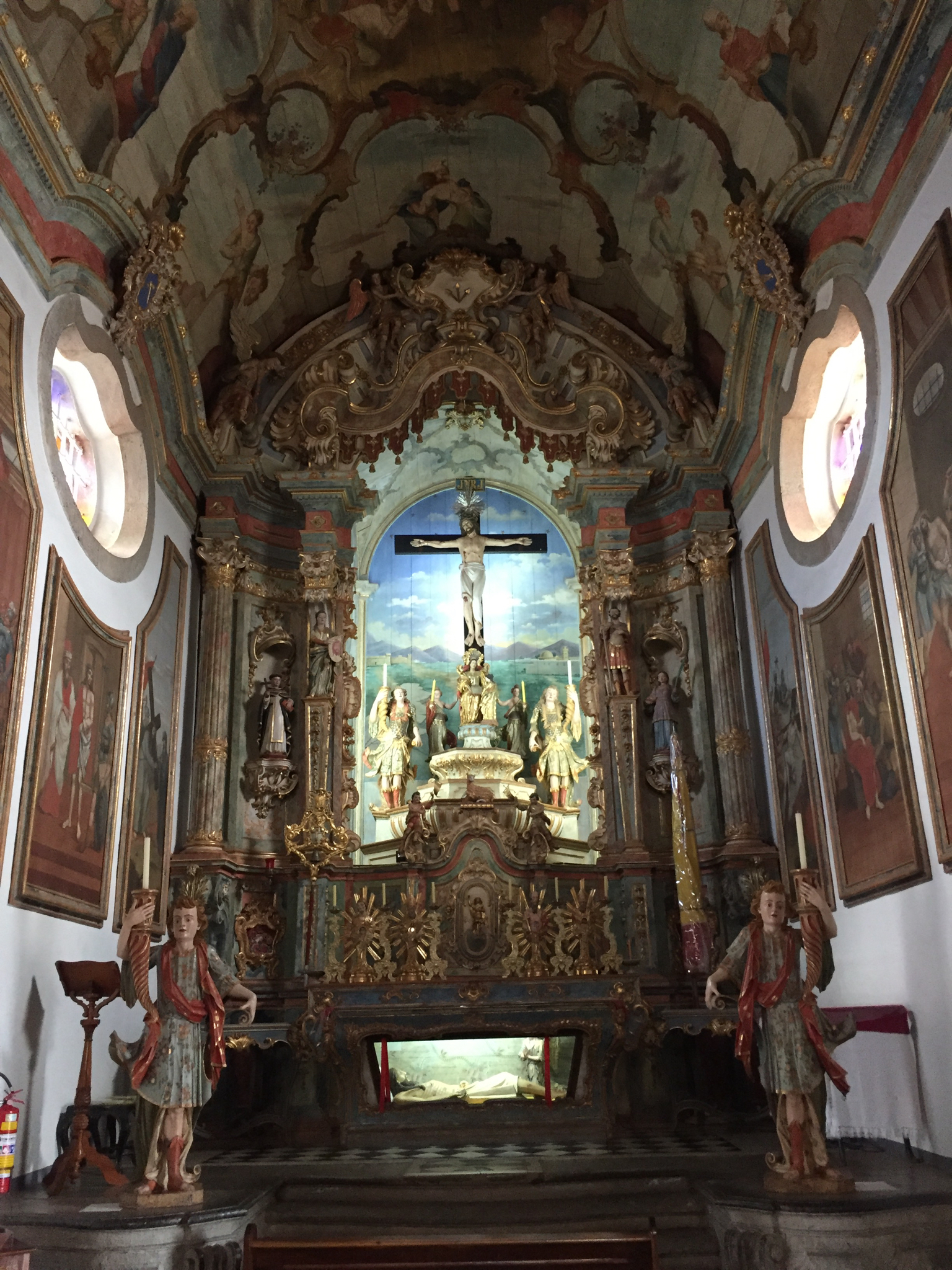
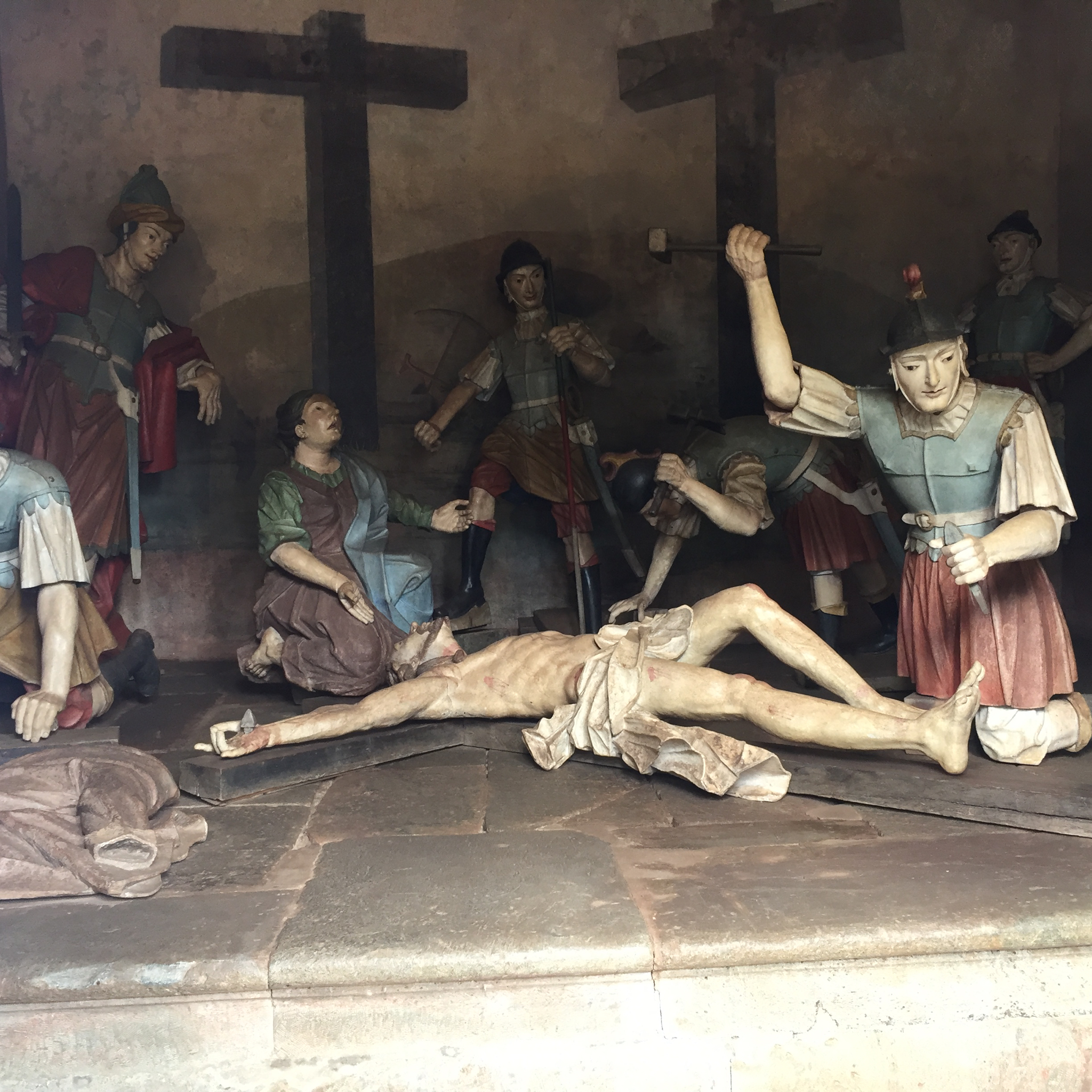
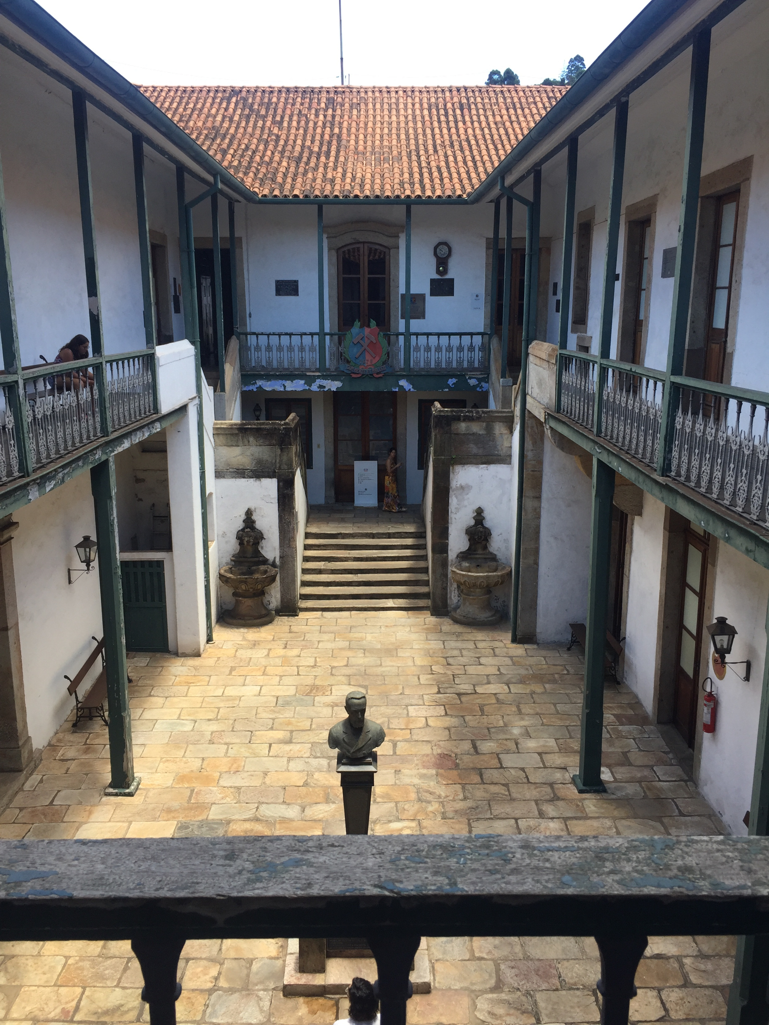
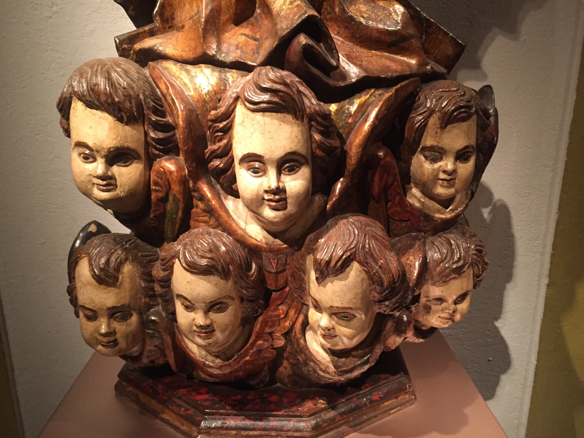
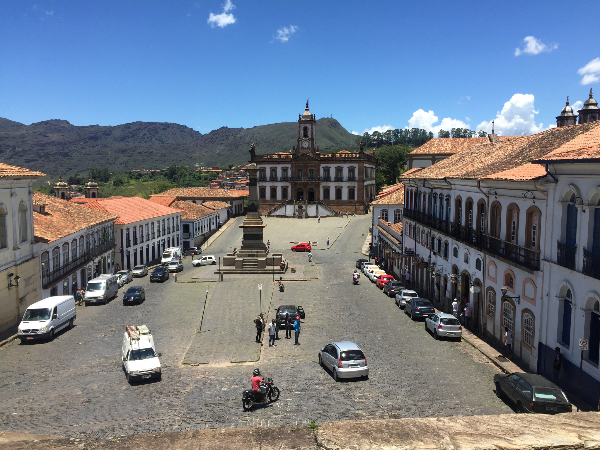
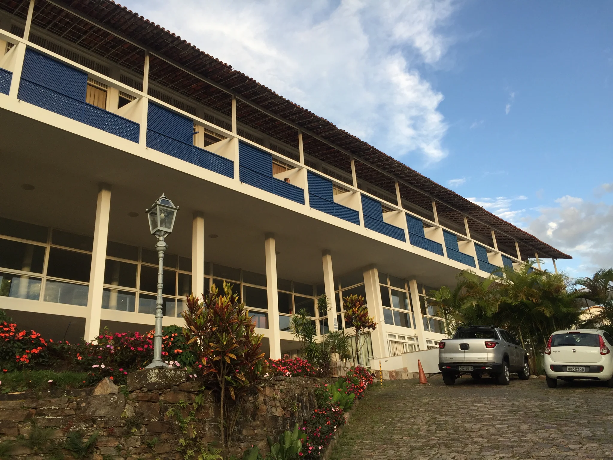
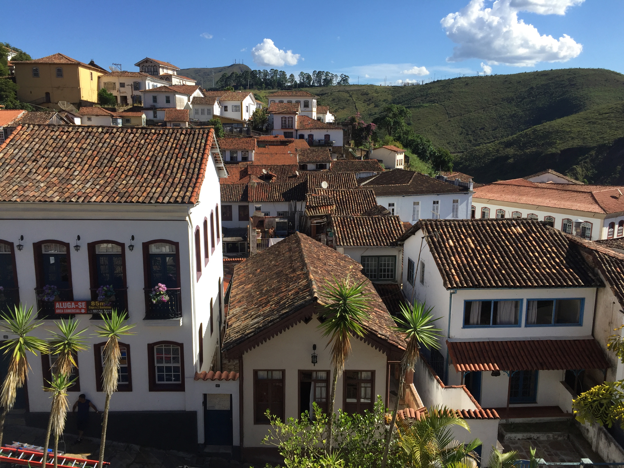
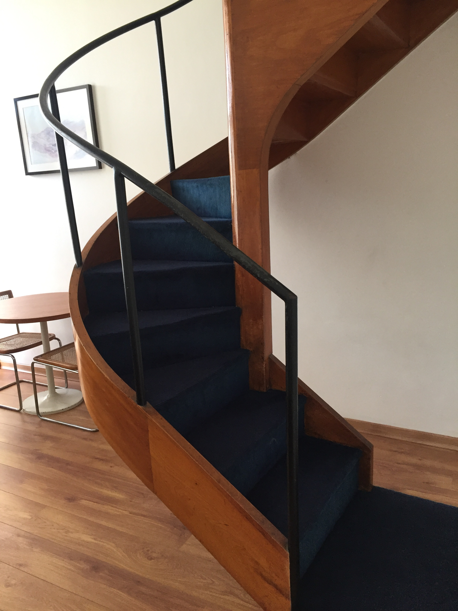
I practically wept at the haunting beauty of the twelve Aleijadinho soapstone prophets in Congonhas, and arrived in the colonial mining town of Ouro Preto. (You can still stay in an original Niemeyer duplex in the Grande Hotel with one of his signature winding staircases.). I happily lost myself in the cobbled streets of the colonial town and visited the three local museums—the Inconfidencia is an excellent intervention into a former slave prison. It wasn’t until I returned to the States that I learned that Ouro is another town also directly at risk from mine disaster as is much of Minas Gerais, once the wealthiest pocket of Brazil.
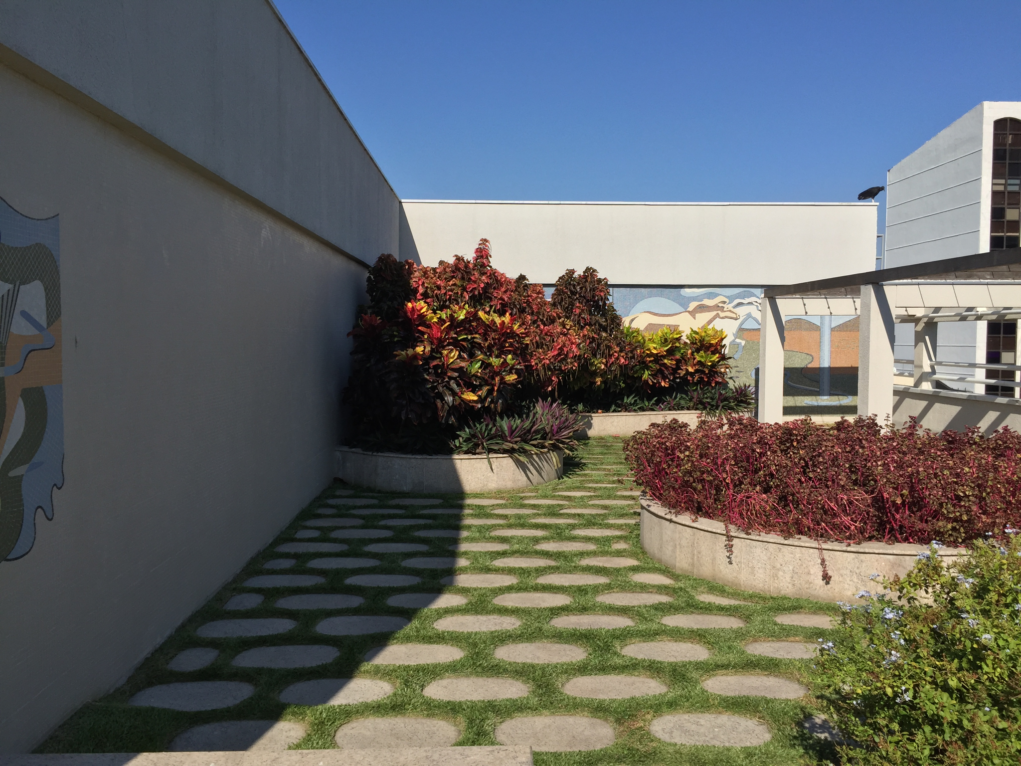
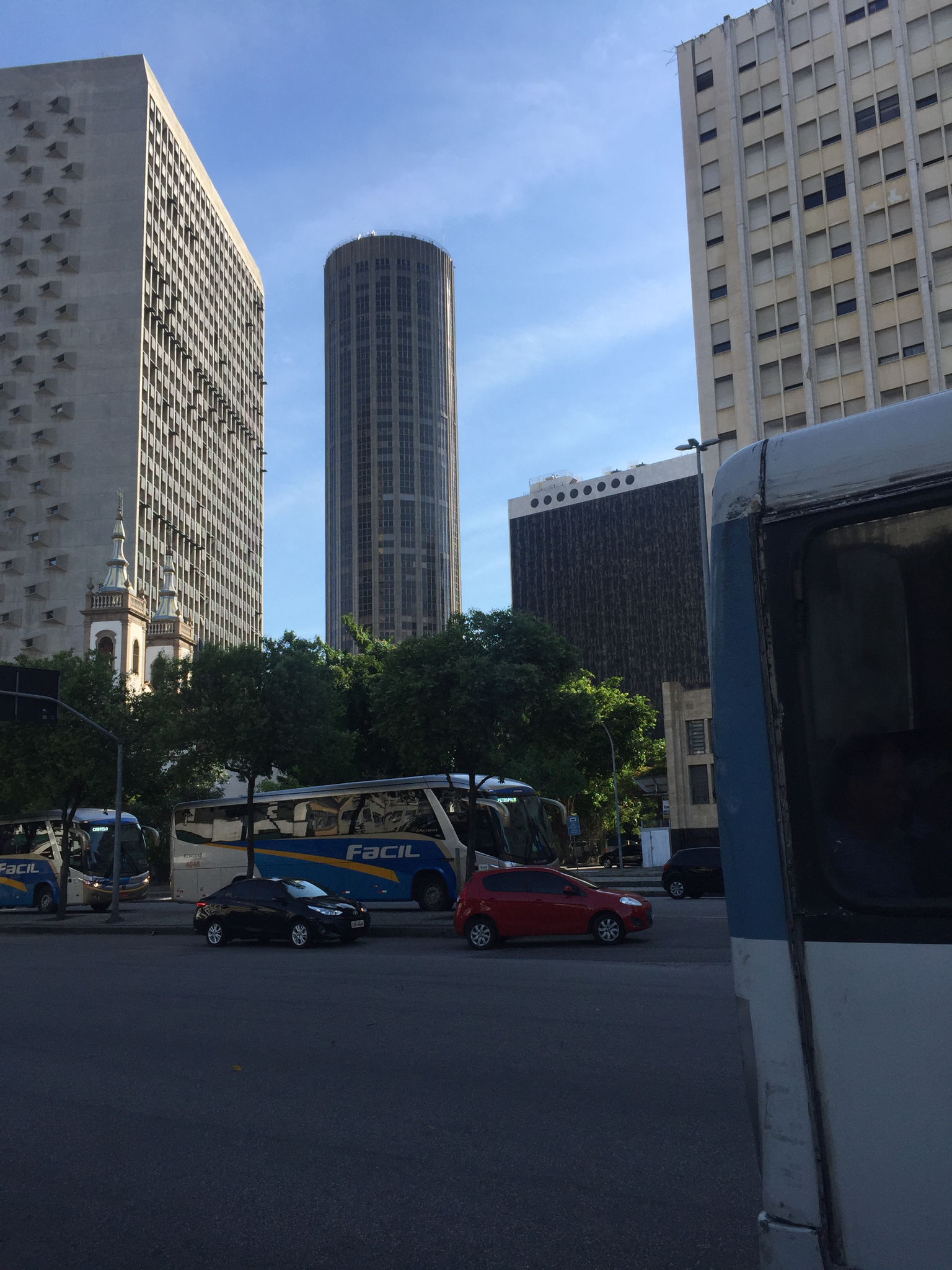
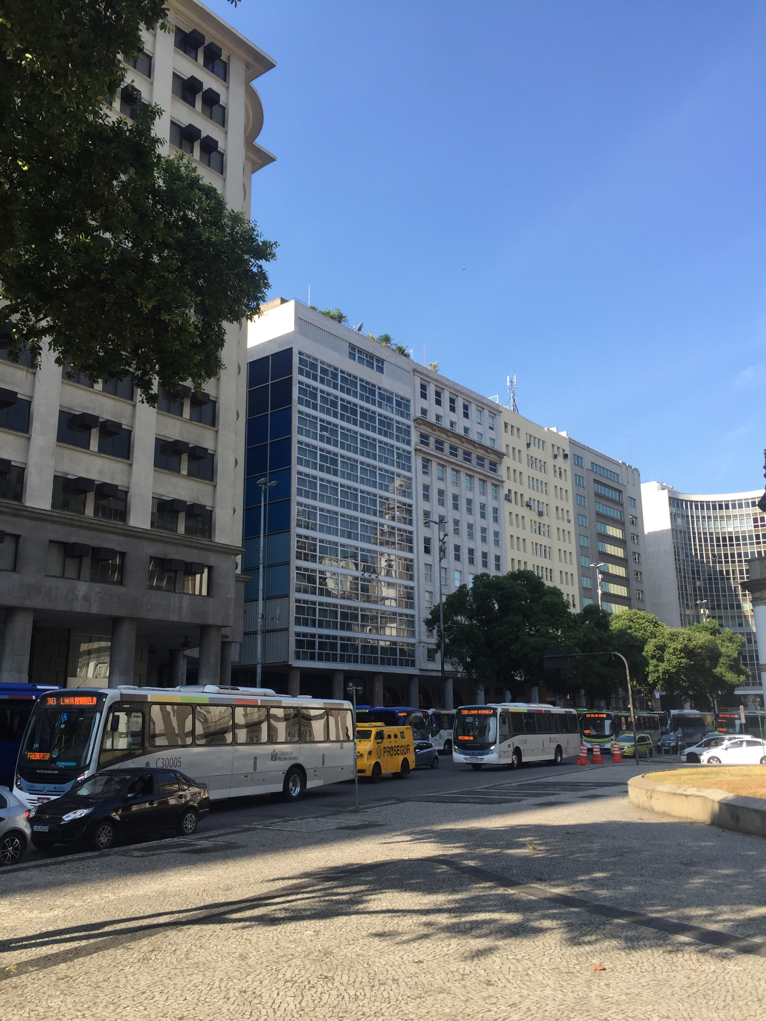
Arriving in Rio at the famed Santos Dumont airport was the first time I had a real chance to assess my vivid memories. The city is still so beautiful, where mountains meet the sea, but at every turn, the favelas remind of the societal disparities. (One even still bisects an extravagant private golf club.) Nevertheless, the display of modernist, art deco, and French inflected architecture is unparalleled and with the right guides one can access some hidden spaces that are an aficionado’s dream. I learned more about Lucio Costa and his Carioca school confederates Affonso Reidy, the Roberto Bros, Paolo Werneck, Jorge Moreira et al.
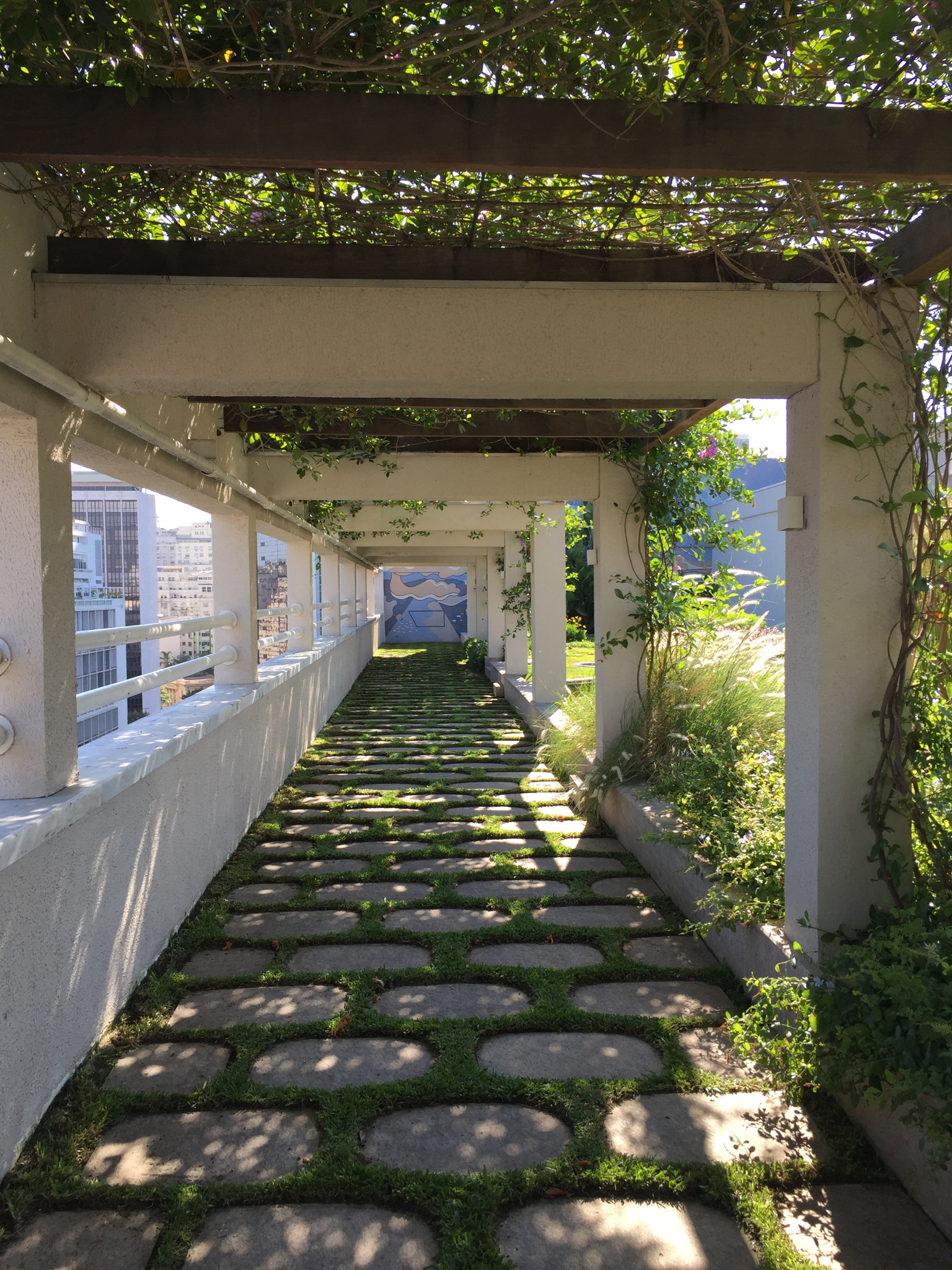
Highlights: We went to the roof of an adjacent building for a view of the famous Niemeyer-Burle Marx Ministry of Health which was at the top of my list (closed for restoration as so many projects are, alas), explored the hidden upper reaches of the Brazilian Press Association, the perfect reinstallation of the Burle Marx garden at the top of the (very private) IRB corporation Roberto Bros designed building.
The Instituto Salles was also partially closed for installation, but its outdoor spaces are elegant and well preserved in contrast to Oscar Niemeyer’s own house which, though technically in restoration by his family, is a mess. An expedition there with two intrepid architects who care deeply about its progress enabled me to see close up just how much is needed, and is not being done. Though I had written about the out of town Sitio Burle Marx, I was unprepared for its wild majesty and the many 17th century domestic structures left as Burle Marx inhabited them. The Sitio was apparently the scene of wild parties and gay life that garnered him quite a reputation at the time, but only enhanced the enchantment of this extraordinary space for me.
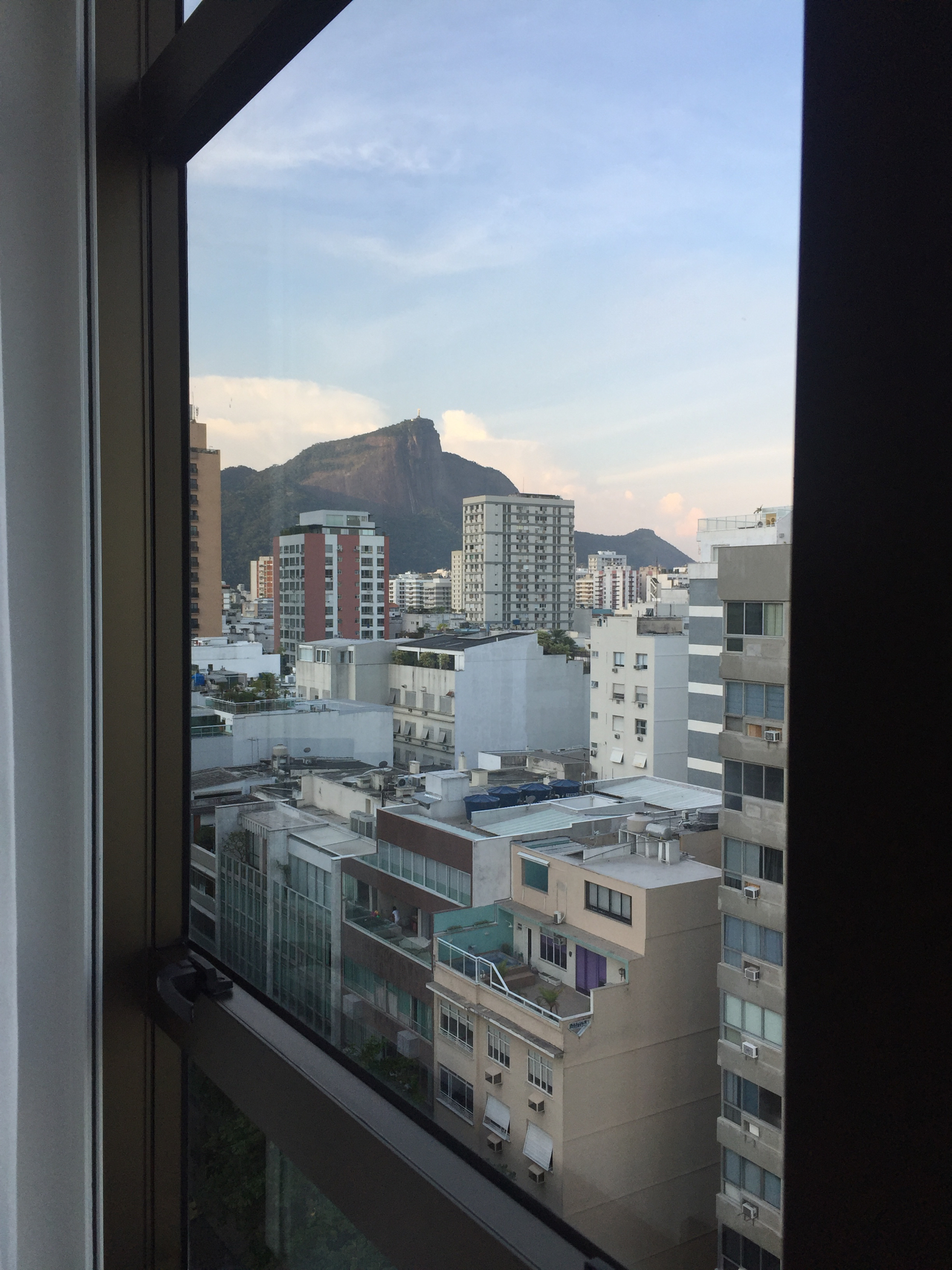
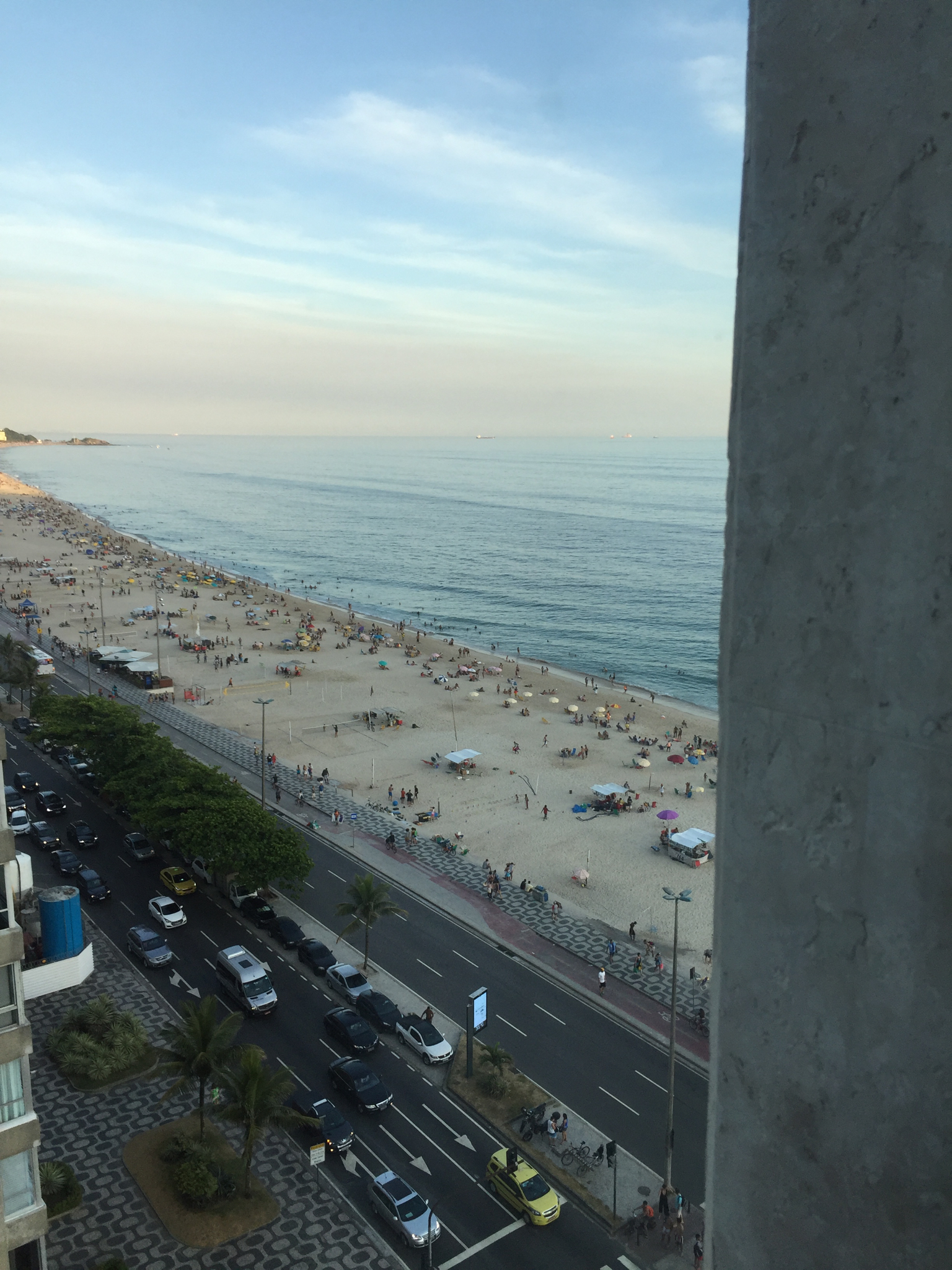
(Note well: There is a completely new oasis in the Leblon district, the Janeiro Hotel set to officially open in time for Carnival next month. This boutique heaven will certainly draw the smart set away from the famous Copacabana Palace. If you look left, you see the Corcovado. If you look right, you are facing Ipanema Beach. It has almost every service a larger hotel would have—and an especially engaging staff. At the end of a day of seeing many buildings in disrepair, it was particularly welcome. Anyone who is considering Rio—for example for the Architecture Congress in 2020—would do well to base herself here.)
In Rio, shorts is the uniform. In Sao Paolo people wear suits and build enormously high walled compounds. Brutalism reigns. (Again I was warned about crime, but experienced no qualms myself. One homeowner told me he had been held up at gunpoint in his shower and had left his absolutely primo brutalist Paolo Mendes da Rocha house in the care of his brother). Mendes da Rocha himself, now 90, is, however, apparently undaunted and still maintains his modestly located downtown office. Though busy , SP certainly has a less exotic, hothouse air than Rio.
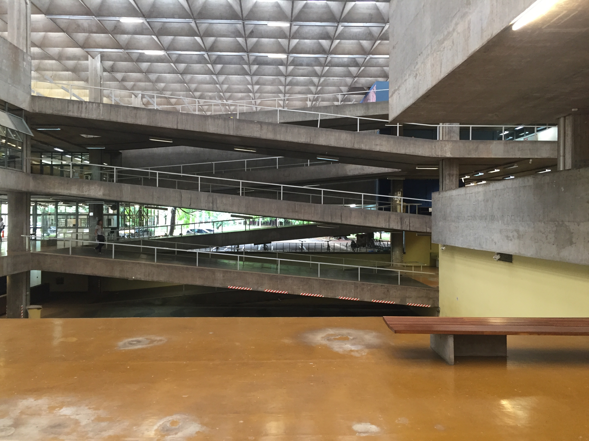
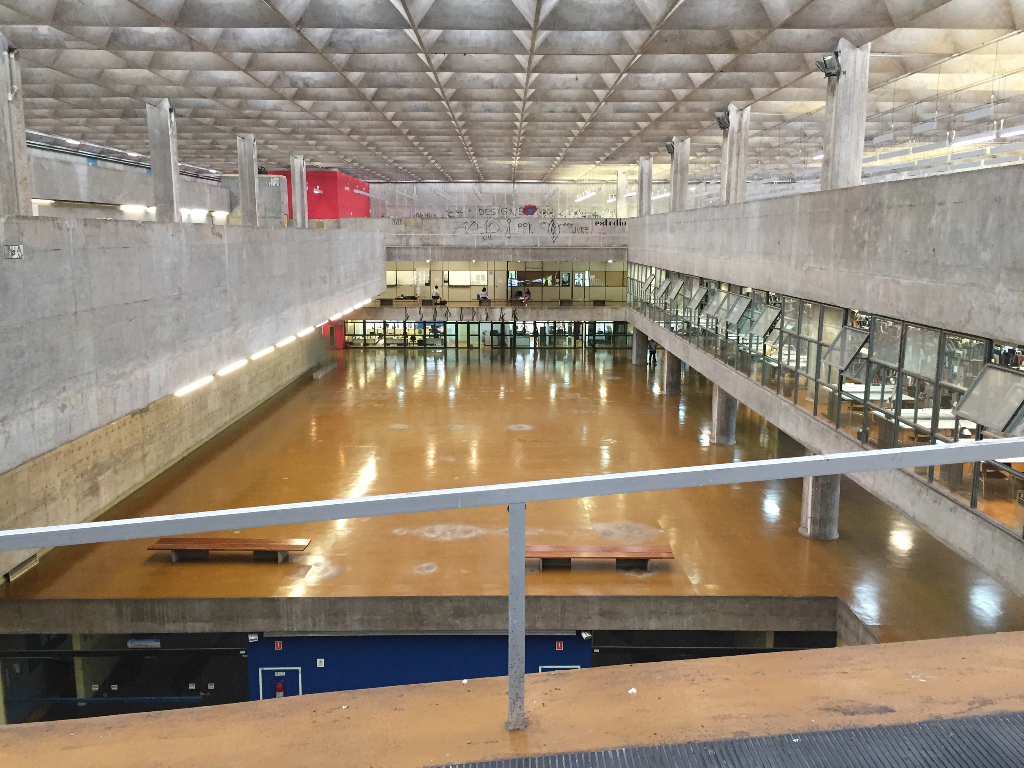
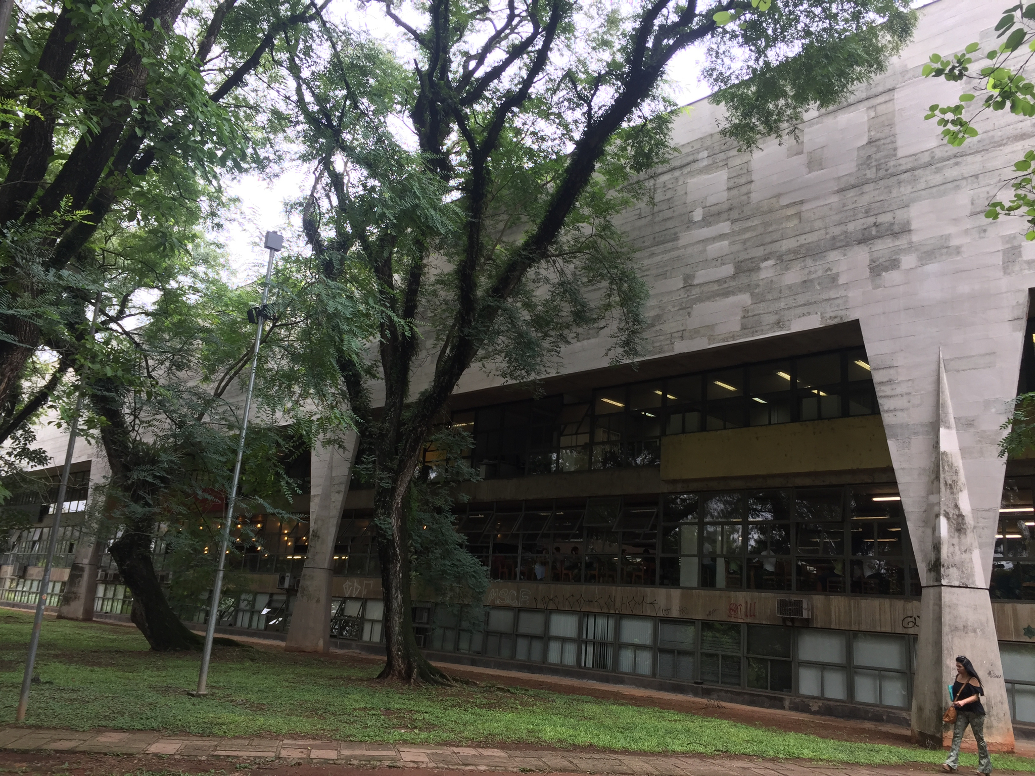
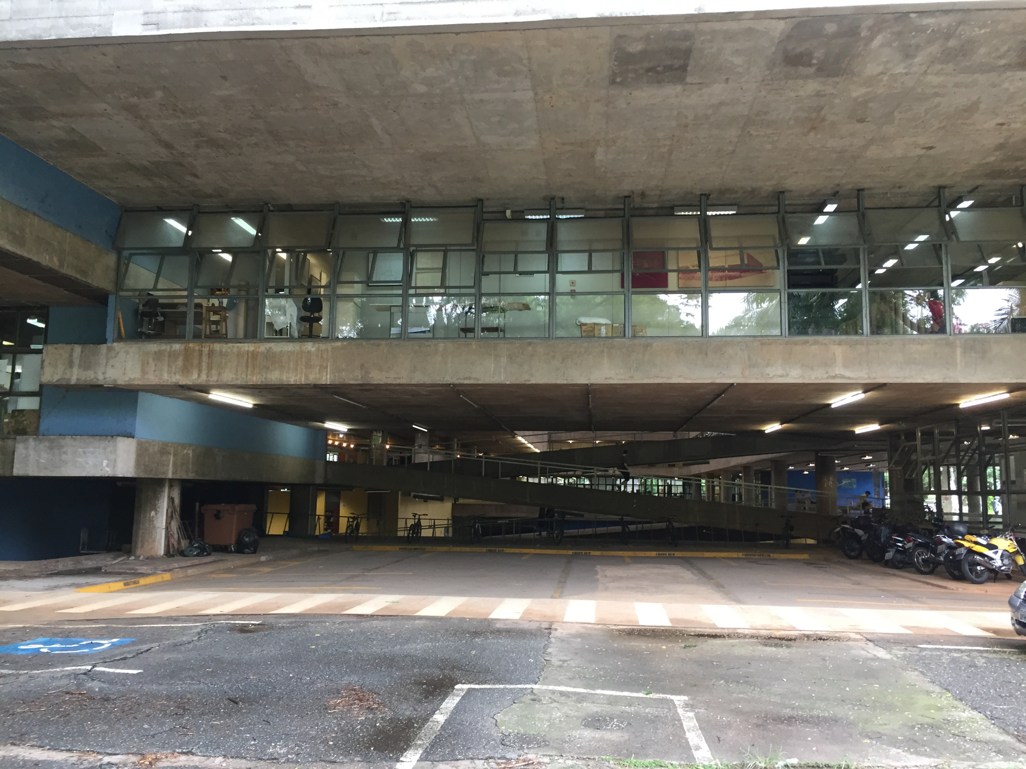
Highlights: The projects of Lina Bo Bardi, the Italian architect who together with her husband Pietro commandeered the Brazilian art and culture world in the 1950’s and 60’s via the Museum of Sao Paolo, her stewardship of the museum and university in Salvador, their joint editorial supervision of their magazine Habitat, her truly egalitarian SESC Pompeia culture center and her own Casa De Vidro are still first class examples of civic and botanical engagement combined with architectural splendor (more soon on Bo Bardi). Proud homeowners welcomed me to their singular brutalist houses. Niemeyer’s grand Ibirapuera Park is vast and undergoing very slow renovation. Artigas and Cascaldi’s architecture faculty at the University is a majestic building but from my perspective, compromised by layers of apparently unrestricted grafitti. It’s in vastly better shape however than its counterpart architecture faculty in Rio.
Brazil has probably the greatest concentration of important 20th century architecture as anywhere in the world. Private funding for preservation is scarce, there seems to be precious little corporate support of these structures.
Mine was the only American I heard on this trip, and very little else. Argentinians were the few tourists I encountered. Many have been scared off, I imagine, by the onslaught of frightening front page news. The Brazilians are among the liveliest, most welcoming, citizens and their creative professionals among the most erudite. I urge Bolsonaro to reconsider his priorities. Brazil’s artistic heritage is one of its strongest suits and can only serve to deposit prized dollars into its coffers. I returned wanting to install ramps, winding staircases, philodendron. And a set of drums.
The Sea Ranch at SF MoMA: If you build it, will they come?
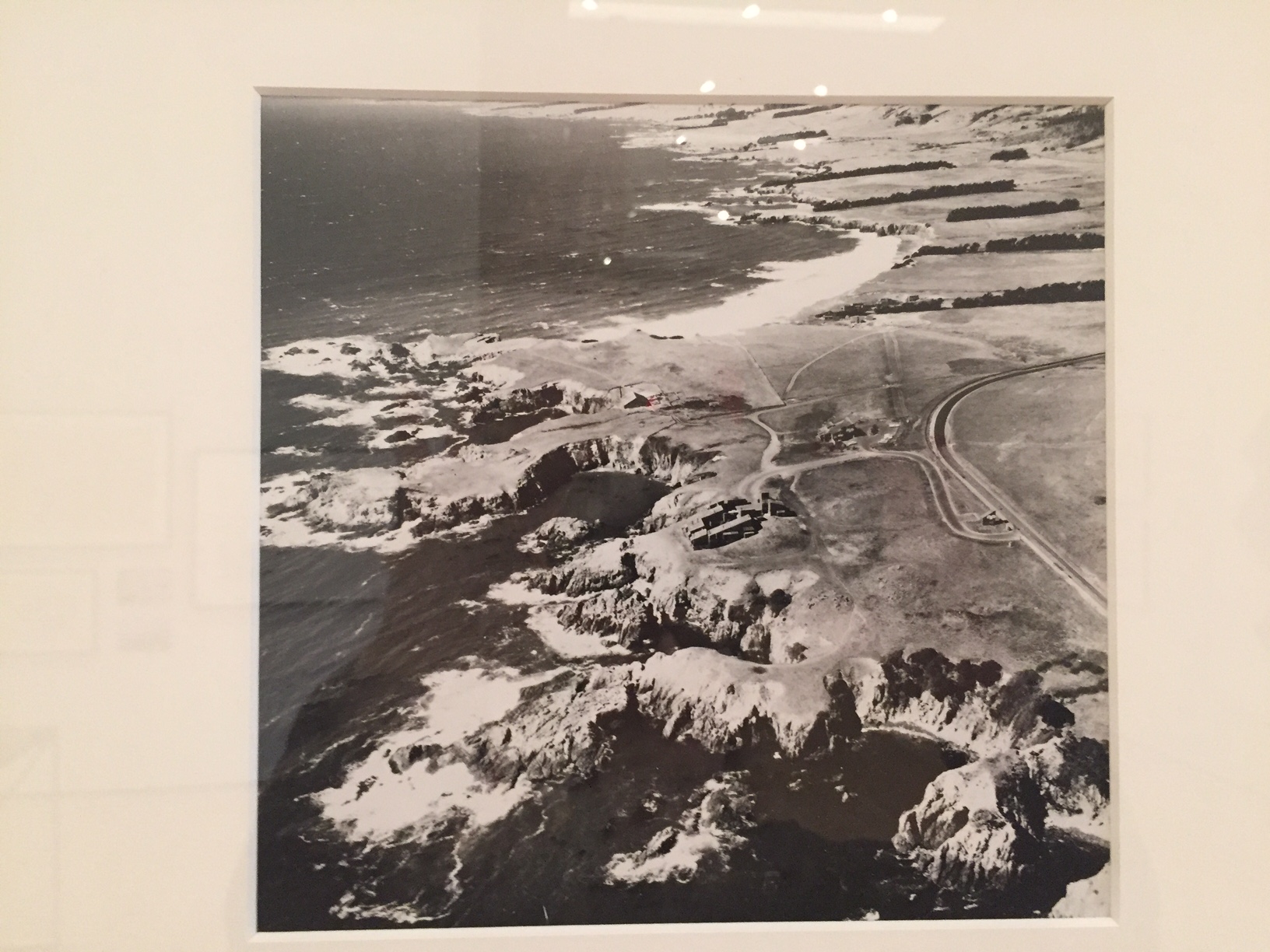
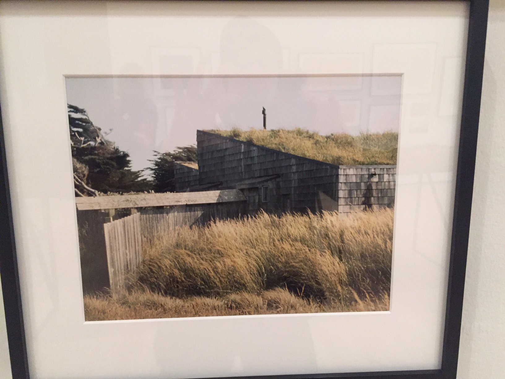
Sea Ranch, a sixties Utopian project by Bay Area architects and designers about 100 miles north of San Francisco, is now the subject of a tightly focussed exhibition at SF MoMA, and still exemplar of a remarkably sylvan development along ten miles of pristine California coastline.
The purchase of the land was organized by Al Boeke, an LA architect- developer in 1963 and was a hat trick that would never be allowed today as problems of public access to the ocean arose almost from the very outset. The powerful California Coastal Commission—which now regulates billionaires from getting their way in Malibu and other seaside communities— grew out of the divisive politics of getting the Sea Ranch underway.
Larry Halprin, the opinionated landscape architect, was engaged to master plan the site and Joseph Esherick, Obie Bowman, Charles Moore, Bill Turnbull, and other architects and designers to create housing (the first condos) all out of unpainted redwood that would meld more naturally with the grassy, coastal landscape. Roofs had to have a specific slant. Bold graphic design and marketing by Barbara Solomon kept within the scheme. Originally, there was to be an escape from suburban style development, but when the concept didn’t sell well enough, more structures were added. Now there are over 1800 homes (many second homes or rental properties).
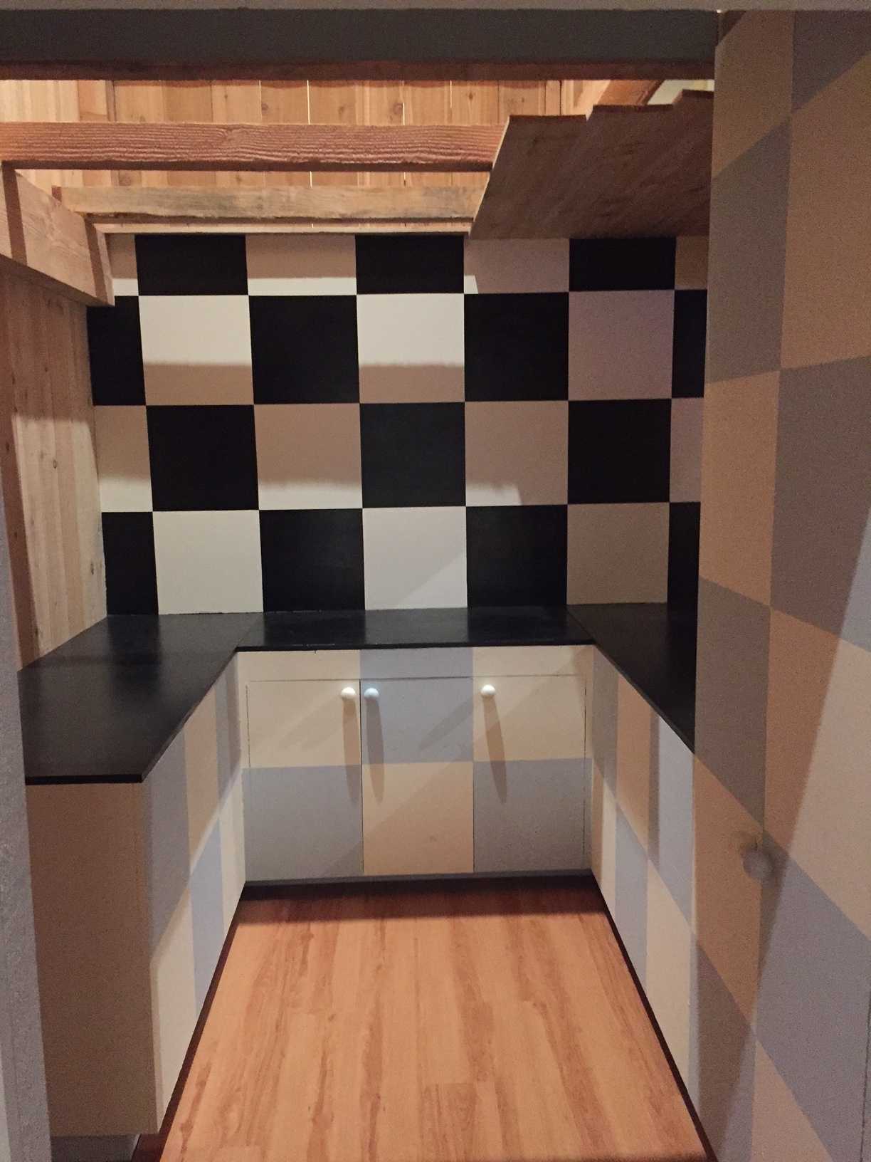
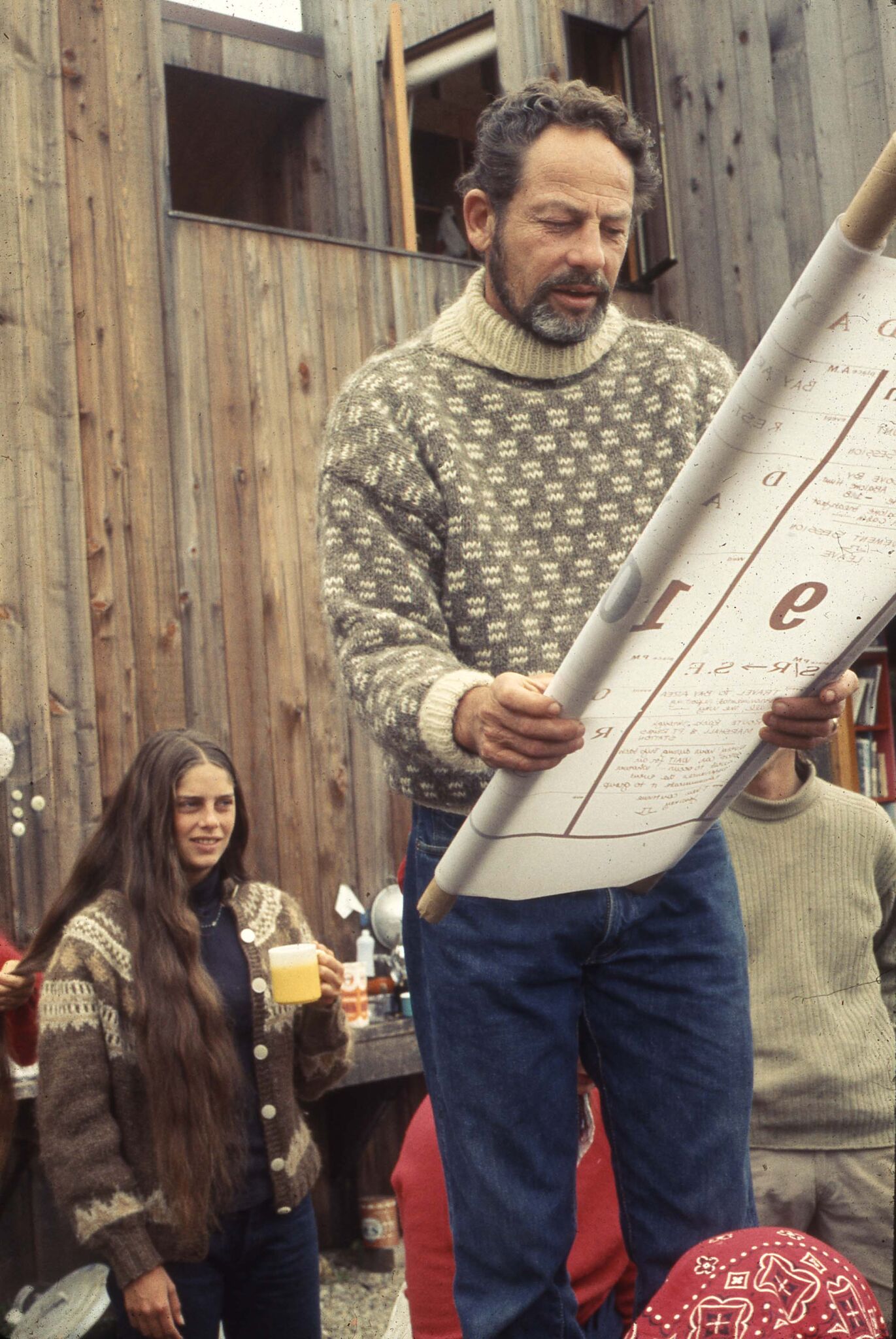
SF MoMA has built out the interior of a house within the exhibition gallery and it is under the weathered eaves you can catch a short film about the project with original participant interviews. As in Gibellina, Sicily, visionary but dogmatic planners were eager to influence the way we live our lives—see the list of dos and don’ts in my slide show (above). They were intent on making the development nature-and-environmentally friendly, yet ignored certain human foibles. The sixties and seventies were marked by this kind of futuristic ideation at a time when it felt like the world was indeed falling apart. Structure and planned community became a literal metaphor for trying to put back some kind of order into life.
The natural progression after seeing the show is the drive up to Sea Ranch where there are many vacation properties for rent and see what you think. Has it lived up to their prescription?
The importance of Kem Weber, Walt Disney's design guru
Dave Bossert, a 32 year veteran effects animator of the Walt Disney studio who worked on The Little Mermaid, Beauty and the Beast, Aladdin ,et al, was gifted the original Kem Weber-designed desk that had been his steady support and companion on his departure. His affection for this desk grew into a wonderful new monograph on Weber’s important design contributions to the Walt Disney studios in Burbank.
After the cozy mish mash of the Hyperion studios, Burbank was a streamlined factory. Workers complained that some of the spirit was gone, but in exchange they had the most efficient and beautiful machine from which to make their innovative and highly technical animated films.
Bossert tracked down Weber’s original drawings and renderings for both the exterior physical plant and the custom furnishings at UC Santa Barbara. Each type of artist had a different desk: the flat, expansive kind for directors who had to lay out entire scenes or sequences, the tilt topped, back-lit kind for animators and assistants, the file cabinets, the shelving, the meticulously thought through workstation. Artist input was solicited for the preferred angle of light, the chair style, the comfort, the ease with which they could accomplish the maximum quantity of high-value, technical work.
Bossert was not there during the time period of my Vanity Fair story research on the Ink and Paint department which was the earlier Golden Age, but I know that the workers I interviewed very much appreciated this attention to their comfort and productivity and Bossert says in his era too, they all felt enduring capability and inspiration from their custom-designed surroundings.
Weber was German-born and had worked under a master of the Wiener Werkstatte as well as for the Barker Bros., but there is also much Bauhaus and International style as well as mid century modern in his influences. He found in Walt Disney a true patron who worked with him on almost every aspect of the studio design and who allowed him creativity as well.
Interestingly, Walt admired this kind of industrial design but not the worker collectivity theory behind it for almost as soon as they got to the new studio, the famous Disney strike began for which there was much retribution.
Weber desks have gone at auction for very high prices especially when they were attached to famous animators. I admire Weber’s work, even the smaller occasional pieces, and especially wish the commissary and the coffee shop still existed. Walt’s Weber-designed office is extant in the pink Animation Building, a testament to how innovative his thinking was on every aspect of the dynamic company he created.
Bossert’s beautiful book is for sale here.
Images courtesy of Dave Bossert, copyright UCSB.
Odile Decq: We need architecture to help people live better
Odile Decq had been recommended to me by architects like Thom Mayne as being in the forefront of European architects—male or female—so I was very eager to hear her deliver the Arthur Rosenblatt lecture at the AIA last week.
Decq resembles a Goth Grace Slick. Her look—black teased hair, black clothing, black nails, huge black rings, black eye makeup, and lipstick—is something she may have arrived at long ago to appear strong, to stand out as tough.
Would I need to reference the physical attributes of a man the same way?
If he stood out like this: yes. Absolutely.
This is a presentation as much as anything she says.
I ask her if she has designed her own jewelry and clothing. ‘No,” she answers with a smile, “but why not”. She laughs when she tells us that she wants to design everything in her projects even if she loses money on it. Shades of Frank Lloyd Wright.
This is a woman, a person, for whom creating a whole environment is what she is all about. An atrium with a winding ramp also reminds of Wright. A Barcelona building has Gaudi in it. She invokes the great mid century designer Pierre Paulin in her designs for chairs. She does not ignore history but she is surely the antithesis of classic and conformist.
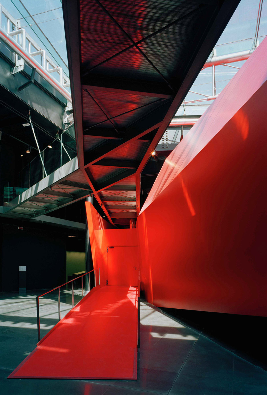
She loves black. Recently she has also been loving red.
Other than that there is not much else in her palette. Oh, ok, white.
Despite the black, she has a sense of humor, and is charming and funny in delivering an anecdote.
Exteriors are fenestrated. Staircases have glass siding. She wants to be open to the world—and vice versa.
“We need architecture to help people live better,” she says.
Her husband and partner died in a car crash two decades ago—a tragic, defining time for her. Yet, finally after many years of the firm still being referred to by their joint names, in frustration, she took sole title in 2013. Her work is everything to her, She does not take vacations.
She was also frustrated with the institutions where she was teaching so she opened her own architecture school, Confluence, which depends on short term faculty workshops rather than semester long commitments. The enrollment is still small, but she seems undaunted.
Mirrors and shiny surfaces abound in her work. Having just seen the HBO doc which showed Jeff Koons opining on how important his shiny balls and surfaces are to reflect the world I can’t help but be discouraged for a moment.
Then I realize: Decq is not about reflecting the beau monde but rather the real world. It’s an entirely different energy.
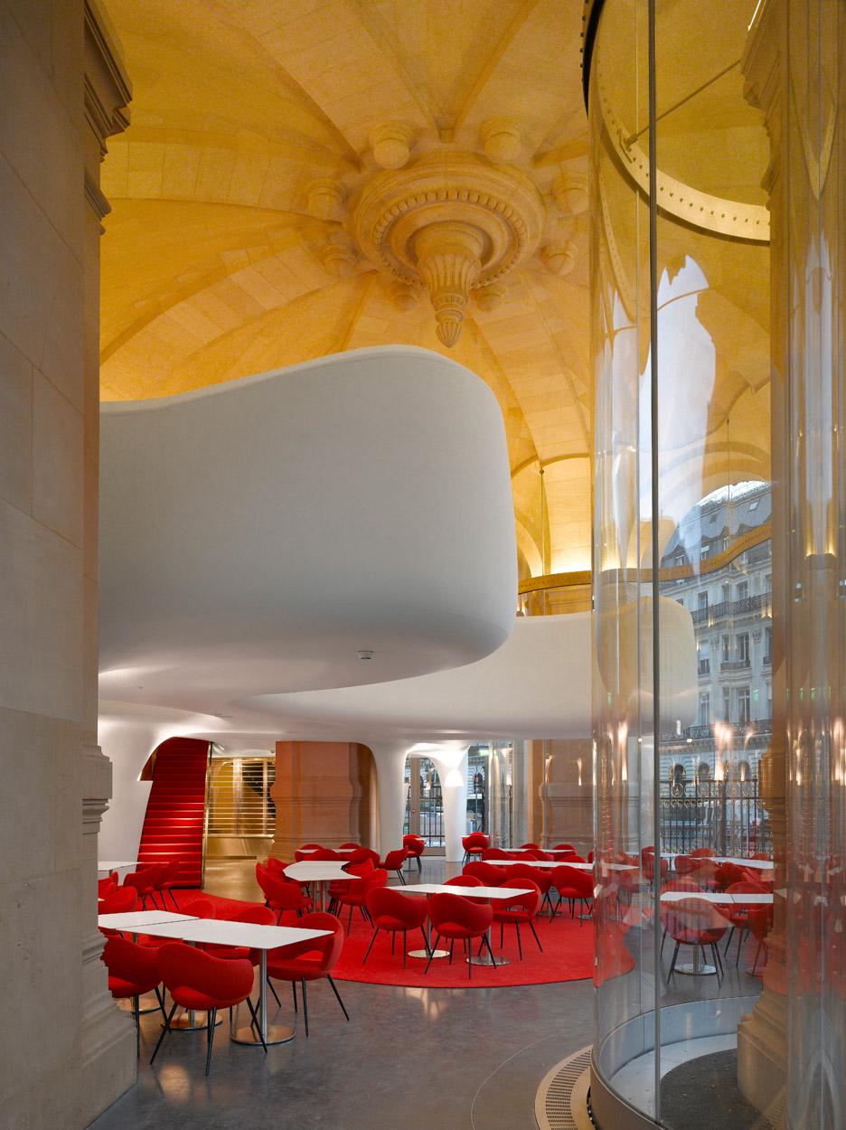
I like most of all her restaurant for the Opera Garnier. It’s Courrege-ian, sixties, disco, but also very contemporary. She tells the story of how because of French landmark regulations, she was only allowed to alter the floor. Still, she found a great solution.
I don’t know of any projects of hers in the US but I can’t help but imagine that some ambitious client will soon be unafraid of collaborating with this dynamic woman.
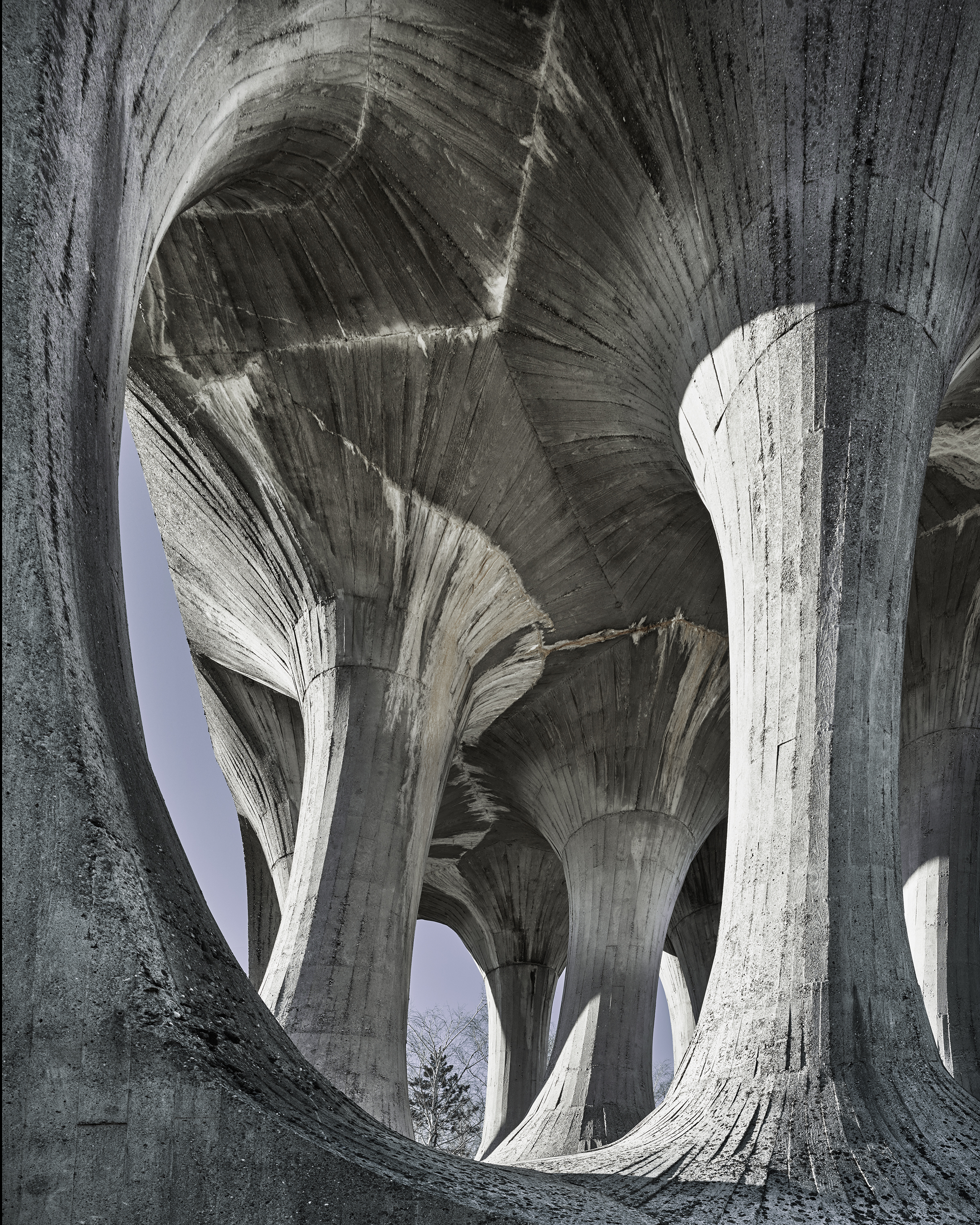
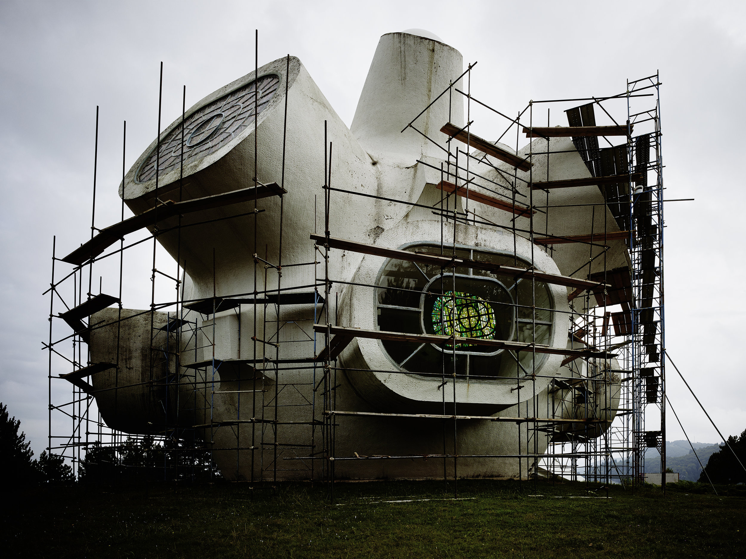
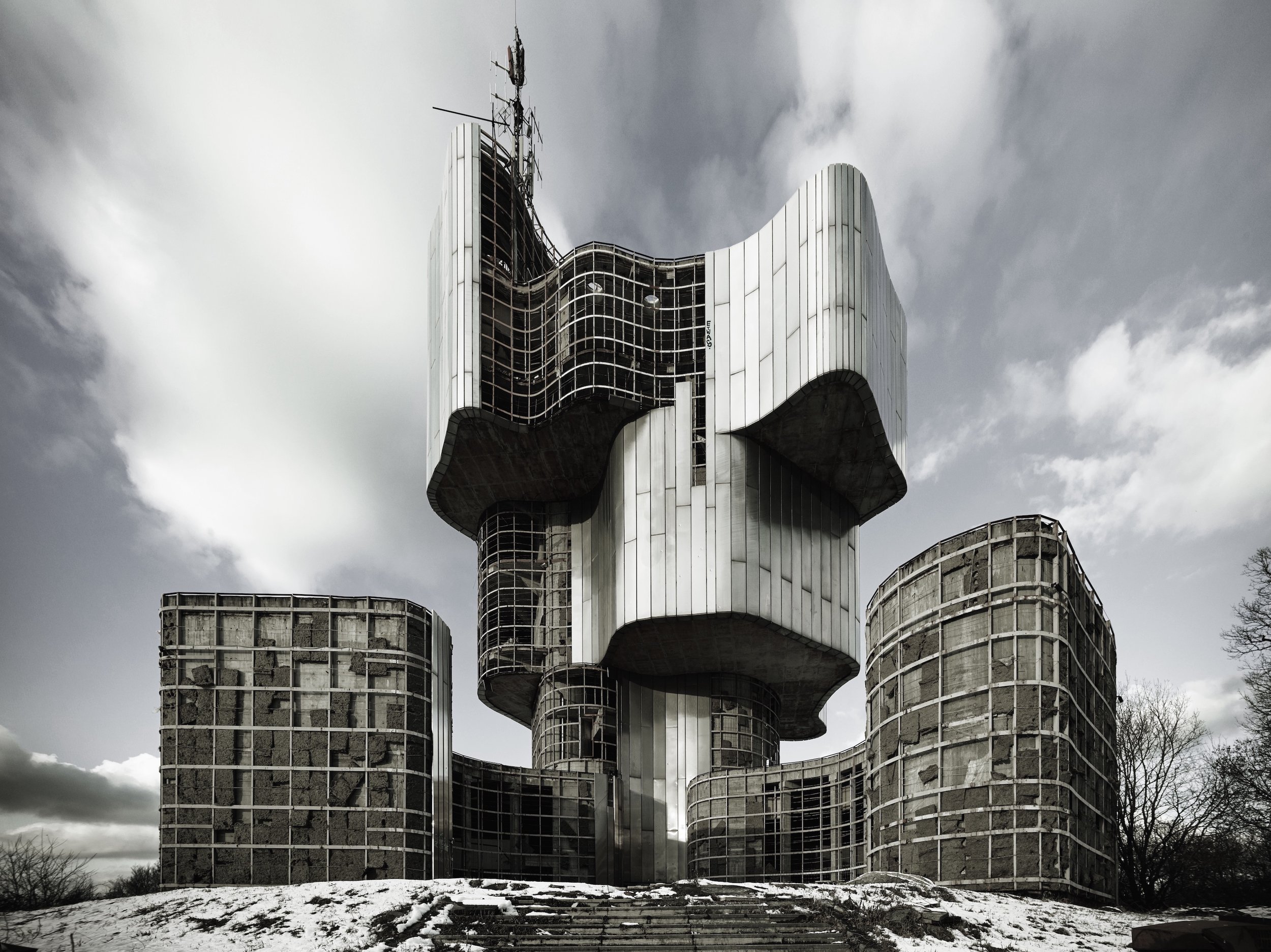
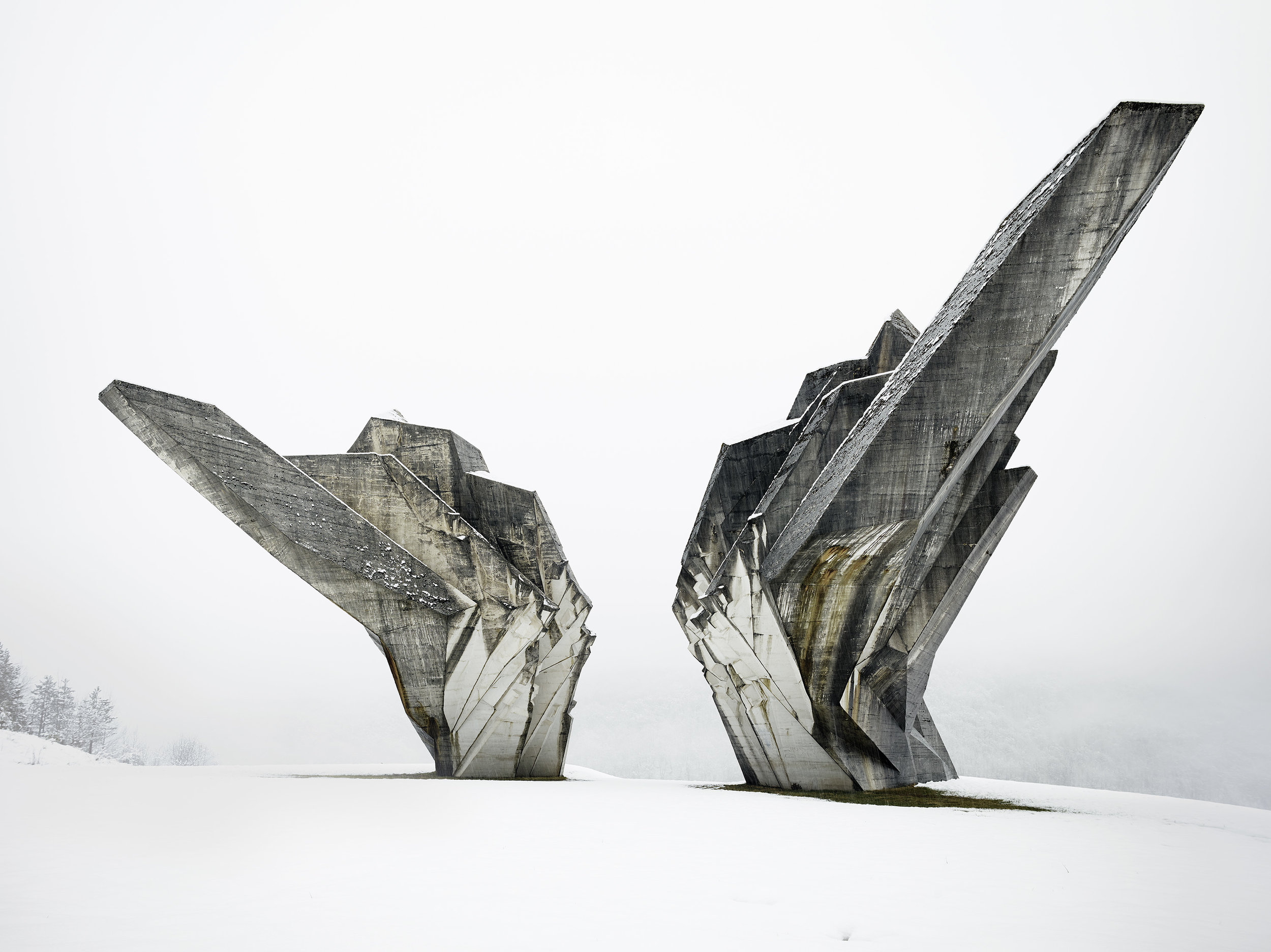
MoMA: Toward a Concrete Utopia: Architecture in Yugoslavia, 1948–1980
Alongside the fantastical Bodys Isak Kingelez exhibition in an adjacent gallery, MoMA has produced an architecture show Toward a Concrete Utopia of a very different sort, much more in keeping with their comprehensive Latin American show that Barry Bergdoll so deftly curated a few years ago. This is architecture that made a different kind of historical statement, and had everything to do with the post-war Eastern European socialist movements of the 1950s-1980’s.
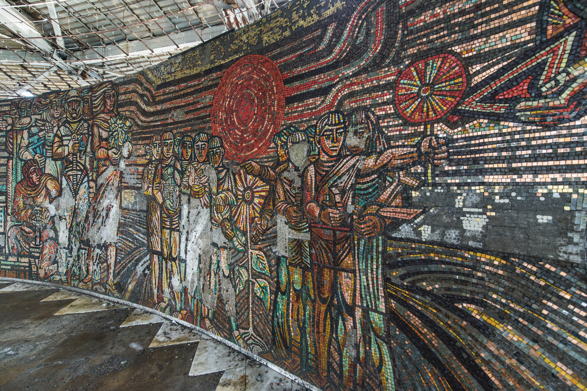
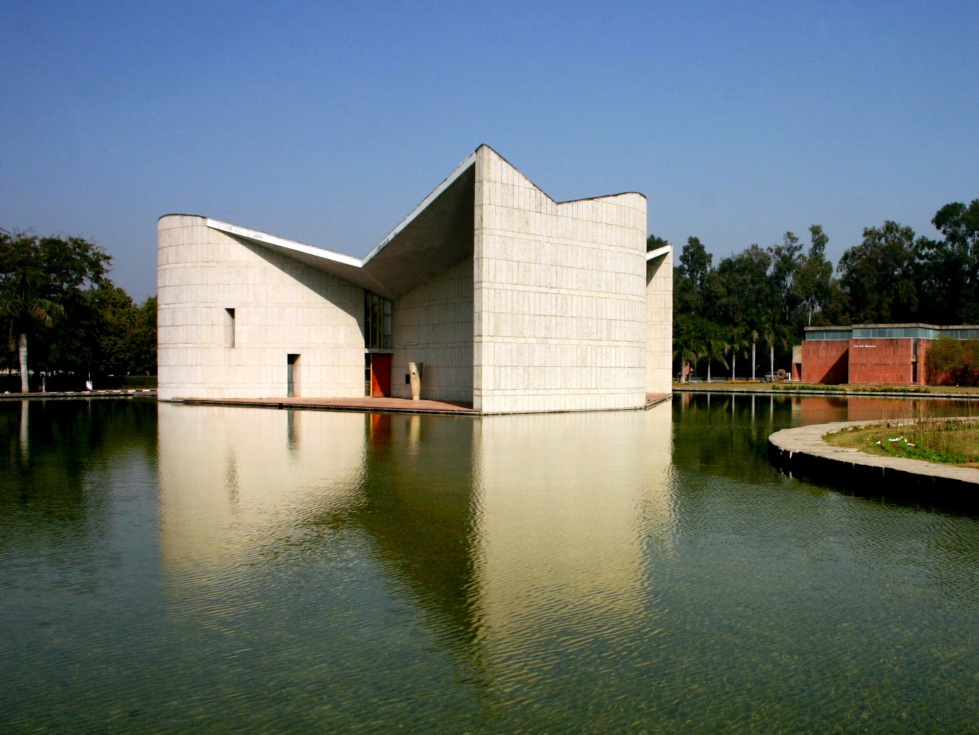
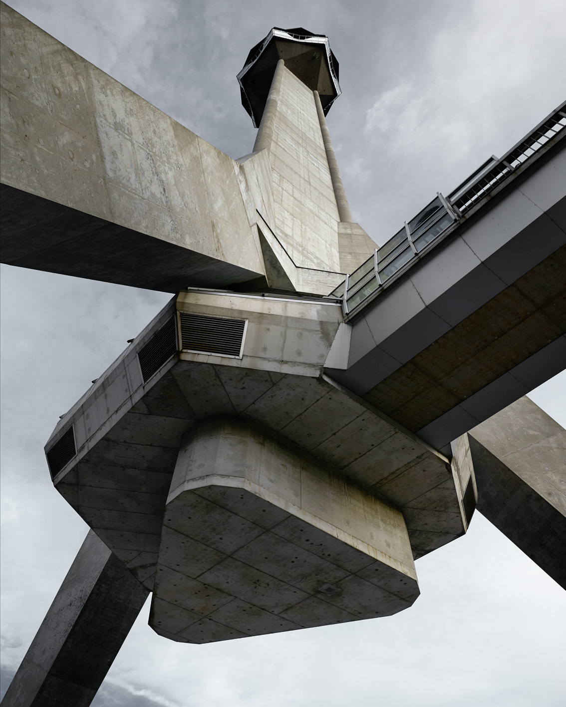
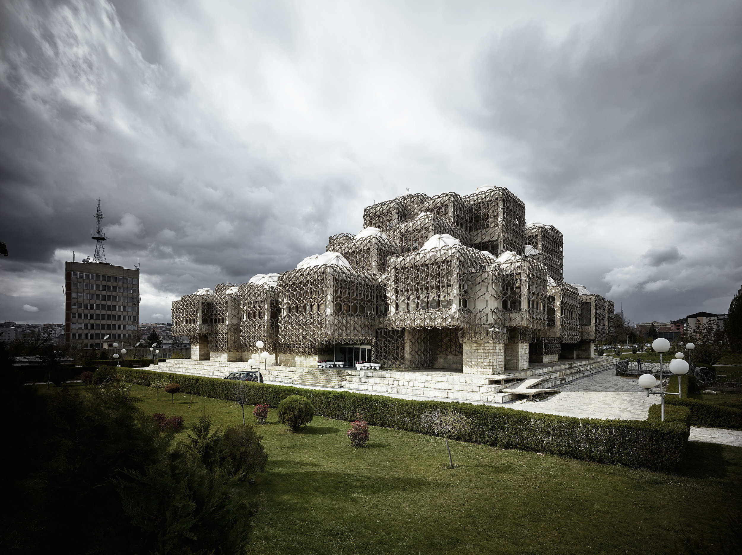
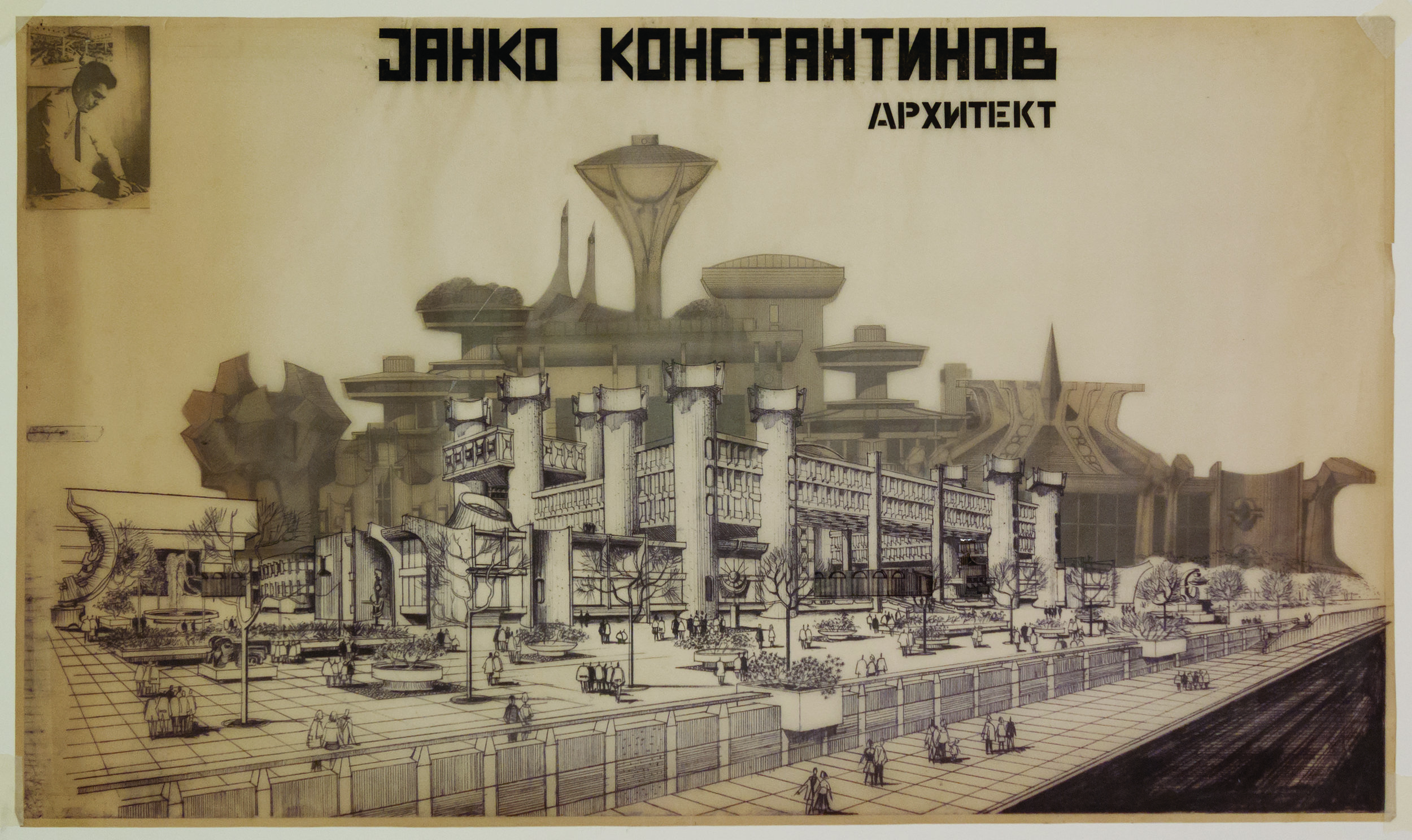
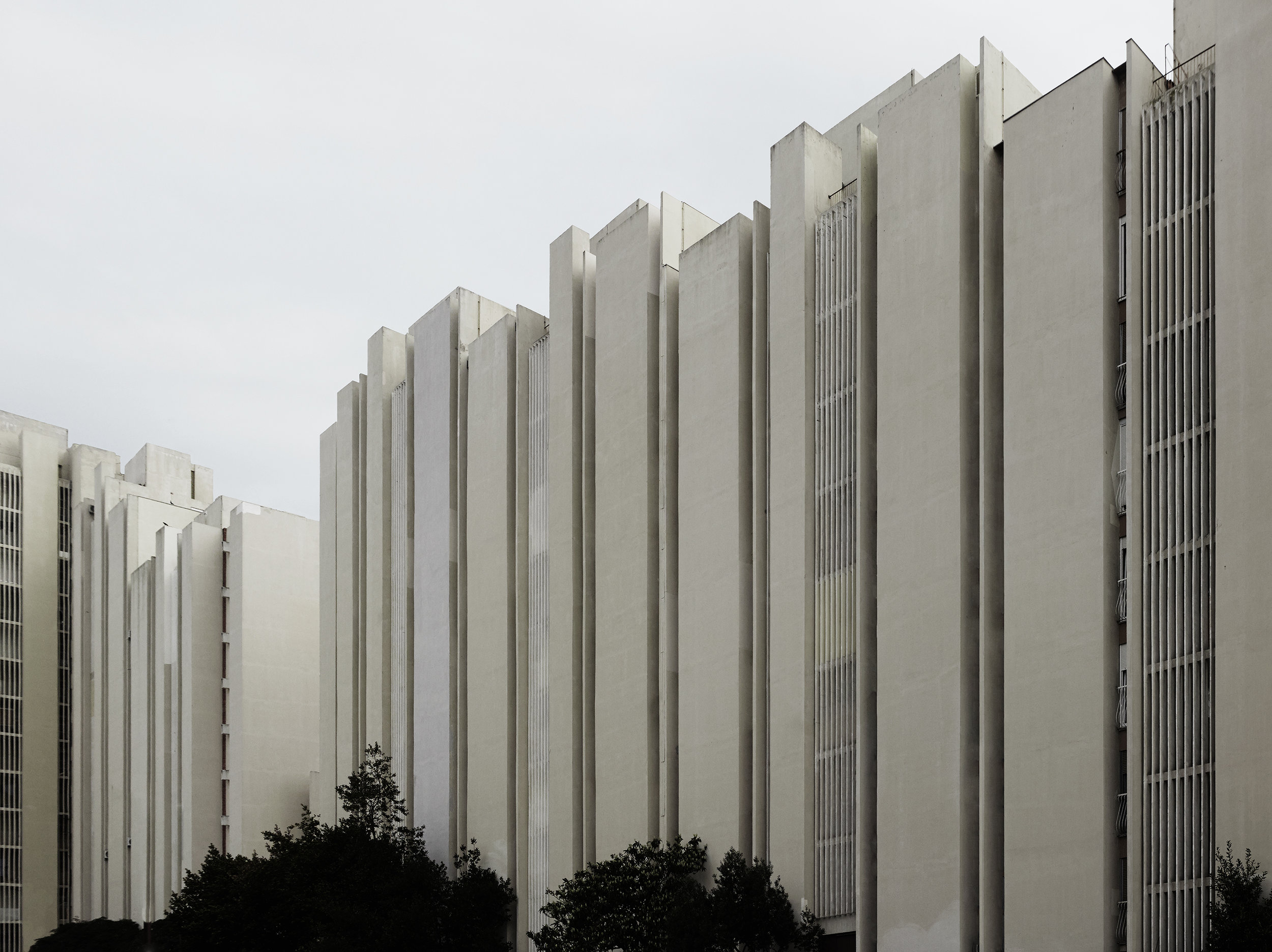
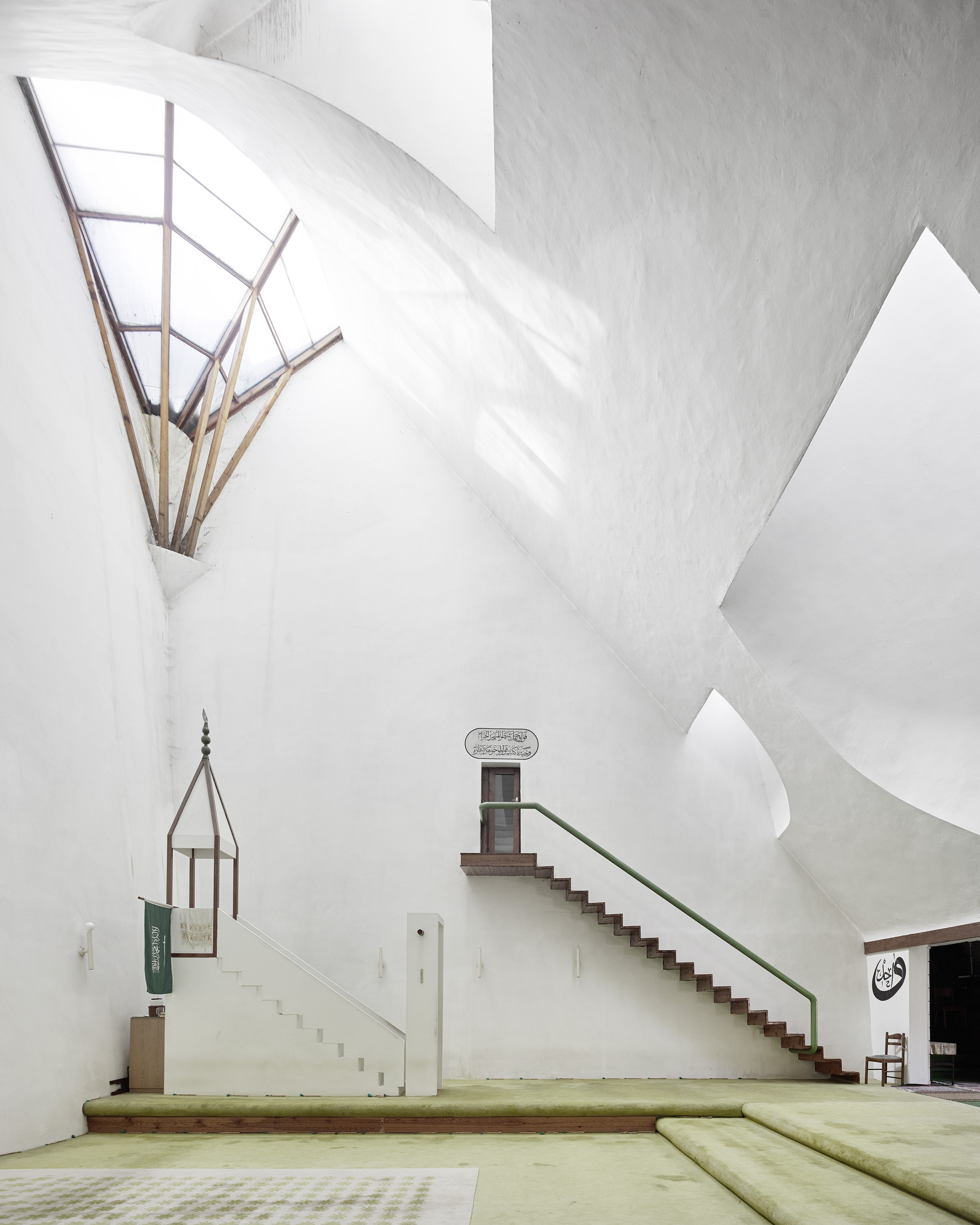
Yugoslav architecture? It doesn’t sound sexy. But it is! The more I look at Brutalist architecture the more I see the cragginess, the undulation and not the monolithic. And its monuments are apparently a great hit on social media. The images above may tell you why.
The architects will not be household names, but they were deeply influenced by people like Paul Rudolph and Kenzo Tange. This Brutalist ethic was in keeping with the desire for monumentality, permanence and commemoration that swept Eastern Europe at the time. This is a region that has gone back and forth from federation to separate nation-states --these buildings and monuments are the most permanent residue of the shape shifting.
Architecture as a symbol of utopia, dystopia or even myopia—all this is present in the exhibition.
I won’t be able to get to this show right away but I’m very interested in flagging it having plunged deeply into Communist era and mid-century architecture this year in neighboring Prague, Vienna, Berlin and previously in Cuba and Latin America and especially Mexico.
All images courtesy of the Museum of Modern Art.
Venice Architecture Biennale
My second visit to Venice for the Architecture Biennale was a one-Day extravaganza of thoughts about the world, and our human place in it.
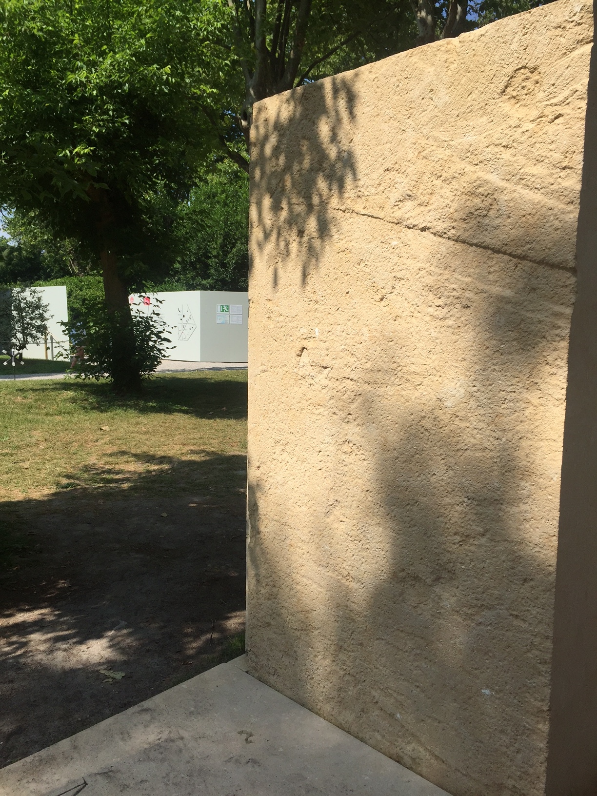
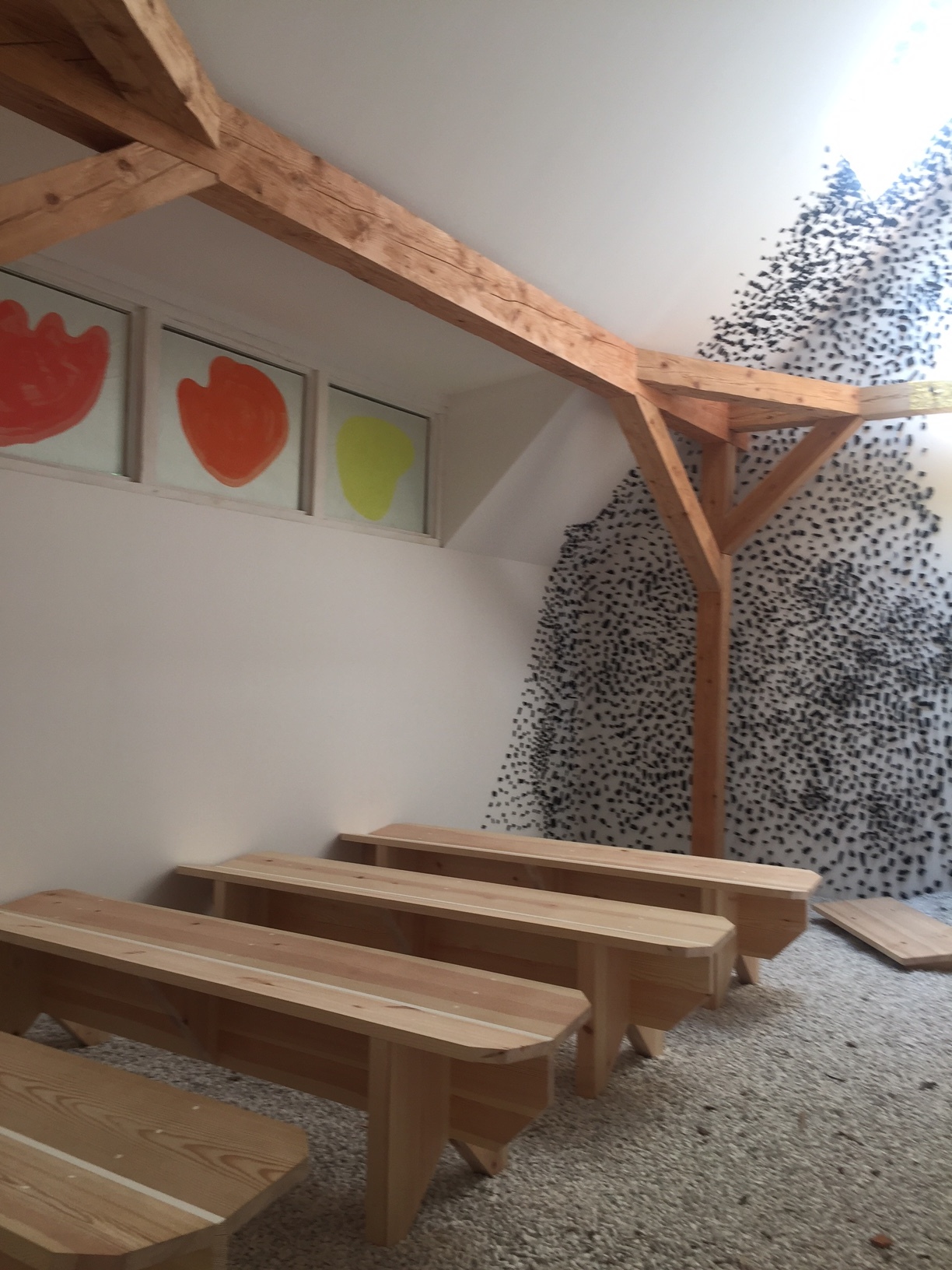
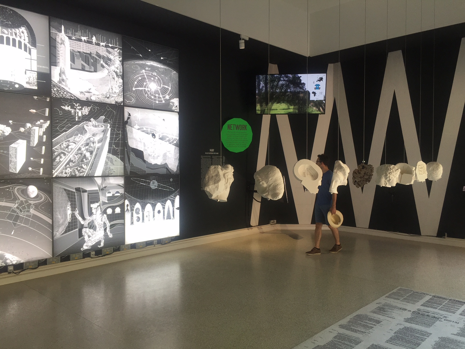
The curators-- Irish women (hooray) Yvonne Farrell and Shelley McNamara --made every attempt to encourage the national pavilion curators to hew to the theme of Freespace e.g., the role of walls/migration/identity/generosity and exchange and they did. It's a feast of thought experiments
My visit was timed with Trump sulking off from the G7 and meeting up with his bullying Korean counterpart in Singapore, a place where enforced cleanliness and comportment is the norm. No migrants landing there. The Singapore Pavilion defined free space "as a result of careful considerations in planning," and the celebration of "Place making through openness...and he creative freedom of the mind". I’m not sure the curators of this pavilion had the summit in mind
Architects therefore take up this challenge at their peril when governments themselves are rejecting the concept. And again, my constant complaint: architectural jargon is so off putting. Plain language is anathema to architects.
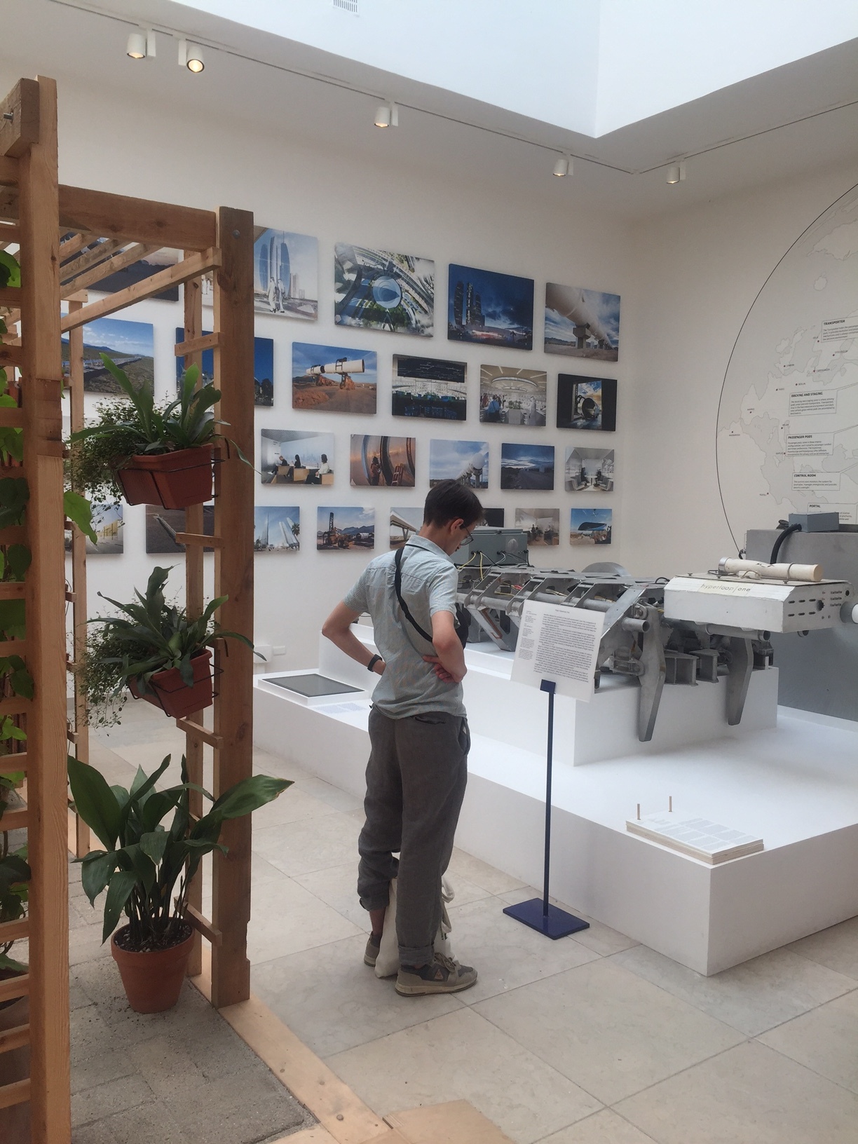
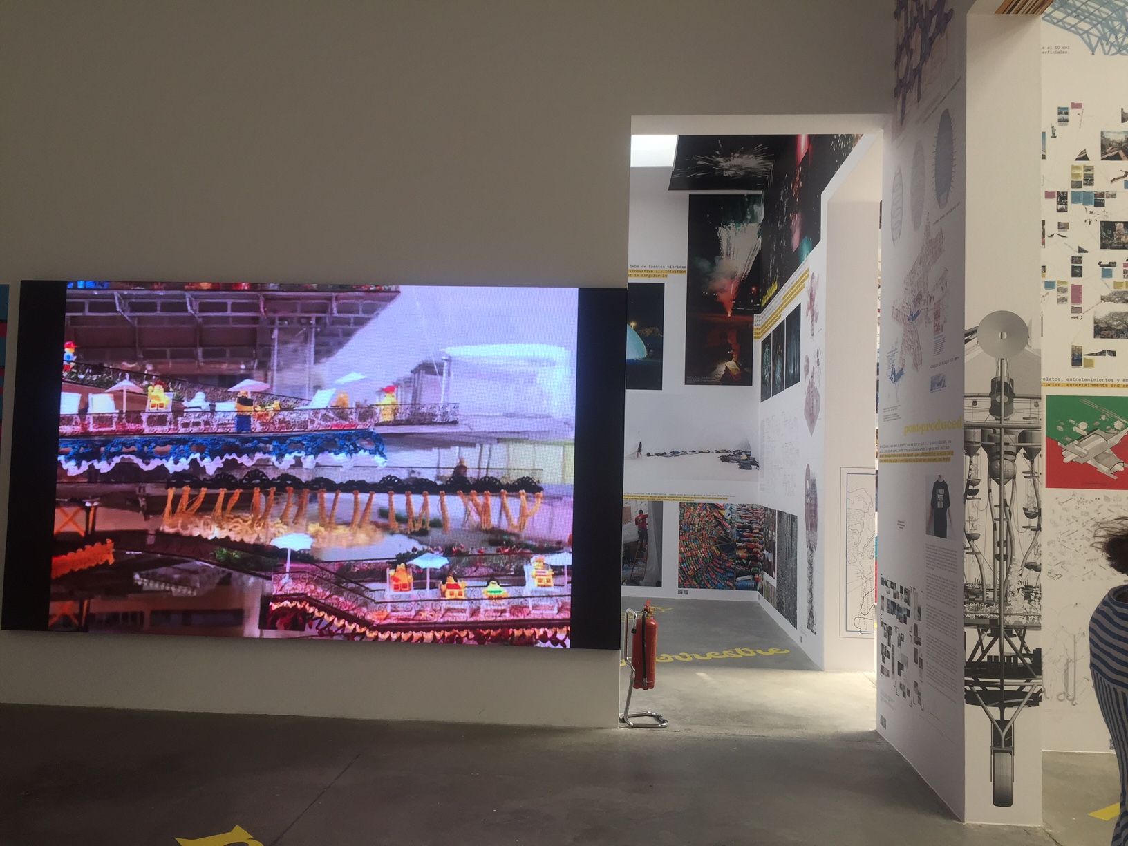
Still, they are optimists. They want to bring back abandoned spaces, repair the ones extant, take care, nurture. In no particular order some impressions:
The Swiss pavilion is white and empty, unfurnished --a house tour--and I'm afraid the pure intellectualism of this one passed me by. (They won the prize)
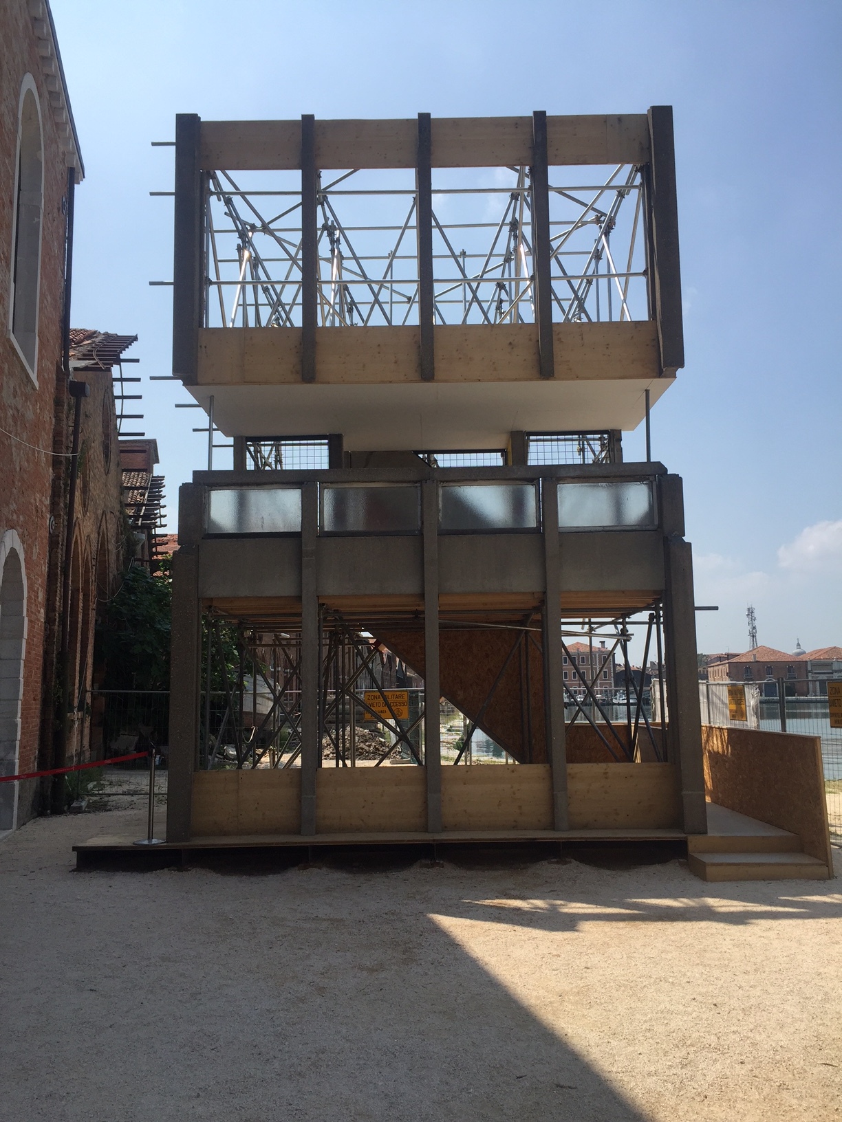
The British pavilion is also empty "an island" with exterior scaffolding, we are meant to construct our own environment, where the absence is the presence. Hmmm....
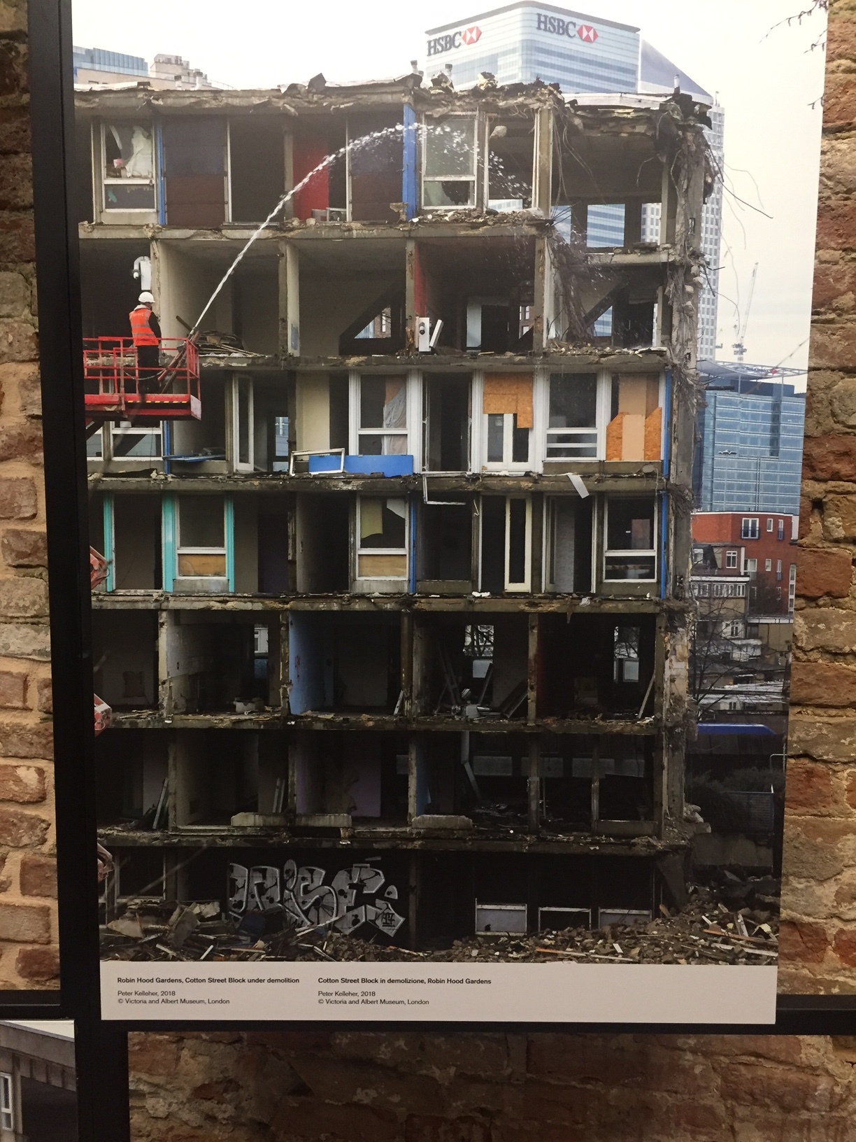
By contrast the V and A brought and reconstructed an entire section of the recently destroyed Robin Hood Gardens, the Smithson’s brutalist housing project which has already been partially torn down. This incited controversy--both in the tearing down and in the putting up on display--but as someone who has recently been softened by brutalist architecture I found it less a story of the type of architecture than the problem of low income housing in general.
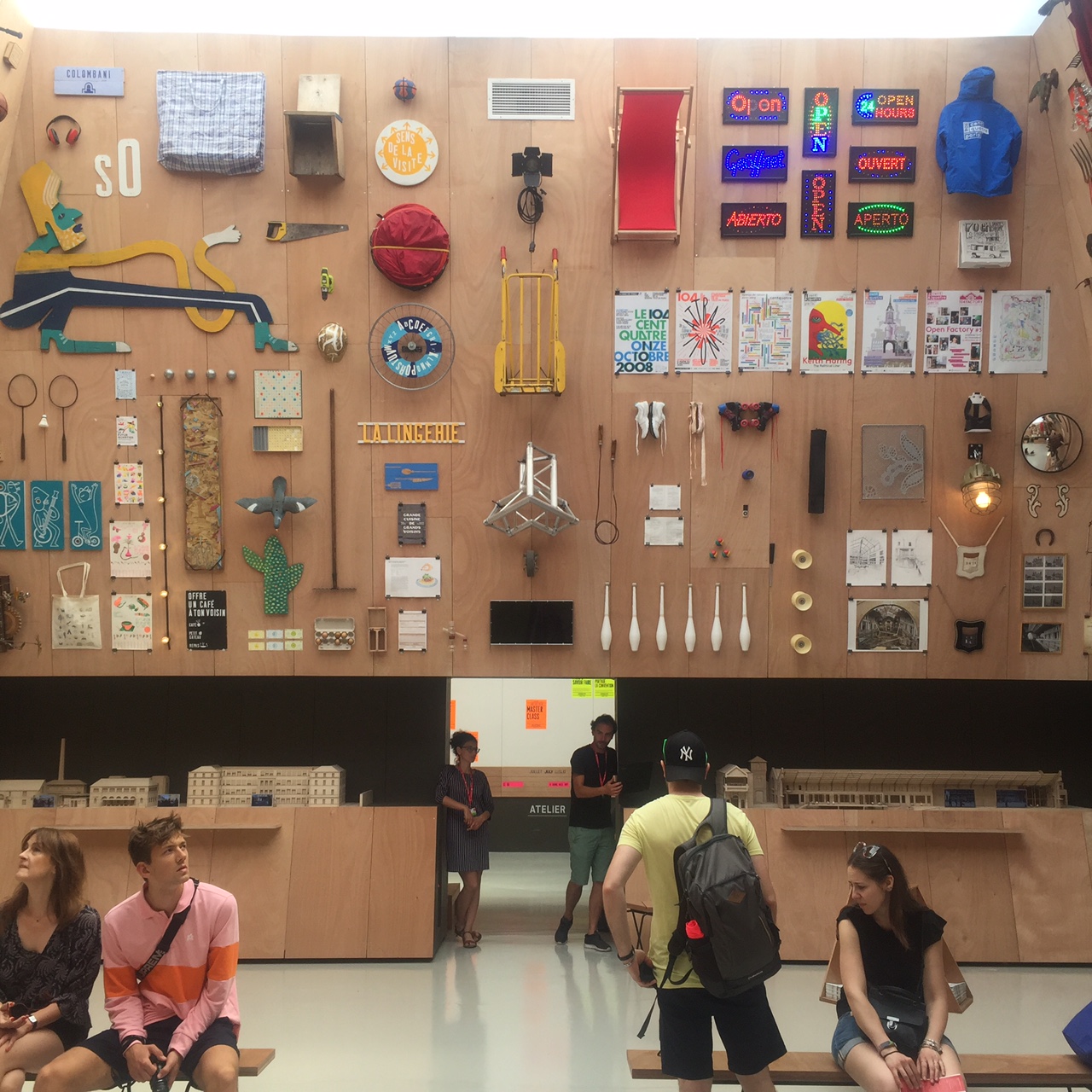
By contrast the French filled theirs up with the detritus of ten abandoned places and asked about reawakening inspiration, community and the stories of people who live in these places and what they would wish for. (It reminded me of Alejandro Innaritu's LACMA exhibition)
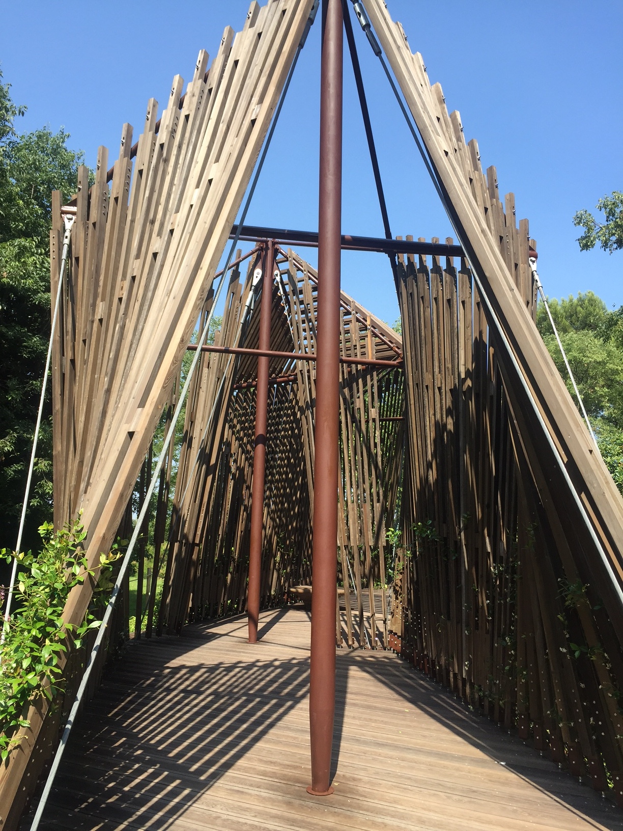
In the same vein, the Italians took up their abandoned villages and towns and suggested interventions. They also had a genius install of routes one might follow --more huts!-- to experience a strong local sense of place.
(In Italy, where just yesterday they turned away a boat of 600 plus --received by Spain though not after a day or two of drifting with no food or water--migrants you can understand that they feel it should not just be their problem. Yet like Syria, it's all of our problems.)
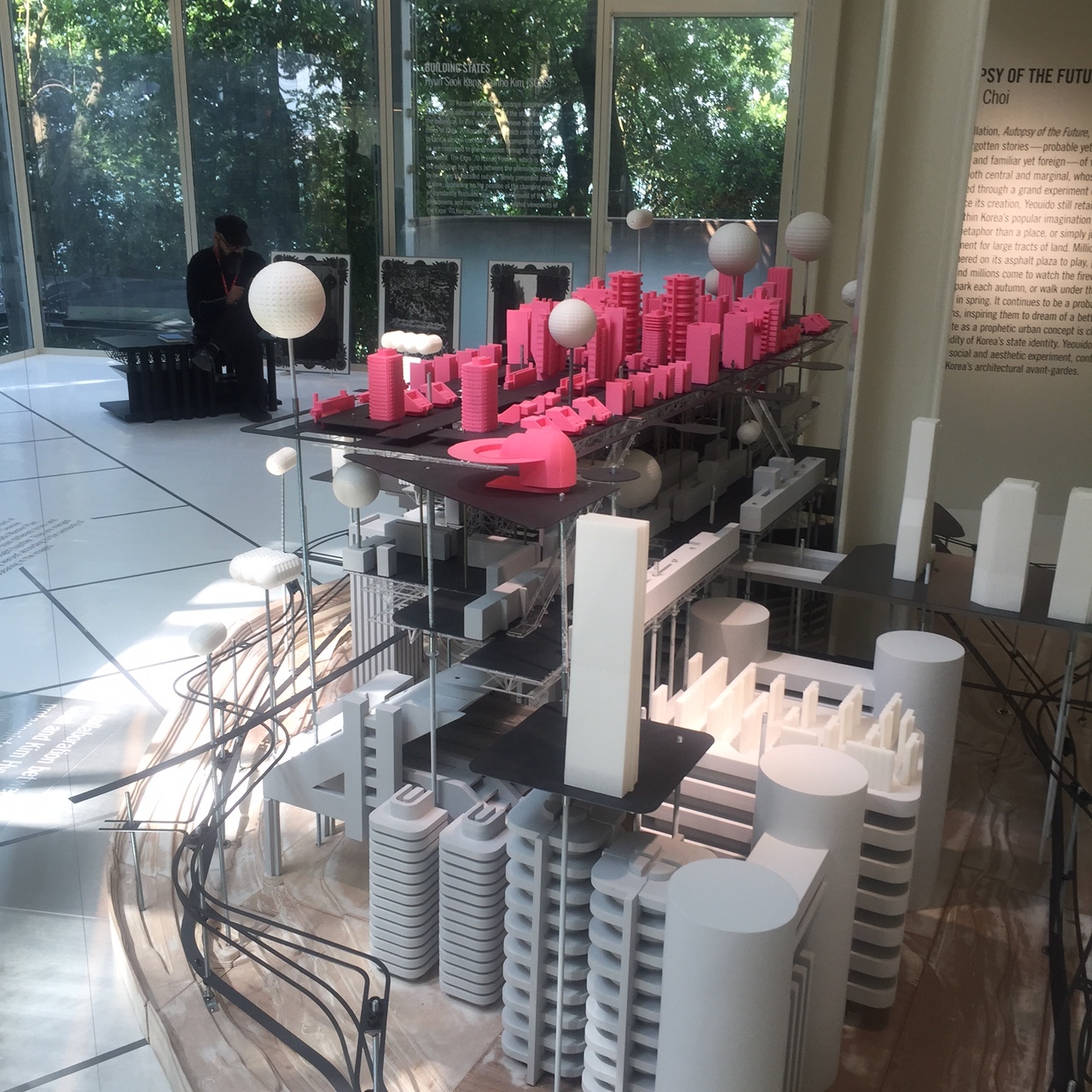
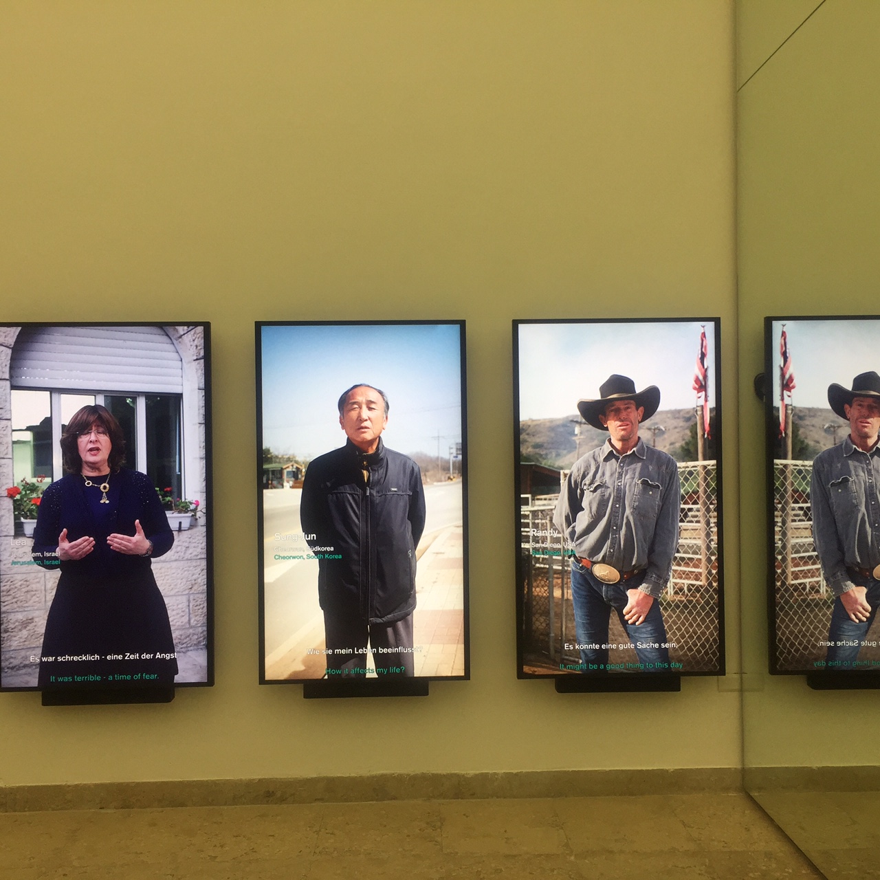
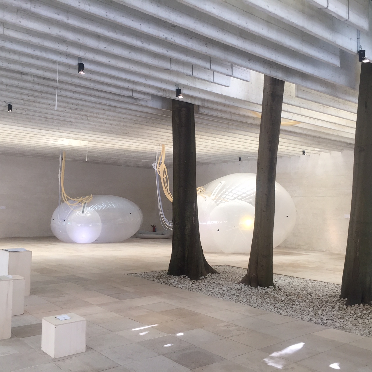
The Australians focused on grasslands and environmental repair. The Czech pavilion explored the absence of life in downtowns and livable cities, free housing, homelessness and Problems of tourism. The Hungarians on building a bridge. The Koreans on the relation of modernity to the state run projects since the sixties, the Germans again on their Wall (this icon of their history is the ultimate resource for freeing space), the Greeks on academic spaces, the Canadians on indigenous cultures, the Spaniards on 'becoming" or the future, the Danes on their newly opened architecture hub in Copenhagen.
Repressive governments were just as eager to put best foot forward as if ignoring their own un free space: Egypt, Saudi Arabia, and an exhibit of 100 towers by 100 architects outside the Arsenale venue were in direct contravention to the themes within the walls.
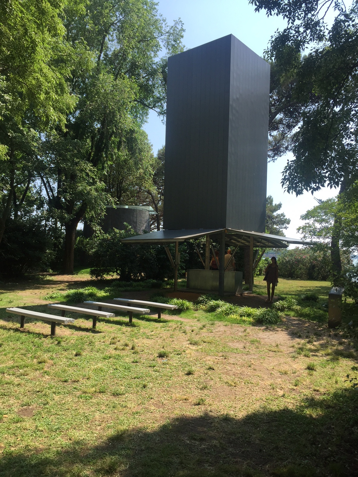
The Vatican has commissioned ten architects to build chapels on San Giorgio and wandering through these is uplifting, as the church has always counted on its architecture to be. Religions are probably the largest patron of projects since time began.
The US pavilion was a bit of a hodgepodge of projects about good citizenship by some famous and not so famous architects, I felt keenly that its discursiveness worked against the themes that some of the other pavilions took up with more single mindedness. Sometimes our democracy can be too much of a good thing.
Small towns, town squares, better housing, back to the future, these themes are not new. What is new is the fact that governments are veering away from inclusiveness, and are responding to fear, and keeping people out, not welcoming them in.
Architects are not expected to have all the solutions. They are rarely given enough money to see their visions through and are utopian by definition. One leaves the Biennial venues with equal measures of hope and despair.
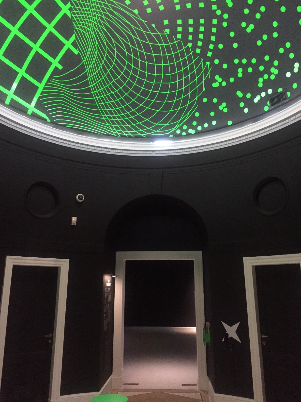
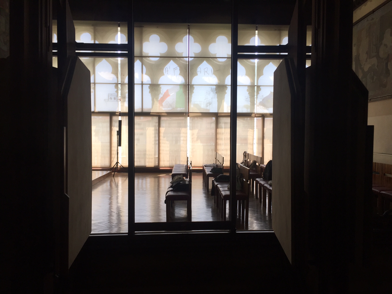
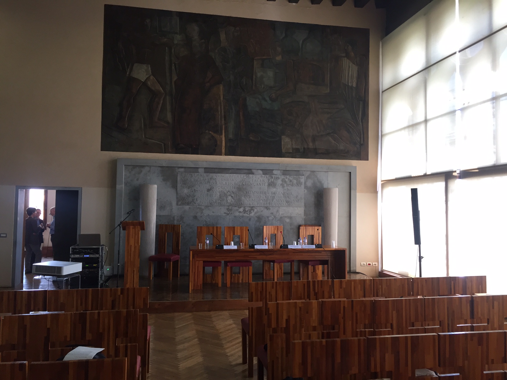
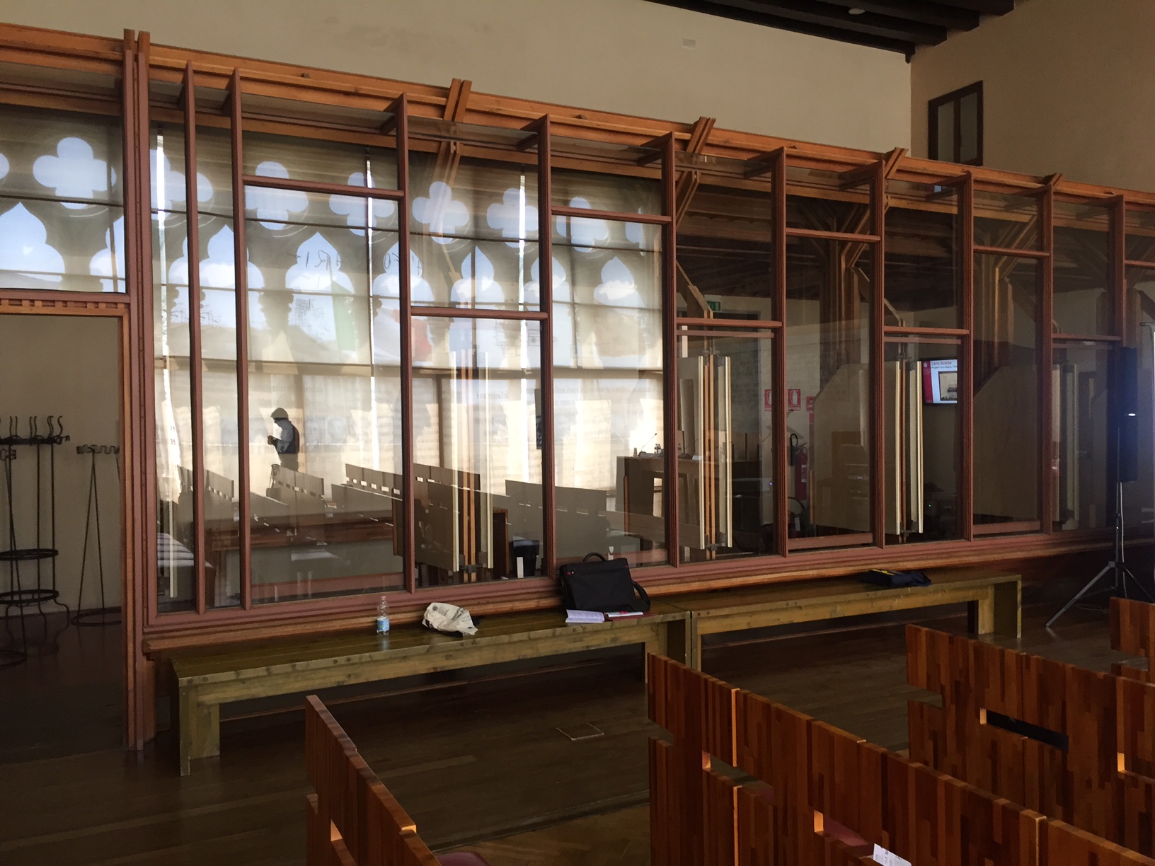
Carlo Scarpa room at the Ca Foscari public university in Venice
After three tries, I finally was able to get into the famous Carlo Scarpa room at the Ca Foscari public university in Venice.
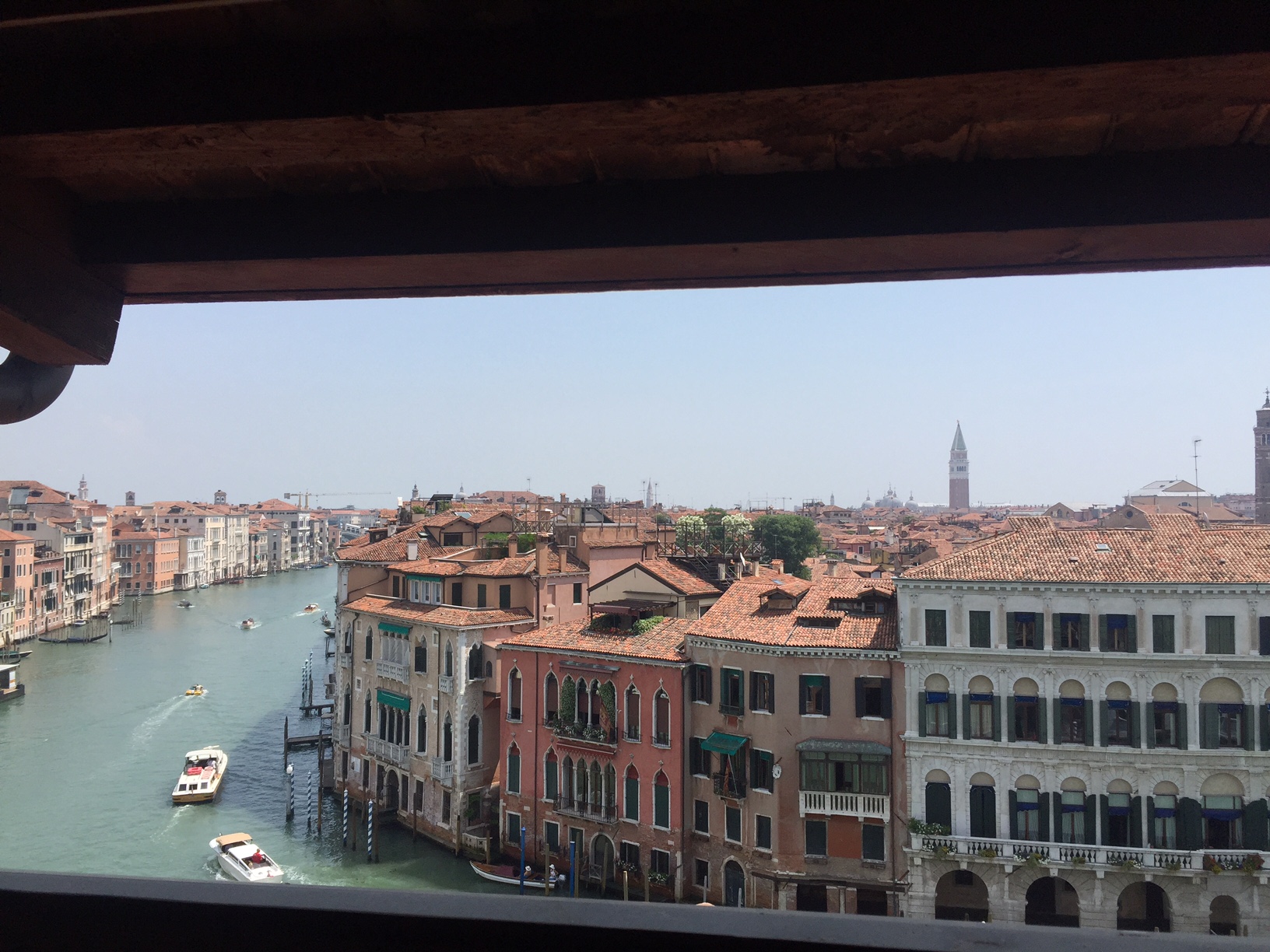
This university seems a wonderful environment with this once in a lifetime situated campus and I was told it has excellent faculty and courses which can be had for a quarter the price of American universities.
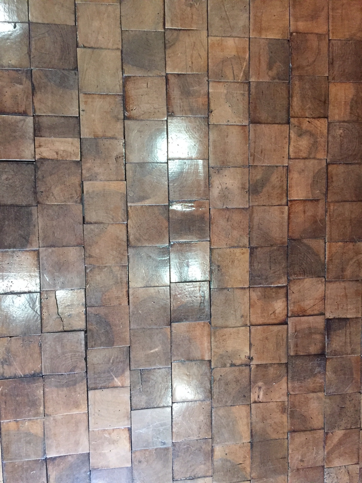
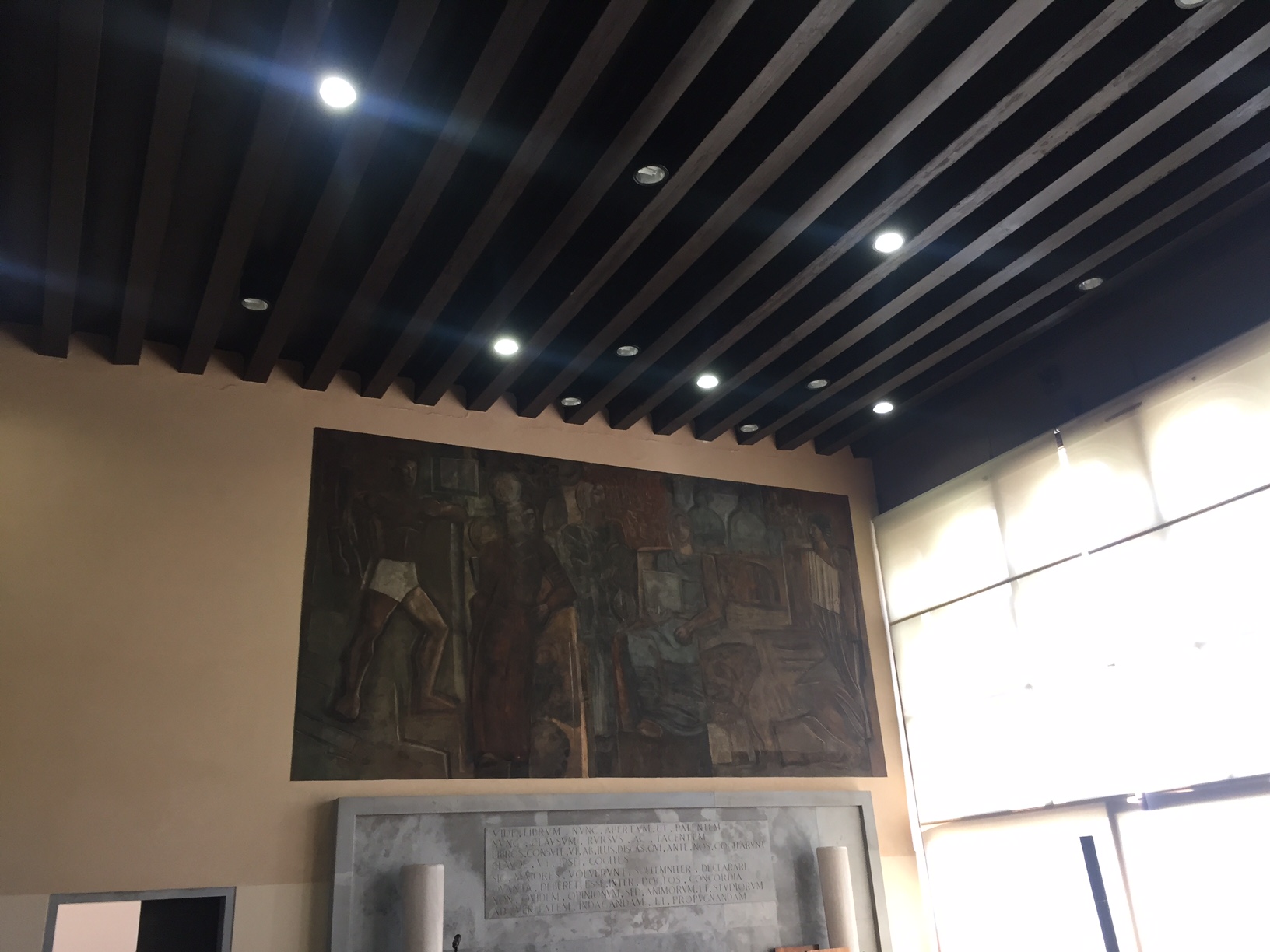
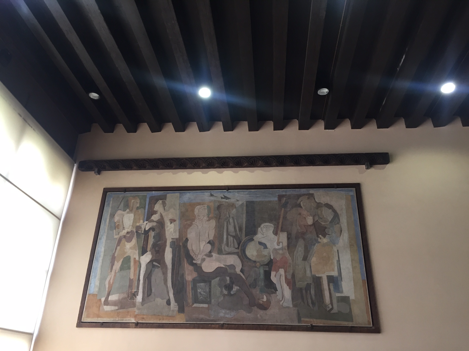
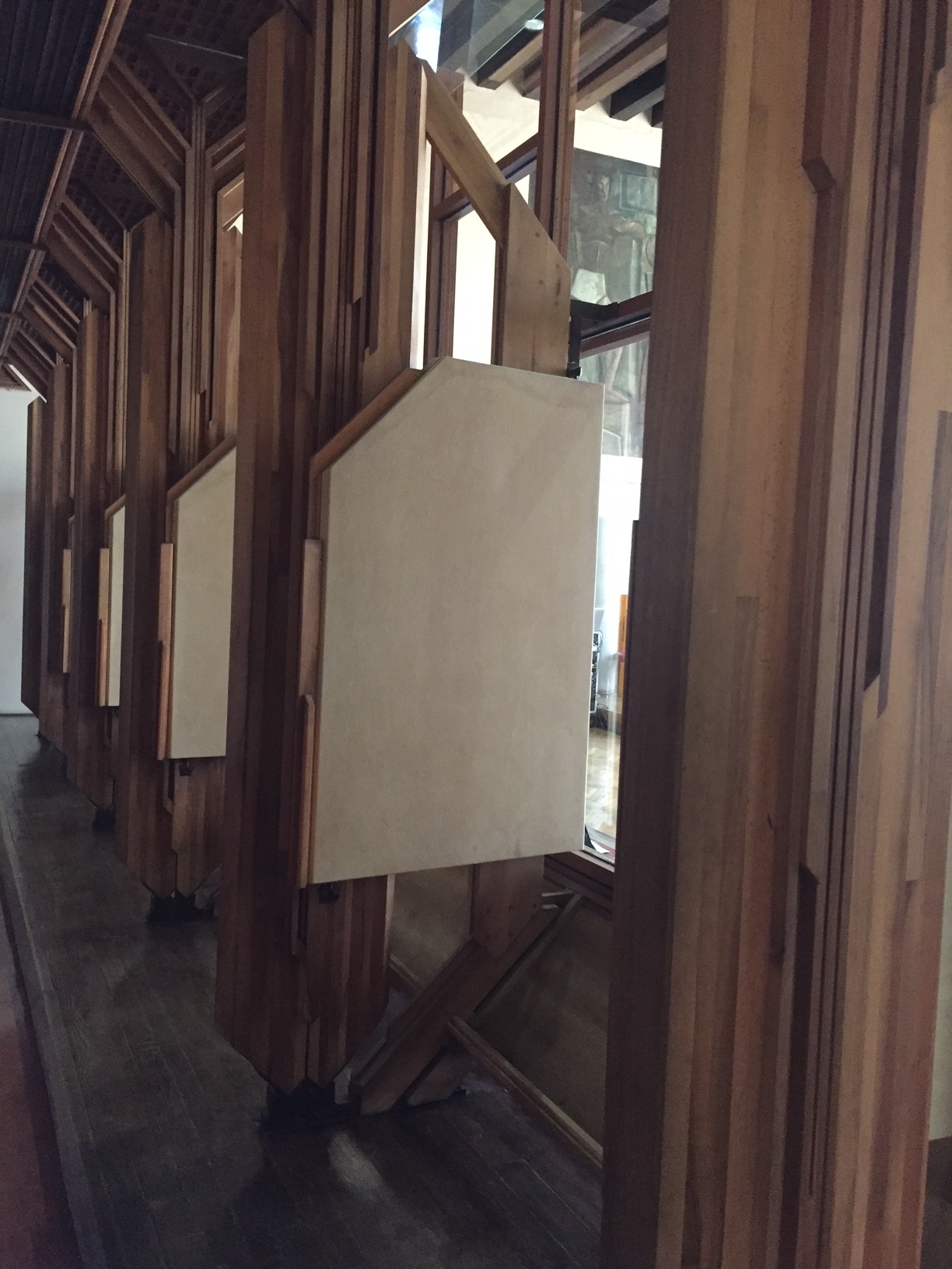
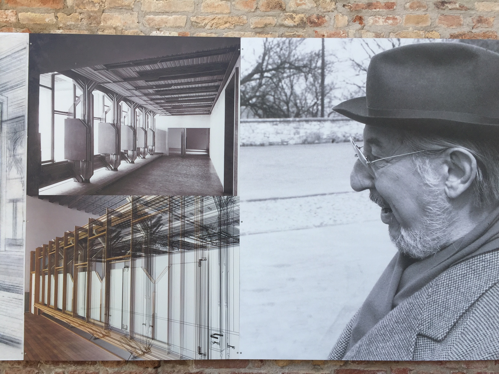
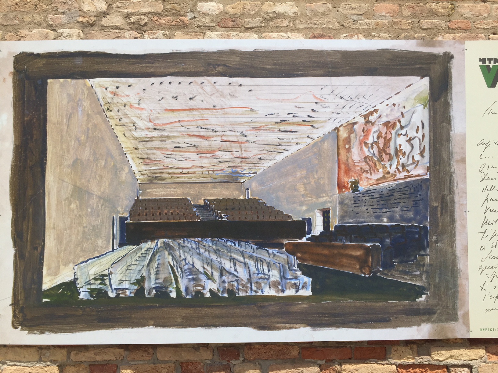
In addition, it holds a rare Scarpa room which he designed for lectures including the chairs, the dais with its removable tile floor,, the folding window screens and wood fretted ceiling. Having done the Scarpa route outside Venice on one of my last trips, this was the excellent dessert. There is a tour which is given and I recommend it as my way of getting upstairs was entirely too random and complicated.
