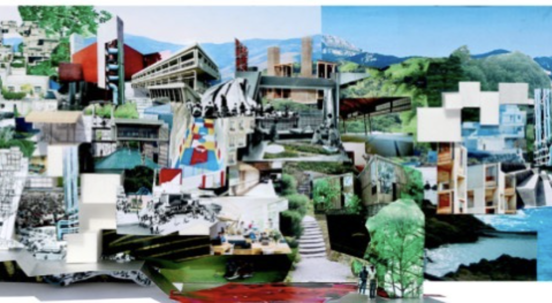
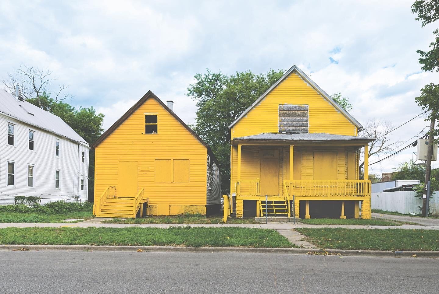
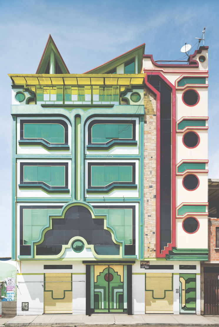
The Mexican architect Tatiana Bilbao doesn’t have a signature building style that’s instantly recognizable. She’s not a top-down diva who designs grand sculptural statements by computer. Instead, Bilbao is singularly engaged with how the world is made and how people interact with her projects. Thriving on input, she prioritizes listening, documenting, and collaborating, a process that begins with her handmade, collaged drawings, which are, she says, “the first sentence in a conversation about architecture.” Bilbao’s egalitarian approach—a change in the traditional paradigm—is winning notice. “Architecture from Outside In,” an exhibition on Bilbao opening today at the San Francisco Museum of Modern Art, features her expansive concept for a Hunters Point master plan.
In schemes with her Tatiana Bilbao Estudio—a botanical garden, government housing, a pilgrimage route, a church, a monastery, a skyscraper “village,” an aquarium, even something as simple but urgent as a safe passage through a dangerous urban park—Bilbao has imported her ideology of inclusion, privileging local elements in novel ways and making the projects themselves agents of change and community.
Bilbao prefers to have a seat at a table, where she actually wants to be challenged. In the SFMoMA gallery, visitors will be encouraged to pause, discuss, and question what they’re seeing. “It’s the moment we’re living in. If we don’t open our voices to other channels, we will get nowhere,” she says. In her work, Bilbao has come up against crime, tornadoes, apathy, and corruption. But she is patient, routinely visiting the inhabitants of her housing projects to get feedback, and wishing every project could emulate her botanical garden, where she has been able to return—to tinker. “I don’t have the answers,” she has said. “I just have the questions.”
Rome Bucket List, Part 1
Bucket list: Rome
The Maxxi Museum, home to some of my favorite architecture and design exhibitions over the years, has a double whammy in store. Today they open the Giacomo Balla house in Rome, Casa Balla, with an ancillary exhibition curated by Domitilla Dardi on its importance at the museum itself.
For those who are fans of Futurism (and few aren't), this is a red letter day.
I’m always taken with artist’s homes (see my recent posts on Lee Miller, Barbara Hepworth and forthcoming on Leonora Carrington) which are generally my go-to sites when traveling. They tell tales about artists that exhibitions cannot: the cup and saucer by the sink, the books in the library, the bedroom where the late nights or early mornings brought inspiration or, sometimes, despair.
Balla was surrounded by talented women: his wife Elisa, his two daughters Luce and Elica. Their spirit is also present. Like Charleston House in England, the home to the Bloomsbury group, the house is a 'gesamtkunstwerk", a deep, family, dive into all aspects of Balla's futurist theories and artifacts. These ideas about the future are made solid in collaborations with tapestry, drawings, sketches, furniture and furnishings. Of course a Balla painting for me is still the ultimate, but now we have a way of understanding the application to the decorative and domestic arts.
Contemporary artists are also in dialogue with Balla at at the museum but I am especially looking forward to seeing the companion film of Beka and Lemoine which investigates the house from their own perspective. You can get info at the Maxxi site www.maxxi.art - info (please, Italy, open!)
Image courtesy Maxxi Museum
Thom and Jones Meet USC
USC has archived architectural photographer Wayne Thom's vast collection of a decades-long career as the go to photographer for many California late modernist architecture and other international projects. Thom fell into architectural photography via his brother, an architect, and documented the late wave of glass and white brutality that became the aesthetic during the 70s.
The Annenberg School of Communications by A. Quincy Jones (1974-9) now houses other student services and there's a new building for the Communications school. But it's a fabulous building as seen here via Thom in its vintage iteration. I still haven't gotten down to Sunnylands, Jones's other masterpiece for Walter Annenberg, his home in Palm Springs.
Jones was a brilliant, particularly Southern Californian architect but who made that specific design aesthetic ethic every bit as international as his confreres in modernist Europe.
Image by Wayne Thom courtesy USC Digital Archives.
Radical Architecture of the Future
In times like these, when the very citadels of power, classic structures that represent endurance and impermeability are breached (see, the reality show the Capitol), it is hard to imagine what buildings, or indeed the built environment can do to save us.
@beatricegalilee, a former Metropolitan Museum curator, current doyenne of @TheWorldAround summit coming next week at the @Guggenheim (where there is already @rem.koolhaas's around-the-ramps nod to similar questions of rebirth and durability, Countryside) takes a stab at figuring all this out in her new uber compendium, Radical Architecture of the Future from @phaidonsnaps. Grazing as Koolhaas does over film, installations journalism, apps, and VR, the book is a good primer into what architects, designers, filmmakers and researchers are or have been thinking about. In highlighting 79 completed projects by visionaries, insiders, radicals, breakthroughs and masterminds, she aims to give an overview of possibilities. Though I've seen many of the projects before at various design fairs and biennials and written about some, it's great fun to see the aggregate of what these geniuses have been getting up to.
Cross disciplinary thinking is now endemic to all professions not just design and architecture (hello: writers, poets, filmmakers, tech gurus, health and wellness guides), but a building or a street has more 'there-there' than most other fields, a permanence that gives the work of these creators a life span that many other fields just cannot claim. (However: I saw the @marchingcobrasofny in their last performance in NY. This is my kind of radical architecture. And @unnoficialkazuyosejima's yellow commuter train! And @BekaLemoine’s original films)
Once upon a time I was a devotee of Superstudio whose radical thinking is eerily similar to projects in this book. These hip Italian iconoclasts were already warning us to be prepared to give up our washing machines and jewelry in the sixties, to live on a grid but off the grid, to find love and happiness without possessions in a new communal, environmentally conscious way. Sixty years later, we are still trying to figure this out.
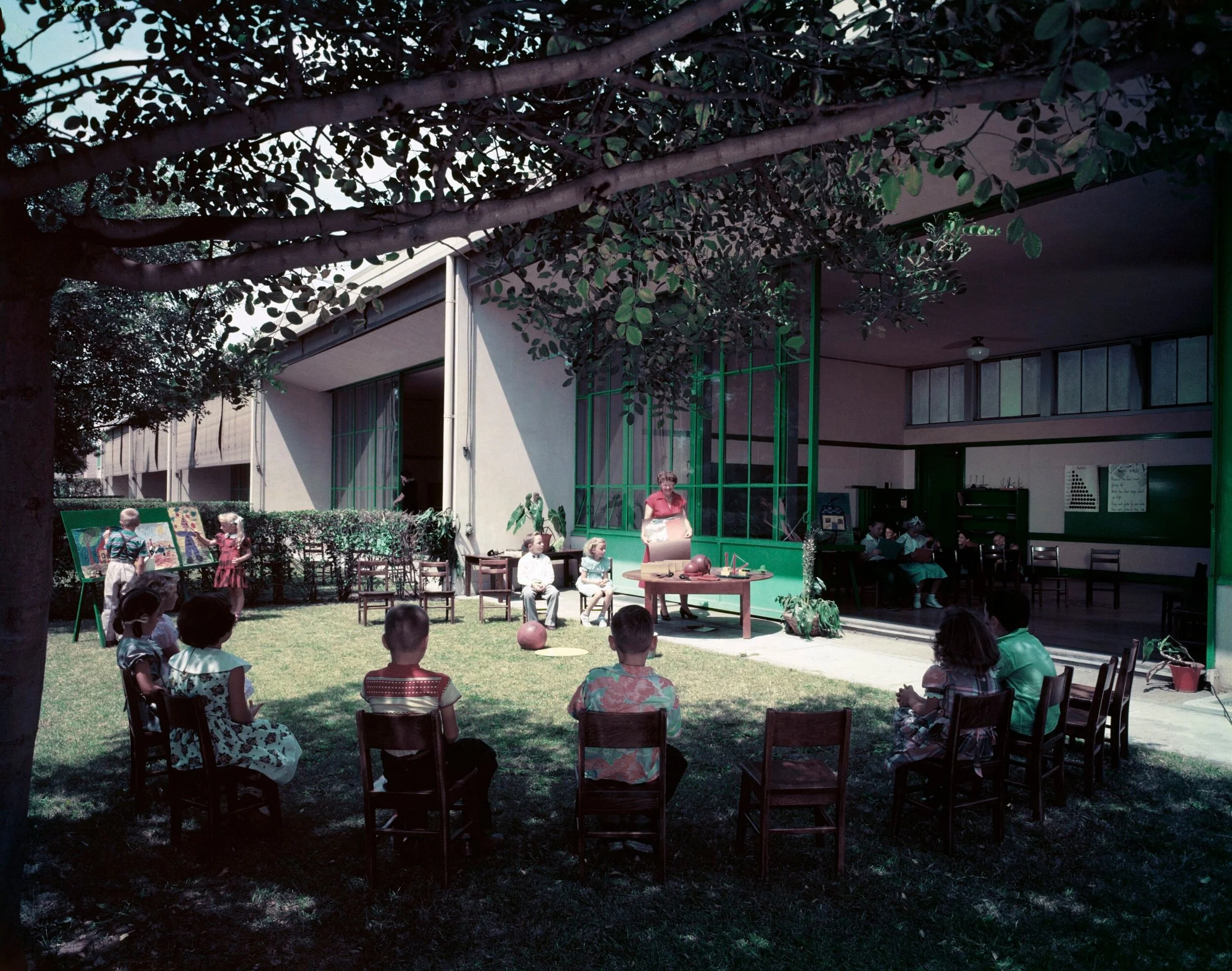
Richard Neutra
Julius Shulman © J. Paul Getty Trust. Getty Research Institute, Los Angeles
Richard Neutra, the Viennese architect who became the storied emigre to Los Angeles did not just design fab Palm Springs houses for the likes of Edgar Kaufman Jr (now on the market for 25 million), he also thought about the education of young children, and what suited them best. (When Neutra's LA office eventually closed, there was a tag sale. I hurried and bought two keepsakes: a map, and the office radio which I like to imagine Neutra tuning to Mozart)
Now that the subject of elementary schooling is writ large during the pandemic as distance learning is very challenging for the young'ns, Neutra's LA Corona Avenue School, here represented in an image by architectural photographer Julius Shulman in 1953, is more than prescient. It followed in the steps of open air schools in Germany, France and throughout Europe designed at first for tubercular and ill children, but then adopted as a healthy way of pedagogy. (see images in the thirties of the Ecole de Suresnes in France above)
In LA of course, the absence of cold weather eventually made these designs more ubiquitous but the large sliding glass doors which were also featured in Neutra's (and Eames et al) domestic architecture brought the outside in and were adopted in less temperate climates.
I look to the current generation of forward thinking architects to revisit some of these buildings and see if they can figure out how to keep children safe, while learning and socializing with their pals during these most challenging times.
Alvar Aalto at ADFF
This year's Architecture & Design Film Festival, beginning on the 19th, is filled with goodies and I urge you to get a series pass. A film about Alvar Aalto is eye opening. First for the insiders view of many of the 200 projects he did internationally, but secondly for the look at the man and his wives (there were two) who were instrumental to his practice.
In a trip I took to Finland some years ago, I was able to see a number of the Helsinki projects--the grand Finlandia Hall with its late period white aesthetic, the National Pension Institution with its doorless elevators and step down library, his cozy home, the Modern Library and then outside the Paimio Sanitorium which some consider his finest work.
But I had not seen most of the projects further north, and in Germany and especially one house for a French art collector the Maison Carre which looks sublime and his many churches, schools and municipal buildings, MIT and a room at the UN--all this and more is on offer in this very warm and wonderful film.
Of course his furniture, which was once the most successful modern line sold around the world is still coveted for its clean lines and its wood aesthetic. The hanging lamps are especially pleasing, all handcrafted.
I was not aware that towards the end of his life, Aalto was reviled in Finland for his capitalist projects, his wartime flirtation with Germany, and among friends, his alcoholism. Aalto, whose charm, erotic approach to life and work, bonhomie, and huge success attracting important clients (Laurence Rockefeller a steadfast patron) was a falling down drunk at times. Nonetheless, his body of work is consistently superior.
Tokyo Ride
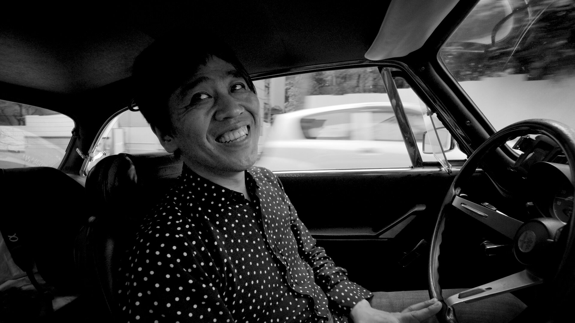
The film, Tokyo Ride, part of this year's Architecture & Design Film Festival begins in a rainstorm. Ryue Nishizawa-half of the Pritzker winning architectural duo SANAA- picks up filmmakers @bekalemoine (whose architecture films are in MoMA's collection) and after apologies for surprising the camera on him so soon, they begin a ride around Tokyo in Nishizawa's beloved Alfa Romeo whom he affectionately calls Giulia. And so begins a Cinema Verite, Nouvelle Vague-esque ride. It's utterly charming.
With a dour face that breaks into a smile, a Beatles bowl haircut and a straight man delivery, Nishizawa is an unconventional tour guide. In floral and polka dotted shirts, he opines on Tokyo, the differences between East and West architecture (Japanese people love newness; Europeans are armed, Japanese architecture like a verb, European like a noun, KenzoTange and Saarinen must have been in some kind of interstellar pre-internet communication etc). He loves Italian cars for their soulfulness, German cars are stricter and indeed the car is as much a character as the filmmakers who try to be unobtrusive but are part of the ride.
A visit to a soba shop for lunch is fun but the real eye opener is a visit to his partner Sejima's house which he designed for her and her parents.It has something of Eames in its plan and transparency but also traces of Mies and Le Corbu--his stated favorites. Sejima and Nishizawa expose their history of bickering (their personal relationship is somewhat mysterious, some larger projects done together, others individually) and if you ever wanted to know what goes on behind closed architectural doors, this is a great place to start. In her six inch platform shoes and Louise Brooks haircut she is both self effacing and determined. After a visit to her office (his, hers, their offices all in same building) and a tour of Tokyo stadiums, the film ends at the house of Nishizawa's friend and client Moriyama serving up some gorgeous take out sushi (don't see this film hungry).
I'm looking forward to other films about Paul Williams and Nakashima so check out the ADfilmfest website.
Orpheus and Apollo at Philharmonic Hall
The Preservation League of New York State, in conjunction with Landmark West hosted a zoom designed to bring more attention to the abrupt and ill considered removal in 2015 of the glorious Richard Lippold sculpture Orpheus and Apollo at Philharmonic Hall (variously known as #AveryFisher and now David Geffen) at Lincoln Center. Well, they have mine, and now maybe yours.
Apparently the new architectural plans cannot accommodate this beauty. The panelists, among them the indomitable Phyllis Lambert who singlehandedly got her father Samuel Bronfman, to create the greatness that was (and still is sort of) The Four Seasons restaurant which also houses a Lippold described this artist's meticulous work process and flair. His piece was landmarked with the entire restaurant as it was understood the art and architecture were inseparable.
Max Abromovitz, the original architect, worked with Lippold at Lincoln Center from the outset. It made a rather humdrum tier of the hall pop.The piece was apparently dismantled without markings or without great care--putting it back together will be a challenge. A presentation by historian Marin Sullivan who is writing a book on these sculptures and others of the period (Harry Bertoia etc) was riveting. There's no question that a great misdeed has occurred.
Deborah Borda— In LA you were so proud of the Disney Hall architecture. I know you have recently cancelled your whole season until June. I mourn the absence of the orchestra also. But please revisit your plans with your architects and see if they can't find a way to restore this singular object to its rightful place even if it's not exactly the same place.
NOMAD x Phillips at the Palais Bulles
Photography by Studio J'Adore Ce Que Vous Faites. Courtesy of NOMAD.
When this marvelous architectural confection came across my inbox this week I just had to share. The Palais Bulles (literally the Palace of Bubbles) which overlooks the Mediterranean, part of this year's @nomadcircle and @phillipsauction private sale collaboration has been owned by Pierre Cardin since 1992, and was originally built by Hungarian architect Antti Lovag for his friend and patron French industrialist Pierre Bernard and finished as recently as 1989. I thought it was a sixties structure, in keeping with the Cardin dress designs that also were hallmarked by this kind of fab pop innovation (I once went into the right bank Paris boutique in jeans to buy a belt which is all I could afford. This was not well received by the mod salesgirls).
Lovag, who had apprenticed with Jean Prouve, apparently coined the word habitology to describe his style which was to meld natural forms with the built environment. Water is everywhere, you can feel under the sea and on top of a hill at the same time.
The house was renovated by one of my favorite architects Odile Decq whom you can read about here. Apparently you can rent it: giving a party here would be a dream.
Ryokichi Mukai's Tokyo Bunka Kaikan
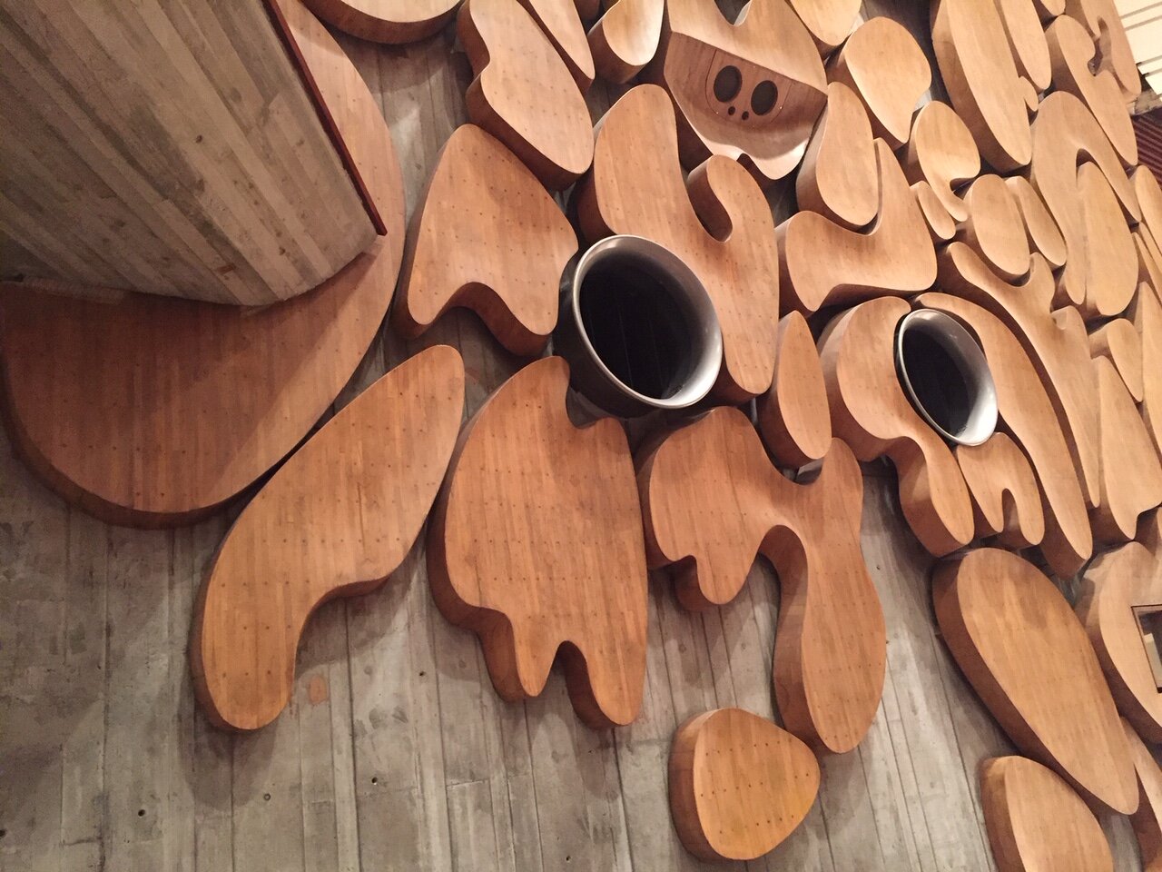
It might take a moment for you to figure out what these are. Don't they resemble the work of Jean Arp? That's what I thought when I entered the Tokyo Bunka Kaikan, one of the venues for the Tokyo Metropolitan Orchestra. Though sited directly across from the Museum of Western Art by Le Corbusier, most miss this off the radar gem from 1961. Inside are two halls, a symphony space with these gorgeous cloud shaped acoustical beechwood babies created by Ryokichi Mukai and a smaller space for chamber music and recitals. It's hard to get in to see these spaces without attending a concert, so that's what I did, returning at night for a lovely performance of Beethoven while skulking around trying to access everything else. I tried to organize a proper architecture tour but was rebuffed. Try your luck! Go to their website, there's a video architecture tour.
The Getty's last round of Keeping it Modern architecture grants
The last round of the Getty's Keeping it Modern Architecture Grants were announced last week. Of all the Getty's marvelous initiatives, and there are many, this has hands down been my favorite among favorites. The buildings that the Getty has identified over the years have been heritage sites that have usually been obscured by want of money, too much politics, and often natural environments that have intruded. A building needs love just like a person does, and these modernist structures are as important as a gothic cathedral or a greek statue. The mid century is no longer overlooked, but unlike the furniture from the period which has seen a renaissance, the buildings are a much bigger task. Take a look at this slide show for some architecture jewels (including work by Wallace Harrison, Pierre Jeanneret) that now have a bit more of a chance of surviving. I am so very sorry this program is being discontinued. In Gibellina Italy for example, they need this kind of help (See my story for ArtNet). This program was designed as a stimulus, not as the answer. Perhaps local authorities will take up the cause.
Paul Williams archive goes to the Getty
When I moved to Los Angeles, we were lucky enough to rent a house we would never have been able to afford from a couple who were unsure of their plans for the property. The house was pedigreed, having been built for an action star in the forties, then eventually owned by a music celebrity and finally this wealthy couple. This house, by Paul Williams, a black architect known as "Hollywood's architect" (along with Tony Duquette and A. Quincy Jones) had rooms so vast that we used the living room as a soccer field for the children and one of the hallways as a living room.The yard had grottos and caves and winding walkways fit for a movie set. We knew we had landed in the LA dream and we cherished it for the short while it lasted. The house itself was classic but the architect was anything but. He was something of a chameleon, designing very contemporary things as well, and most importantly, he had an uncommon sense of civic pride that made him a true asset of Los Angeles which had often lost its architectural way as it grew into the urban sprawl we know today. Many civic projects also bear his imprimatur. Today, on Juneteenth, I celebrate Paul Williams and his legacy.
Charlotte Perriand and Oscar Niemeyer: A rare meet up in Brasilia
Image courtesy of the family of Charlotte Perriand.
This unique image memorializes the meeting of two great stars of midcentury architecture: Charlotte Perriand and Oscar Niemeyer. The two met up when Perriand visited Brasilia. In her memoir she says she admired the urban plan of Brasilia (Lucio Costa was responsible for this, not Niemeyer) and the architecture (this was Niemeyer) but not the interiors--an area in which she had extensive experience having worked for Le Corbusier and also by the sixties, on many wonderful projects of her own. Perriand admired artisans and had a lifelong commitment to egalitarian politics. She worried about housing, about poverty, about crop yields and even the sexual behavior of weevils, which reminded her of a Picasso painting. Perriand was more bottom up, Niemeyer rather top down and their approaches to clients and projects quite different. For Perriand, there was intense attention to the user: the splay of a seat back, the height of a bureau, the fabric of a cushion. She cared about housewives and wanted to make their lives easier. She would have been right at home in 2020 and perhaps had some solutions for us as we face new architectural challenges created by the Covid pandemic.
Lina's World; my story for Air Mail News
“I felt I was in some unimaginable country where everything was possible,” said Italian-born Bo Bardi when she arrived in Brazil.
In a career filled with cliffhangers and high drama, there was likely no moment more urgent for the polymath architect Lina Bo Bardi than the one captured by a photographer in 1967 (above). In her on-site design office under the grand span of the Museum of Art of São Paulo (MASP), her riskiest architectural scheme to date, the restive, Italian-born Bo Bardi, was, for a rare moment, stationary. The project in her adopted homeland had been riven with years of frustrating political setbacks and engineering fixes to her radical design, and now she was racing to meet the 1968 inauguration by Queen Elizabeth. Beside Bo Bardi, Van Gogh’s The Student (The Postman’s Son, Gamin au Képi) was encased in a prototype of her innovative freestanding glass-easel display system, which allowed viewers to circle paintings as if meeting a friend. Behind her stood construction workers, a symbol of the premium she placed on architects acting as instruments of and for the “people”—to whose creativity and needs she was devoted—and not gods who put their designs and egos first.
Recently the subject of “Habitat,” a three-venue career retrospective, and a show of drawings at the Carnegie Museum, all cut short by the coronavirus, Bo Bardi’s work is included in newly reopened exhibitions at the Design Museum Gent, in Belgium, and the Vitra Museum, in Germany. Bo Bardi, who died in 1992, has arrived at the pinnacle of international recognition as much for her diverse body of work as for the original way she went about it.
High-strung, alternately adored by and alienated from her collaborators, Bo Bardi craved attention but struggled for years before receiving any significant commissions. In the interim, she poured her considerable energies into editorial and educational projects, exhibition design, and domestic spaces, emphasizing open access for all. Her ambition for every project was fierce yet inclusive: plant life, circuses, boxing rings, and streets made their way into her creations. Her touch evaded easy classification—she could be monumental or refined—and though she often sought to simplify things, in the end the solutions were almost always complex. By comparison, Oscar Niemeyer, who designed Brasília (the city would become Brazil’s new capital in 1960), was a brand: you knew what you were going to get.
For a time, Bo Bardi was all but forgotten except by insiders. A celebration of her centenary in 2014 began a slow return to recognition. As this latest group of exhibitions prove, she has now been anointed the ultimate architectural heroine.
Material Girl
Born Achillina Bo in Rome in 1914, Bo Bardi would one day claim that she’d wanted to write her memoirs at the age of 25 but did not have enough material. Still, the headstrong young woman already possessed a keen artistic sensibility that was to mark her productive, tumultuous life. A self-described misfit who defied her mother, Bo Bardi adored her father, a builder whose first love was painting. Though her training in classical architecture gave her a solid grounding in history, she escaped her conservative upbringing and education by fleeing to Milan, where her expressive, colorful drawings easily found their way into freelance illustration and writing assignments for the magazines Domus and Lo Stile, both founded by the revered Italian designer Gio Ponti.
Bo Bardi thrived on the attention of male mentors, who were often infatuated with the seductive, opinionated young woman whose imagination and dynamism foreshadowed an unconventional talent. But bereft of any meaningful architecture career, she grew increasingly disturbed as many notables, including Ponti, allied with the Fascist Party that was gaining traction among Italians in the years leading up to the Second World War. An assignment to document living conditions in Italy following the end of the war left Bo Bardi with ideas about the need for humanitarian action and a feeling of solidarity with the disenfranchised. Her romance with Pietro Maria Bardi, a shrewd, older journalist, curator, and dealer looking for respite from postwar economic retrenchment—and, apparently, his wife—was to be dispositive. He had his marriage annulled; they quickly married to appease her family and departed for Brazil, where he had important contacts and she hoped to energize a meaningful career.
Bo Bardi’s touch evaded easy classification: she could be monumental or refined.
When the newlyweds arrived in Rio in 1946, the freedom and hopefulness in the air was a stark contrast to the gloom of postwar Milan. Bo Bardi, now 31, found it exhilarating. “I felt I was in some unimaginable country,” she said, “where everything was possible. ” Nevertheless, she was largely ignored by the entrenched Carioca School of modernist architecture—the war may have been over but her battle for recognition had just begun. When Bardi found a crucial supporter in Assis Chateaubriand, a newspaper magnate with aspirations to build a new museum, the couple decamped to São Paulo, a culturally underdeveloped city where they could more easily make their mark.
The trio quickly opened temporary museum spaces where Bo Bardi experimented with display and Bardi with unorthodox teaching methods and exhibitions focusing on new audiences such as children and native Brazilians. The Bardis sensed that their worth and the worth of the Brazilian people would develop in tandem, and they envisioned a day when the museum could be much more than a receptacle for art.
Read All About It
As the Bardis plotted a more capacious home for the new museum, they knew that popular media could help them gain traction with their daring, multi-disciplinary efforts. In their launch of the magazine Habitat, Bo Bardi found her voice as an advocate for indigenous culture and a vision that turned away from the paternalistic, European canon. The magazine achieved a global following. With fashion and Surrealism populating its pages alongside Marxist tracts and articles on basket weaving, it was a stealth project to wake up the bourgeoisie, alerting it to the wealth of creativity within Brazil’s own borders. Everything in the Bardis’ tool kit had an integrated socio-political function. They fast became a Paulista power couple.
If a woman’s home is her castle, the Casa de Vidro—the house Bo Bardi designed for them outside São Paulo, now the site of the Instituto Lina Bo e P. M. Bardi—was instead her laboratory, an environment “that offered protection…but at the same time remained open to everything.” With inspiration from Le Corbusier and Frank Lloyd Wright, Bo Bardi combined the transparency of glass with thin supporting pilotis to create a tree house with its rear hugging the hill, an inventive mashup of modern and colonial. Now almost entirely surrounded by her plantings—which she may have considered the real occupants of the property—the building feels at once open and private, a perfect setting for an ongoing salon that mixed the creative class with powerful figures in society and government. Being on display was a hallmark of Bo Bardi’s person and her projects. “I was born for this,” she would soon say.
Despite her improved status, Bo Bardi longed for a refuge from the slow progress of the museum and other projects and, not incidentally, from the orbit of her powerful, unfaithful husband. Though Bo Bardi seemed fearless in transcending gender boundaries, her inner life was often a torment of self-doubt.
Alternately adored by and alienated from her collaborators, Bo Bardi struggled to receive commissions.
Salvador de Bahía, the former colonial capital, would become the conduit for Bo Bardi’s transformation from stylish belle of the ball to the substantive, makeup-free, “Anna Magnani of architecture,” as the critic Martin Filler has called her. The ethnically diverse city buttressed Bo Bardi’s growing belief that architects were not handmaidens of the aristocracy but of the people. In Salvador, like the drumming and dance ensembles known as sambistas, Bo Bardi became a whirlwind of movement. She taught at the university; wrote a Sunday column; co-founded and directed the Museum of Modern Art of Bahía in a sugar mill she adapted; curated a landmark exhibition on the indigenous culture of Brazil’s northeast region, Nordeste; ran educational programs; and embarked on long-term collaborations with the filmmaker Glauber Rocha, the ethnologist and photographer Pierre Verger, and the theater director Martim Goncalves.
In a second wave, Bo Bardi master-planned a renewal of the colorful city center that included the Casa do Benin for African heritage and the Ladeira Da Misericordia—a narrow, crumbling street that hugged the edge of the city—which she revitalized by integrating her colleague João Lima’s thin, undulating, concrete buttresses into a housing and restaurant complex. Chairs she designed evolved from sleek leather buckets to roadside perches made of twigs: beauty had become a barometer of decadence. “No one can save themselves by design,” she wrote. “Can a beautiful glass save us from thirst? Can a very beautiful dish … save us from hunger, misery, illness and unemployment?”
Though Bo Bardi’s productive years in and out of Bahía ended in humiliation and intimidation—her volatility made enemies of key supporters and the military junta—they freed her to tap into the region’s rich Portuguese and African traditions along with leftist politics and the avant-garde. She came into her own. Bo Bardi’s baggy pants, blue workers shirts, and free-flowing hair announced Salvador’s parallel personal impact. Where she had once needed to be desired as a woman, now she could lay claim to being noticed as a propulsive thinker and doer.
Spot the Difference
By the time Queen Elizabeth arrived in São Paulo to inaugurate the opening of the MASP, gone was the Bo Bardi of elaborate ensembles. In her place: the public intellectual and architect who excelled at ruffling feathers. “I want to clarify that…it was my intention to destroy the aura that always surrounds a museum,” she wrote. The museum instead became a social and cultural resource for the metropolis, a new town square.
Bardi’s freestanding glass easels display art inside MASP.
Bo Bardi’s last decades cemented her reputation as an exceptional innovator. Her most consequential commission was the transformation of an old barrel factory in a working class section of São Paulo into the SESC Leisure Center on the Rua Pompéia. The inviting spaces born of low-rise, cavernous sheds became a library, a cafeteria, art studios, a theater, and a public “living room” with a winding reflecting pool. The Center culminated in delicate, ramped concrete structures for sports, all free and open to the public. Bo Bardi designed the furnishings, signage, even new uniforms: this was a project she proudly owned in its entirety. Once again, her insistence on an on-site office made the posse of young male architects and construction workers more nimble; she may have been demanding, but she inspired ardent dedication.
She had once needed to be desired as a woman; now Bo Bardi could lay claim to being a propulsive thinker and doer.
Bo Bardi died at age 77 after declining health, her legacy not assured. She was that rare combination of populist and autocrat and many of her interventions were allowed to deteriorate, or worse, were suppressed. Though the Getty Conservation Institute made a survey grant for the Casa de Vidro, and the World Monuments Fund put the Ladeira on their Watch List, a visitor last year found only debris and weeds in the largely inaccessible abandoned hilltop bar which had incorporated nature and her signature cloud windows. In Salvador’s Gregório de Matos Theater, dozens of her folding wooden chairs were stored in a grimy heap next to garbage and paint cans. Her elegant Casa do Benin has had to survive as a gift shop. Bo Bardi was able to supervise repairs to São Paulo’s MASP before her death but not to prevent 20 years of posthumous decline, as well as the removal of her unique painting display system.
Happily, the glass easels are now returned to open formation and the museum is again on surer footing. But increasingly diminished resources for culture in Brazil are worrying. What would Bo Bardi think—however holistic their intentions—of the Danish starchitect Bjarke Ingels, who recently toured Bo Bardi’s beloved Nordeste with members of a real estate conglomerate and then met with authoritarian President Jair Bolsonaro to receive his blessing for large-scale tourism development?
Both Bo Bardi’s published writings and her buildings are vigorous counter-narratives for a bottom-up, inclusive world. Her love for the circus—she once made space for it under the massive span of MASP, and used it for her plan of the Espírito Santo do Cerrado Church in Uberlândia, Brazil—is emblematic: all are welcome under Bo Bardi’s Big Top.
Photos: Lew Parrella © Colección Instituto Bardi/ Casa de Vidro São Paulo; Courtesy of Museo Jumex.
Pietro Consagra's spectacular theater in Gibellina Sicily at risk
This week would have been the opening of the Architecture Biennale in Venice, now postponed until this time 2021. In 2018, a project about the extraordinary 1972 theater of Pietro Consagra was center stage in the Italian pavilion. When I got to Gibellina and saw it, even with the debris in front and the disrepair, it was still one of the most beautiful structures, an example of this visionary sculptor's who envisaged each inhabitant would be transformed – in a “The Frontal City”, so they could "experience art...to keep oneself suspicious, susceptible, nervous, intolerant, evasive, enthusiastic, balanced, unbalanced, attentive, aggressive, lazy, imaginative, libidinous, free, ungraspable.” Consagra continued, “We no longer wish to live in cubes, nor in spheres or tubes. We do not want to end up in conventional dimensions dictated by the standards of mass production. We do not want to live within any concept of normalization...Whatever space we happen to use must be mobile, temporary, transparent, paradoxical and amenable to fluctuating ideas. It must evade the eternal structures of Power”. Today an effort is still ongoing to bring this utopian structure back to life.
Nanda Vigo and her Anthropomorphic Traces in Gibellina Sicily
When I was in Gibellina (see my report on Artnet) Sicily discovering the history of the modernist town that had been built adjacent to the ruins famously covered in concrete by Alberto Burri, I corresponded with designer and artist Nanda Vigo, who has died. Vigo who had worked with Gio Ponti and lived with Piero Manzoni, designed the 'Anthropomorphic Tracks" repurposed out of elements that had been destroyed in the 1968 earthquake. Vigo said (in her own translation), "My idea was to give remembers of the old village, so I recovered the remains of the very old fountain, still there from the time when the village was founded from Arabian people, and I rebuild it in the new town. I did the same with a beautiful “normanno” arch and with many pillars from the main church. All together I called “tracce antropomorfe” (anthropomorphic tracks). Vigo was a leader in the effort to help the town's mayor Ludovico Carrao in marshaling artists to help build this new city. Very candidly she considered the project something of a failure, " today Gibellina looks like a dead town, without the look and the hand of Corrao. The municipality of the town don’t take care at the monuments, enough the Burri “cretto” is now save thank to the private policy. There are living only old people, young population leave for the main town or strange country." Gibellina is being rebuilt, and Sicily is one of the first Italian areas to reopen. Still, I fear for the important but delicate ongoing preservation project.
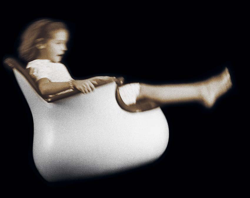
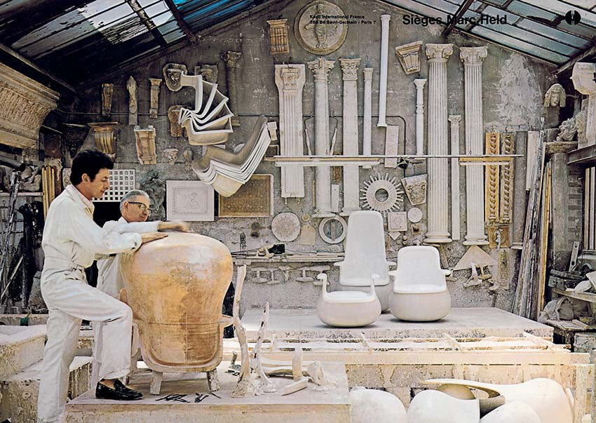
Marc Held's sixties Culbuto chair
"I dream of a chair that could pivot and swivel without the need for mechanical devices" said designer Marc Held. His sixties chair design, the Culbuto, made out of glass fiber and polyester with white coating, and leather, wool or fur coverings, riffed on Arne Jacobson's Egg chair but it had a dynamic energy all its own. The idea was that walking is less tiring that sitting still. After 9 weeks of Covid isolation, I certainly would agree! Knoll issued three versions of the chair and later his own company even included a version for children. Michele Champenois has written about Held in two books and the wonderful Parisian store Norma is featuring them this week.
Eileen Gray at Bard Graduate Center
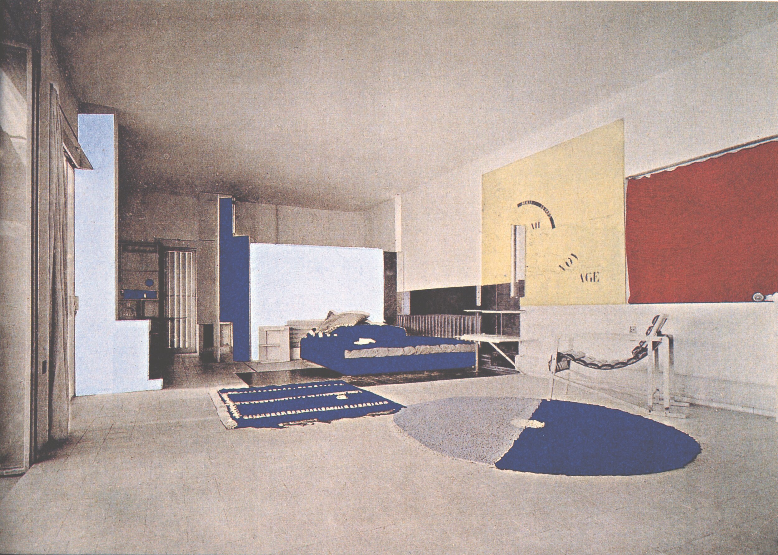
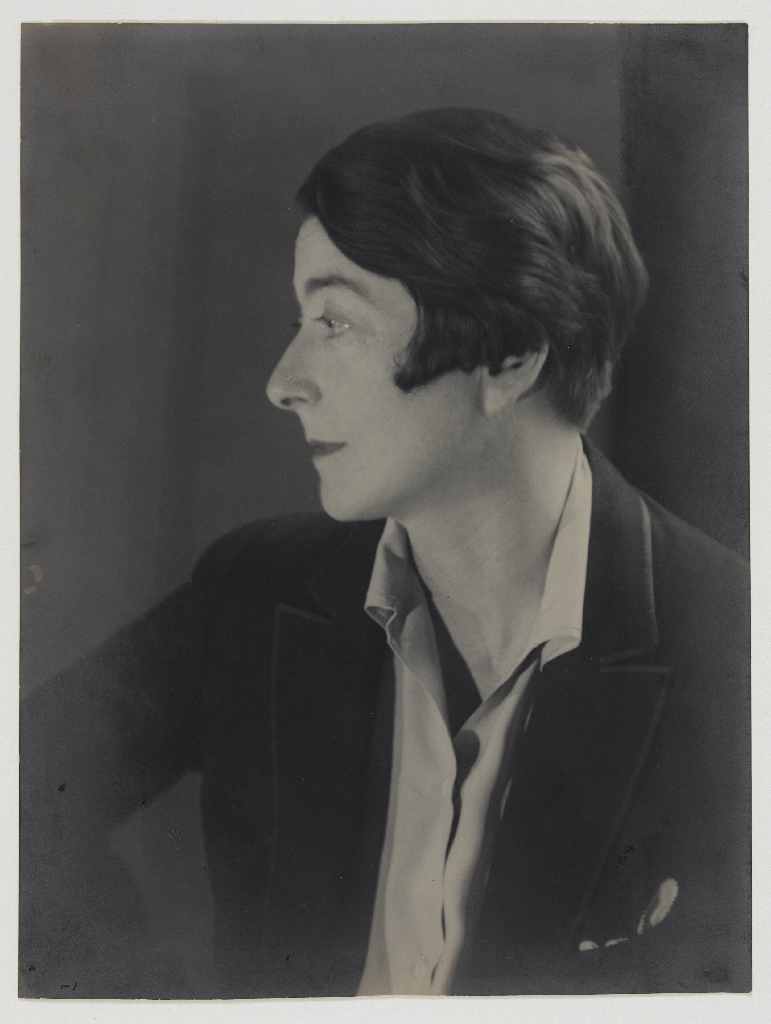
An exhibition of iconic 20th Century designer Eileen Gray at the Bard Graduate Center includes drawings and objects and alas got short circuited by the pandemic. The image of her in the slideshow by photographer Berenice Abbott is only one view of this chameleon-like talent who although faithful to the clean lines of Le Corbusier (like Charlotte Perriand) very much went her own way. Still, you can see things online and if we are lucky, the show will still be up when things begin to open. The Bard Graduate Center is small but always has wonderfully curated design shows but this exhibition began at the Centre Pompidou.
Photo credits:
Eileen Gray and Jean Badovici, E 1027, Au Cap Martin Roquebrune, 1926-29 from L’Architecture Vivante, no. 26 (Winter 1929), Paris: Éditions Albert Morancé, page 32. Centre Pompidou, Bibliothèque Kandinsky, Paris. Fonds Eileen Gray
Berenice Abbott. Portrait of Eileen Gray, 1926. Silver gelatin print. National Museum of Ireland, NMIEG, 2003.569
The San Francisco Maritime Museum: a WPA fantasia
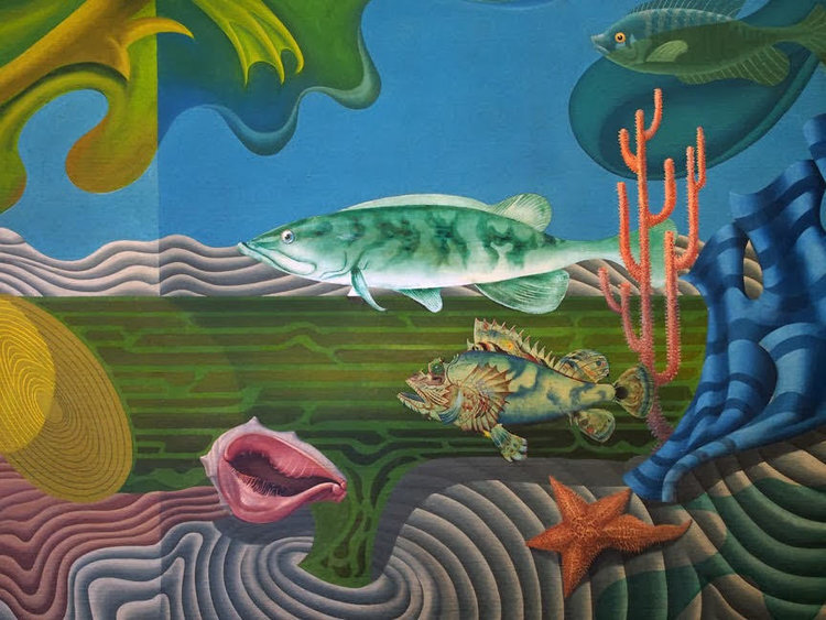
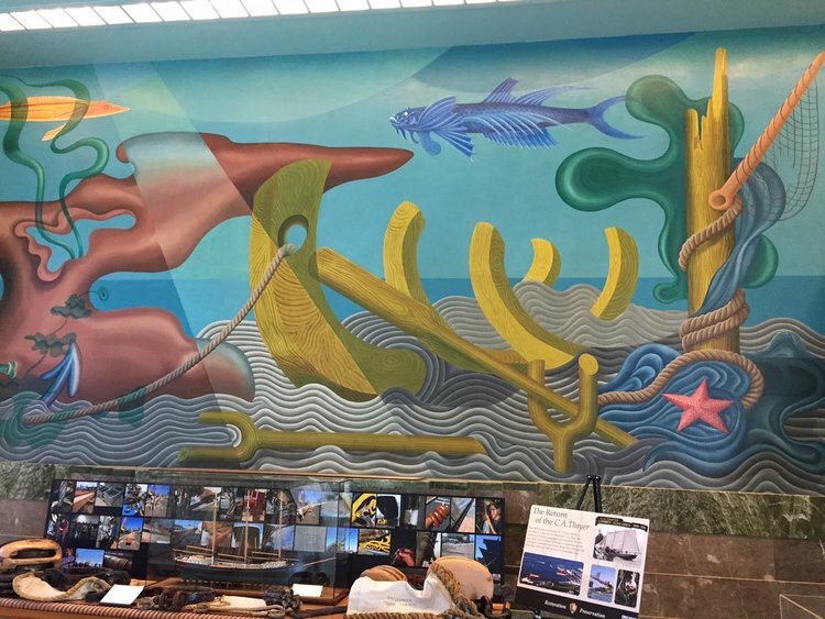
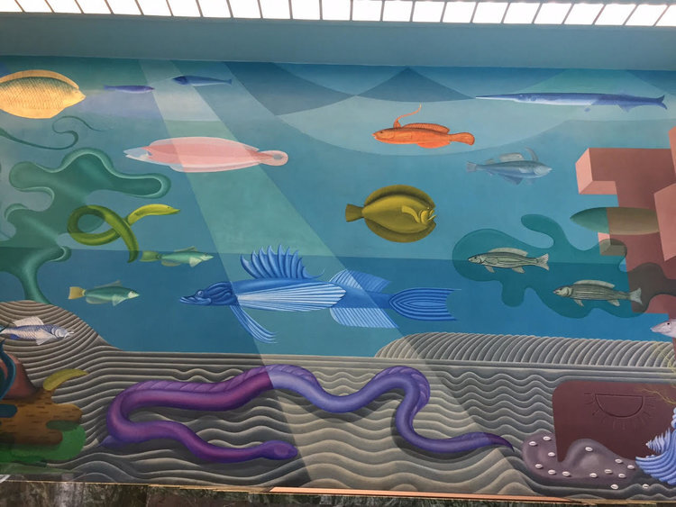
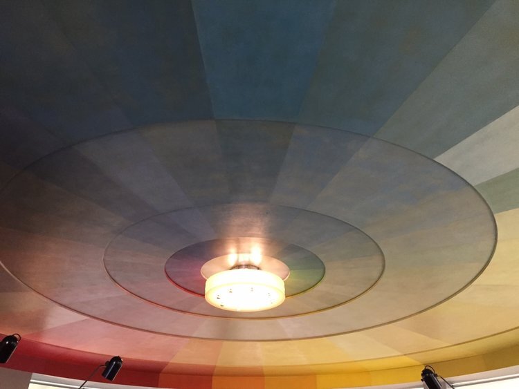
The story of the San Francisco Maritime Museum, a hidden San Francisco gem, is not just one of architecture and design although that is what pops when you walk in the subterranean Ghirardelli Square-adjacent entrance. Looking out over the historic seafaring vessels of the Hyde Street Pier and the crescent shaped beach a visitor is struck by the graciousness of this temple to the history of West Coast Maritime History, rich with exhibits that speak of the life of the people who made their living at sea. Built in 1939 jointly by the WPA and the City of San Francisco as a bath house, the museum is part of a National Park Service Maritime Historical Park that highlights the city's connection to the sea. The museum, over 20,000 square feet, is.an astonishing example of the power of the federal government when it’s functioning as it should be and could be a model for a new federal program that could enlist the help of the many talented but struggling artists during the time of Covid. This enlightened project came to fruition over more than four years under progressive American artist HilaireHiler who not only did the phantasmagoric first floor murals of the Lost Cities of Atlantis and Mu but was also a costume designer and color theoretician, a polymath who had befriended Henry Miller Anais Nin and Hemingway at the Jockey Club in Paris where he had been the host. His glorious ceiling Prismatarium” is an ode to color theory in which he proposed that color and the human psyche interact to enhance creativity. Other artists like Sargent Johnson, a black sculptor who did the tile murals who had been associated with the Harlem Renaissance and Richard Ayer who supervised the second floor murals and flooring and who engaged vibrant Shirley Staschen, who had also done the WPA murals at the nearby Coit Tower, were also enormously talented. This treasure is a model of public engagement which is on scant display today under the current administration.
Charleston House, Bloomsbury's hideaway, is at risk
In 2005 on July 7, the world stopped in London. I was on my way to meet the author of a book about the love triangle of surrealists Max Ernst, Gala Dali and poet Paul Eluard before a trip to Charleston House, the home of Vanessa and Clive Bell and Duncan Grant. I waited at Victoria Station for what seemed like forever and suddenly agents in acid green vests began running through the station. There had been a tube bombing and the station was being evacuated. After some desperate attempts to reach the author, I boarded the train to Sussex. I only found out later that he had been on the train behind the train that was bombed. But my day at Charleston was thus also surreal: the house is a wonder of color and decoration, evoking a bygone time when home and hearth were the breeding ground of creativity. Now, Charleston(get IG address) is in jeopardy like many other cultural sites and all our homes are the only safe haven. The Covidbomb, just another terrifying moment in history.
